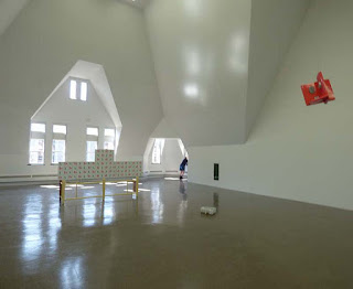
The sculptures of Richard Rezac can no better share the same room with each other than a bunch of anarchists might. They’re more about breaking rules than following or making them. The resulting space feels like the aftermath of a child’s birthday party. Unusual objects appear to hang from the ceiling, sit on the floor, project from a wall, or wedge into a corner for no good reason. Each has been reduced to the most basic kinds of enclosed shapes, much like a Brancusi bird or fish. But less attention has been given to developing an inner dynamic of form – and more to inviting viewers “to consider the multiple layers and possible readings of each piece”
There might be two cross purposes here. On the one hand every Richard Rezac object looks pleasant and well crafted. Like toys made for toddlers, the shapes are simple, the surfaces smooth, the colors solid. None of the twenty pieces are disruptive, and a few are quite attractive in a modern decorative kind of way. Puzzlement, however,seems to be the top priority. Many appear to be architectural details, yet they serve no conceivable function. It’s as if some organic pattern of interior design had become cancerous and was producing dysfunctional anomalies. A variety of materials are used – glass, wood, metal -- in such a way that the combinations always feel incongruous. One end of a gate might be supported by a painted wooden strut – while the other end is supported by a lump of unpainted cast plaster.
The largest piece, referred to as the “Ren Screen” was apparently designed for a specific place on the floor of the Renaissance Society gallery – which is itself a rather incongruous space. It’s bizarre, trapezoidal walls were the unavoidable consequence of the Gothic Revival façade of Cobb Hall. The upper edge of the screen echoes the pattern of high windows in the wall behind it. It serves to scale down the ungainly space of the enormous room. It also cheers the room up with a quite pleasant red and green floral pattern. Yet, when seen from the rear, the symmetries are broken and the combination of patterns feels arbitrary. It serves to support a small wood sculpture that resembles the waist of a violin. Titled “Cremona”, it makes a droll reference to the history of musical instruments while accenting the center of the screen -- but it doesn’t really save the screen from feeling arbitrarily pieced together..
Who cares about anomalies? Near anomalies can be quite thrilling in paintings as they challenge and stress the composition. If they destroy it, however, scientists and financiers might be even more fascinated. Something that doesn’t make sense often triggers a major new theory, product and investment opportunity. Those modern elites might be the best viewership for this kind of art. It might well inspire creativity within the immaculate white cells of laboratories or corporate headquarters.. Elsewhere, however, it probably just serves to reaffirm the intellectual superiority of the viewer - without really offering any substantial evidence of it.
************************
The review published in New City concludes that "Above all, this is an anti-monumental show. Nothing big, nothing grandiose, no hyperbolic claims about art’s importance. This is itself refreshing, but the sculptures thus run the risk of not being taken quite seriously enough; and to underestimate them would be a mistake, because there’s something quietly subversive about Rezac’s well-crafted dialectic of difference and repetition."
Presumably, a "dialectic of difference and repetition" is subversive, and being subversive is important. We can only guess why. The artist is well established and his "vocabulary of shapes" though incomprehensible, is hardly provocative in a contemporary artworld that thrives on provocation.
The exhibit, as well as Luke Fidler's review, would seem to reaffirm rather than subvert any social or visual conventions that may apply.


No comments:
Post a Comment