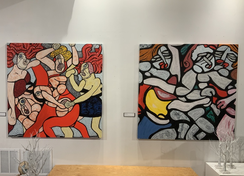
Left to right: Kristen Phipps, Joseph Royer ( 3 pieces ), Bruce Thorn
Soon after turning forty, Russian emigre John D. Graham (1886-1961) began to compile his magnum opus "System and Dialectics of Art" - a free-wheeling lexicon of the "fundamental terms’’ on the subject of art. A born aristocrat, he trained as an attorney and later served as a cavalry officer. Fleeing to New York to escape the Bolsheviks, he began to study, make, curate, and write about art. At that time, he was especially enthusiastic about Picasso and he collected sub-Saharan African sculpture.
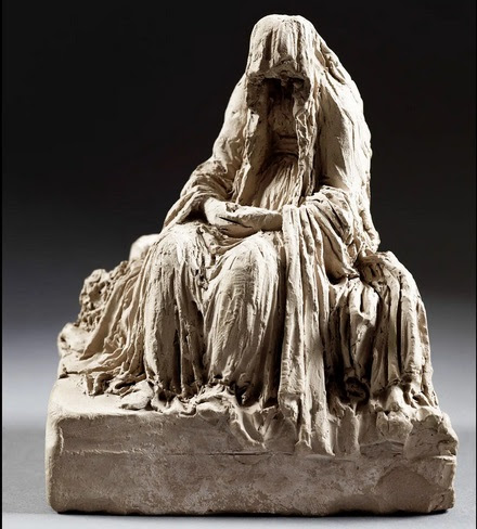
John Graham, Model in studio, 1935 (left)
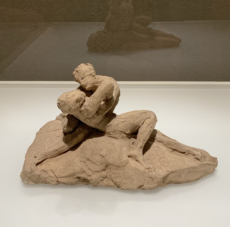
These two Graham pieces are included in this exhibit.
The one on the left appears to be a student piece though it’s dated 1935.
John Graham, Still Life with Fish, 1941, 25 x30 (detail)
Everything else in this exhibit comes from local artists who responded to the curator's call for submissions. Each of their works is accompanied by one of the questions Graham asked and answered in his book - and often they clash.
For example, the three pieces by Joseph Royer shown at the top are matched with "What is the relationship of symmetry to art?" .. which Graham bluntly answers with "Symmetry has no place in art. Symmetry is balance by repetition. Art knows only the balance of unequivalent elements.".
To the left, "LAUGHs", the large, cheerful piece by Kristen Phipps, is accompanied by "What is the origin of a work of art ?". Elsewhere, however, Graham has asked "What place has humour in art?" … and his answer is "None.
Humour, or sense of humour, is nothing else but
a deficiency in the sense of joy…..a substitute for impotents, or castrates, deprived of primeval sense of joy." Ouch! That would seem to disqualify anything lighthearted as a "work of art". And the reference to masculine potency might exclude any female artists as well. Graham mentioned many painters and writers in his book - and none were women.
To the right, Bruce Thorn’s "Blue Rider" is accompanied by "Is painting a two-dimensional or a three-dimensional proposition?". Graham answers with "Painting is a two-dimensional proposition because of the very nature of the operating space. Modeling as a means of expression belongs to sculpture". For sure, Thorn has not modeled illusory volumes in an Albertian picture box. But he does make careful use of paint’s three dimensional properties - as did Van Gogh ( one of the 11 artists Graham listed under "great painting")
*********
With a few exceptions, this exhibit no better represents the art of our time than Graham’s book represents the art theory of a hundred years ago. Both offer much of what is typical - but little of what transcends that. They do, however exemplify the glaring difference between the American artworld of 1920’s and that of a hundred years later: the growing preference for concept over form.
For Graham : "Art has nothing to do with representation, impersonation, interpretation, decoration, compromise, character, caricature or psychological problems... Form itself expresses fully all elements of subject matter, character, tragedy and psychology. " Something like that is the principle that underlies the great encyclopedic collections of world art that art museums had begun to assemble in earlier decades. We might note, however, that Graham would eventually abandon this dogma, as Poussin replaced Picasso as his guiding light, and mystical symbols replaced mystical energies.
Most of the art in this exhibit is primarily notable for its craftsmanship and concept. Form - as the "Ability to control the stream of energy in regard to space" (Graham) - or what might also be called the inner spirit of shape - is less of an issue - and might even have been considered a distraction.
Bruce Thorn, Blue Rider, ( detail )
Oil on linen, 24x 30
The two exceptions, for me, are the pieces by Bruce Thorn and Misu. Whatever concepts were intended (and presumably Thorn was thinking about the early Modernism of Der Blaue Reiter ), it's the mysterious, and quite different, origin of their forms that holds my attention. Thorn’s pictorial world is so cosmic, tumultuous, and eternal.
Misu, If not for the Charm of Old Memories, I’d be Tangled in Knots,
Acrylic and marker on Rosin paper, 24 x 36
While Misu’ s pictorial world is so romantic, beautiful, and ephemeral.
Kristen Phipps, LAUGHs, mixed media on canvas, 62 x 44
This piece also seemed to be going where I would like to follow, but then got frustrated with its own cuteness.
Kara Cobb Johnson, Articulation of Form; PrismaGrid Sketches
wire fence, transparent colored vinyl, acrylic medium
Curiously, the above piece was accompanied by the question:
What is the language of form?
Possibly it was chosen because the word "form" is in the title - but the visual effect - as well as the artist’s statement would contradict that:
Kara creates work from a conceptual core. Her focus is to create harmony within a picture plane, installation space, or sculpture. This authentic, playful, creative investment honestly scribes the dual natured demands of American womanhood and motherhood. The use of her hand and body moving around a work or through a space is also of import, making the work tactile and immediate in conception and commitment, but contemplative and cathartic in creation and consumption. Often works are renamed as time passes and according to where a work is displayed which can change the meaning it can evoke in each new setting. Her current works explore communication and propaganda in America today. She manipulates reflective hazard tape and electrical tape and fencing along with paper and cellophane to create light bending ephemeral installation landscapes that question stability and re-calibrate perception unique to each viewer.
*******
Basically, this is a survey of the local emerging artists who applied to participate - much like those programs of exhibits on 35th St. at the Bridgeport Art Center and the Zhao B Art Center. But the inttroduction of a fascinating document of art theory has made for a more thought provoking - and less illustration-packed show.
Madron gallery is like no other in the Chicago area. It’s the owners’ collection of early 20th C. American painting - on permanent display as a kind of museum - and periodically enhanced with special exbhits of their favorite artists, both historic and contemporary. It is happily quite independent of the trends followed by all the other art museums in our area.
*********************
BTW - a free PDF of Graham's book is offered online - and it does make for some good reading.
Here are a few of my favorite excerpts:
Desire to have ethnographical or circumstantial information about an
object of collection, or art is : a) a desire to pose as a scholar, b) a
fear to be taken for a newly-rich ignoramus, c) an inability to SEE the
object as SUCH in all its self-sufficiency, d) a desire to sneak in on
it in an underhanded manner, under false pretense of high science, or
high art through the back door, and form an opinion based on irrevelent,
circumstantial,
circumstantial, ethnographical and
anecdotical evidence about the object. These people will never learn.
This is a plea for the sacrosanct authority of the relationship between viewer and viewed. It denies the premise of academic art education as we now know it….. and I agree with Graham.
…All painting based on modeling is a make-believe painting or an illusory art. … Giotto misunderstood Byzantine paintings precepts.
Even if an appropriate antidote to the common trope of Byzantine artists as backward and ignorant — didn’t Graham ever enter the Scrovegni Chapel?
The Egyptians and Greeks painted men and animals aligned in postures and gestures within the operating plane, flat. It is not that they could not paint them in perspective but that they did not choose to do so. Painting in perspective was known to the antique world (paintings of grapes to which birds used to come and nibble at) and was not discovered by the
Subject matter or plot or anecdote has nothing to do with a work of art; it has no place in a work of art. Form itself expresses fully all elements of subject matter, character, tragedy and psychology. Subject matter has no educational value. ……. The interest in subject matter is a degenerate desire to get results quickly without the tedious process of legitimate creation. Such is the art of a capitalist society
- the art devoid of form but rich in anecdotal matter, the art derived from an extreme rectum - consciousness, financial-value-consciousness, the art of great care in execution and cleanliness, the art of sterility
The rectum consciousness of capitalist society — devoid of form but rich in anecdotal matter ?
That characterizes the high-end contemporary artworld - does it not?
What is the most important element in art ? …..Revelation through pure form (not style) in space.
A quote worth remembering - though I wish I liked Graham’s paintings more. Picasso and then Poussin may have been his heroes , but I’m not sure what he learned from them. One of his pieces in the show looks like mediocre student work, while the other is no more than annoying. No love of life in either one.
How is a great work of art recognized?…….When the gods speak, the figure is stupendous and frightful
This speaks to what Graham is looking for, based on his own life experiences. I’m sure he would get along quite well with our local artist, Wesley Kimler - before they tried to kill each other.
...Genius travels the road of ruthless investigation, argumentation and conclusion.
The road is vertiginous. Genius questions everything, prys mysteries of divinity open, challenges all. Genius is of Satan; because his processess are negative though the results are eventually positive. The desire to create is a demoniac desire to rival the first creator, the primeval father, the Sun, to challenge him desperately and in love as Satan; and Prometheus did. Satan;
perhaps, is the most poetic and the saddest image humanity has ever created. His burning desire for truth and pure deity (marve!) led him to challenge this very deity offering his own flesh as target for its wrath....
Is Modern Art really satanic? Hans Rookmaaker thought so. ("Modern Art and the Death of a Culture")