Tuesday, May 29, 2018

Richard Rezac at The Renaissance Society


The sculptures of Richard Rezac can no better share the same room with each other than a bunch of anarchists might. They’re more about breaking rules than following or making them. The resulting space feels like the aftermath of a child’s birthday party. Unusual objects appear to hang from the ceiling, sit on the floor, project from a wall, or wedge into a corner for no good reason. Each has been reduced to the most basic kinds of enclosed shapes, much like a Brancusi bird or fish. But less attention has been given to developing an inner dynamic of form – and more to inviting viewers “to consider the multiple layers and possible readings of each piece”

There might be two cross purposes here. On the one hand every Richard Rezac object looks pleasant and well crafted. Like toys made for toddlers, the shapes are simple, the surfaces smooth, the colors solid. None of the twenty pieces are disruptive, and a few are quite attractive in a modern decorative kind of way. Puzzlement, however,seems to be the top priority. Many appear to be architectural details, yet they serve no conceivable function. It’s as if some organic pattern of interior design had become cancerous and was producing dysfunctional anomalies. A variety of materials are used – glass, wood, metal -- in such a way that the combinations always feel incongruous. One end of a gate might be supported by a painted wooden strut – while the other end is supported by a lump of unpainted cast plaster.

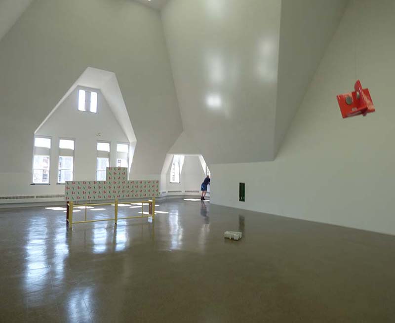
The largest piece, referred to as the “Ren Screen” was apparently designed for a specific place on the floor of the Renaissance Society gallery – which is itself a rather incongruous space. It’s bizarre, trapezoidal walls were the unavoidable consequence of the Gothic Revival façade of Cobb Hall. The upper edge of the screen echoes the pattern of high windows in the wall behind it. It serves to scale down the ungainly space of the enormous room. It also cheers the room up with a quite pleasant red and green floral pattern. Yet, when seen from the rear, the symmetries are broken and the combination of patterns feels arbitrary. It serves to support a small wood sculpture that resembles the waist of a violin. Titled “Cremona”, it makes a droll reference to the history of musical instruments while accenting the center of the screen -- but it doesn’t really save the screen from feeling arbitrarily pieced together..

Who cares about anomalies? Near anomalies can be quite thrilling in paintings as they challenge and stress the composition. If they destroy it, however, scientists and financiers might be even more fascinated. Something that doesn’t make sense often triggers a major new theory, product and investment opportunity. Those modern elites might be the best viewership for this kind of art.  It might well inspire creativity within the immaculate white cells of laboratories or corporate headquarters.. Elsewhere, however, it probably just serves to reaffirm the intellectual superiority of the viewer - without really offering any substantial evidence of it.


************************


The review published in New City concludes that "Above all, this is an anti-monumental show. Nothing big, nothing grandiose, no hyperbolic claims about art’s importance. This is itself refreshing, but the sculptures thus run the risk of not being taken quite seriously enough; and to underestimate them would be a mistake, because there’s something quietly subversive about Rezac’s well-crafted dialectic of difference and repetition."

Presumably, a "dialectic of difference and repetition" is subversive, and being subversive is important. We can only guess why.   The artist is well established and his  "vocabulary of shapes" though incomprehensible,  is hardly provocative in a contemporary artworld that thrives on provocation.

The exhibit, as well as Luke Fidler's review, would seem to reaffirm rather than subvert any social or visual conventions that may apply. 


Saturday, May 26, 2018

Mary Qian and Miguel Malagon at the Vanderpoel Museum


Mary Qian: "Dayton Street"


More images of the show have been posted here


Mary Qian’s “Dayton Street” is the first painting you see when entering this show. It’s also one of the best realist paintings recently made in Chicago. In the background, people are walking, driving, or biking down a busy street. In the foreground, a tall, Latino man with shoulder length hair is staring at a point somewhere above the viewer’s head. With eyes wide open, and expression calm and determined, he is apparently having a vision. The strong triangular composition gives that vision the gravitas of a religious icon. The neighborhood is vibrant, congested, and youthful, while Willis Tower in the hazy distance identifies the city as Chicago. These are not the mean streets that might relate to a discourse on social justice. Nor are they the beautiful streets that might celebrate the pleasures of urban life. The street is orderly in that everyone is following the rules of traffic. Visually, however, it has the chaos of arbitrary placement ,a jittery sense of space and a hint of anxiety. All that makes this view beautiful is the man depicted in front. Not that his face or clothes are especially attractive – but there is a beautiful spirit shining out from his eyes. You might call this a romantic realism that is more sentimental about the future than the past.

Qian’s other portraits, usually just a head and shoulders, also pursue a truth that is earthbound as well as spiritual. Skillful drawing projects the volumes of the skull and the fleshiness of features like the lips and nose. Yet even more, the design projects the spirit of the person depicted. They don’t seem to be extraordinary individuals – but neither do they appear depraved, ridiculous, demented, or banal. Each has a unique character. All other qualities of paint or model are secondary. A more expansive cityscape fills the background of “Above”, and again the person in the foreground is looking upwards in a pensive way. The light breaking through the clouds intensifies the dramatic effect – as if this woman had overcome many obstacles and was courageously pursuing her dream. She’s young and handsome, and appears to be African American – but all that seems incidental to the strength of her spirit. This is Rembrandt's legacy in portraiture: painting the soul while making the body just realistic enough to convince you that such a person actually exists. A double portrait of a mother and child is less successful. This time, the narrative is carried by a caressing hand rather than a staring face so the mood needs to be more about comfort than perseverance. The foreground features a beautifully painted color patterned shirt, but that’s not enough to keep this grayish painting from feeling a bit sad and dreary. It’s a tribute to motherhood that’s more to be admired than enjoyed.


Miguel Malagon: "Downtown Vendor"


The cityscapes of Miguel Malagon are as immersed in the street life of the city as the man depicted in “Dayton Street” for which he was the model. They have the same gritty texture and jittery sense of space. His figures sometimes struggle to emerge from a blizzard of paint strokes and they never relate to each other very well, but isn’t that the reality of an urban street ? People may be physically close, but each is living in a hectic private world. There’s a sense of displacement, as one might expect in a city with so many immigrants – including both of these artists. (Qian was born in Shanghai, China; Malagon in Guanajuato, Mexico) Each painting feels like a collage of on-site sketches or studies from snapshots. They exhibit more concern with what can be seen than with what it might mean. Malagon’s landscapes, however, seem to focus on a kind of nervous and forceful graphic energy. He has relaxed and taken comfort from some rocks along the edge of a pond, but the hills, trees, and clouds appear to reflect back the artist’s own restless, questing spirit.

This exhibit takes place in the Vanderpoel Museum. John Vanderpoel (1857-1911) was a popular instructor at the School of the Art Institute. In his time, figure drawing from life was fundamental to art education, and he was a master. His instructional book, “The Human Figure” is still in print. Soon after his untimely death, former students began to assemble a collection of observational art in his honor. Some of the pieces were done by him or his students; most were not. Some were made by the leading artists of the day; most were not. It’s a fascinating slice of art history and of a tradition that lives on in the work of Qian and Malagon. It’s also a rather somber reminder that most art, no matter how skillful, thoughtful, and emotive, will eventually be pushed beyond the radar of the artworld. Now located in the Ridge Park Field House on the far south side, the Vanderpoel Museum itself is at the brink. It may not survive another generation unless someone steps up to revive it with more shows like this one.


Wednesday, May 23, 2018

Richard Hull at Western Exhibitions


Ridiculous Mirror


It’s always been hard to look at the fantastic imagery of Richard Hull and not think about the Chicago Imagists who preceded him at the School of the Art Institute by about a decade. His work is typically humorous, defiant, precise, and cheerfully wacky. It has the cranky obsessiveness of a self-taught outsider and the aggressive lines and colors of comic books. In most of his forty year career, however, he has not represented the human figure. He has been called an “abstract imagist”

In many ways, the paintings in this exhibition are not much different from previous work. They still have the flattened, bulbous eruptions of linear protoplasm. But nothing is left of the architectural space suggested in early paintings, and by packaging his forms within a basic shape that resembles a head and shoulders, the viewer is now confronted by portraits of human beings. So now we have a moral content that may be queried. What kind of people are these? Are they to be loved, feared, trusted, helped, obeyed, admired ? As with most of the people represented by the Imagists – they do not appear to be responsible adults. They’re all nut cases – unaware of any world outside their own perseverating mind. They’re caught up in some kind of twisted mental process or an alternative reality with a few too many dimensions. Perhaps they are pondering one of the classic mathematical problems that have bedeviled great minds for centuries. The artist tells us that this series was inspired by the Klein bottle – a nineteenth century topographical construction that defies a conventional understanding of three dimensional space.

The main gallery of the exhibition is rather intense. The viewer is confronted by the same wacko psychology on every wall, as well as rising from the floor as freestanding “mirrors”, painted on both sides. Rather than presenting a human image for contemplation – it’s as if the inner workings of a disturbed mind was bubbling out from a gate to another world - like the monsters that pop out from every dark corner of a carnival fun house. The viewer is immersed in the endless loop of the artist’s repetitive cogitation. The work is intense in close-up detail, as well, with painted surfaces that often feel teased, tormented, and reworked many times.

You can feel the careful consideration given to balancing shapes and colors, and there is a variety of emotion from the black/yellow anger of “Joan of Arc” to the green/red contentment of “Arrived”. Even without any sharp angles, it has a strong, assertive appeal. None of these portraits, however, seem to represent anyone who is compassionate or rational. And there is no sense that the space outside each figure has been taken into consideration. It’s just whatever the inner turmoil has left unfilled. As a group of paintings, it’s fun and exciting. But as a group of the people they might represent, it would be a bunch of high energy psychotics – which is how so many other prominent Chicago artists of our time have viewed humanity. Hopefully, someday we’ll see Hull’s portraits hung side-by-side with similar portraits by Nutt, Rossi, Pyle, and Wirsum. Even more hopefully, however, let there come a day when more Chicago artists, like Kerry James Marshall, offer a positive vision of humanity. If we all accept ourselves as crazy monsters, there’s not much incentive to improve behavior.

Martin Hurtig at UIMA


Complexities and  Contradictions (1966)


There are five distinct styles of abstract painting in this retrospective of Martin Hurtig (b. 1929) spanning the last four decades of the twentieth century. The earliest piece, dating to 1963, is so typical of the gestural abstract expression of the previous decade, it might even have been intended to exemplify it. There is struggle, passion, and frustration as a grand, serpentine gesture culminates beneath a thick red X. Whether or not that meant that the artist was finished with making heroic gestures, we certainly don’t see any more in this exhibit. In the next piece, “Complexities and Contradictions” (1966) we see broad calligraphic strokes and squiggles dancing above a pattern of floating rectangles of solid color. It’s decorative and balletic; and it might remind us that the artist was trained at IIT’s Institute of Design in the 1950’s. In all the paintings that follow, painterly self expression will continue to complement, or perhaps compete, with the geo-form design of modern architecture.

In some untitled acrylic paintings from the seventies, a flat rectangle of solid color ( red, green, or white) emerges from one side of the panel and nearly reaches the other. The margins fight back with strong colors and arbitrary edges, but clearly the battle is being lost. Then, the geometric-forms leave the painting altogether and re-emerge as sculpture. The plexiglass constructions that hang from the wall resemble architectural models for office cubicles. The freestanding pieces block out their space on the floor with aggressive, sharp angles. Be careful! If you stumble into one, it could do some damage. Be especially careful of the waist high aluminum trapezoids called “La Famille”. What a combative, dysfunctional family it must refer to. By the 1990’s, the geo-forms have moved back to the walls, this time as aggressive black and white patterns. The smaller ones might serve as pictograms for hazardous material warnings – the larger ones as wall decor for the hi-tech lairs of James Bond villains. But a few years later, in 1999, the artist returned to a more colorful, painterly kind of painting with blurry ,nearly repetitive patterns. They appear bland at first sight, but reward longer study with subtle rhythms and variations. These two pieces are really quite pleasing – the yellows and greens of the one puts you in the middle of a spring garden – the blues and reds of the other feel like a patriotic parade.

Overall, this body of work, like most architecture, is more about the effective use of line, color, and angle than about anything explicitly personal or social. When color is used, it seems to be perfectly tuned for the space that it occupies – except for a large patch of olive green that is truly annoying. The variety of familiar styles might suggest that these are impersonal, academic exercises, appropriate for an artist who was also directing a university department of art and design. Perhaps, however, the changes chart the course of the artist’s life - from the excitement of self discovery to the challenges of career and family to the comfortable golden years of retirement. A successful life in the modern world. My favorite pieces are the two etchings from 1967 that seem to strike the best balance between the artist’s calligraphic and geo-form impulses. They seem to embody the spirit of the improvisational jazz of that era.


Thursday, May 17, 2018

Judy Ledgerwood at Rhona Hoffman


Yoni


It’s impossible not to smile at the mischievous presence in Judy Ledgerwood's eight paintings now showing at Rhona Hoffman Gallery. And not just because, like everything in last summer’s “A Sag, Harbored” show at Western Exhibitions, all of the paintings smile back at you with a drooping sag across the upper edge. They are right at the edge of tedious repetition and wanton self expression— – of banality and obscenity‚ – of sloppiness and precision. They share the casual goofiness of a daycare center, yet also suggest the conceptual rigor that‘s sought in contemporary art. Whenever my eye tries to escape an annoying pattern, there’s always a drip, or a slurp, or an aberrant lump to give it some welcome relief. And then there are the two orifice-centric pieces that are blatantly sexual. Even before reading the title, “Yoni” was relentlessly pulling my consciousness into the bottomless pit of tantric female energy. And then there’s the muscle bound vagina of “Sheela”, - whose title might well refer to Ma Anand Sheela who was convicted of bio-terrorism against the entire population of a small town in Oregon that resisted the residency of her ashram—. (it’s recently been the subject of a Netflix documentary.) Girls will be girls! It’s a wild story of sex, religion, violence, and boundary crossing - all of which is suggested by Ledgerwood’s painting.

Although less naughty, most of the other pieces are just as fun and playful. “Eye Opener” is a woozy arrangement of lines and polkadots. The pattern would feel too tightly ordered except that some elements are beginning to wander off, and uniformity is occasionally broken by variations in thickness of paint. Similarly, the stultifying grid of “Grandma’s Garden” is relieved by discrete variations in size, angle, and luminosity. “Grandma” is obviously a serious abstract painter when she’s not tending garden,and she mounts an even more flamboyant attack on a checkerboard grid in “Tiny Dancer”. Though strictly maintaining certain rules of an overall pattern, every other choice in color, thickness, and placement feels whimsical yet correct. The only clunker, for me, is “Hopscotch Chelsea Rose” where the variations in color and tone fail to relieve the tedium of a strictly orthogonal, evenly spaced grid.

These paintings are far less overwhelming, more intimate, and less casual than Ledgerwood’s room size “Chromatic Patterns for the Art Institute of Chicago” that serves well as a Feminist assault on the hierarchy of art and craft, – especially now as it’s Bacchanalian vines envelop the walls of that patriarchal institution with the neoclassical facade.. Such provocation was a primary agenda of the The Pattern and Decoration Movement founded in the 1970’s. It remains well represented in major Chicago institutions with Ledgerwood at Northwestern and Michelle Grabner at the School of the Art Institute. Each of these paintings, however, appear to be doing what paintings, especially Chicago paintings, have often done in recent decades: amuse, entertain, and thrill with a prankish attitude and skillful execution.

Judy Legerwood’s “Far From The Tree” shows through May 19 at Rhona Hoffman Gallery, 1709 West Chicago.