Tuesday, June 21, 2022

Cezanne at the Art Institute of Chicago


Cezanne ,  Undergrowth, 1894, LACMA, (detail)


After “Picasso and Chicago” (2013) and “Monet and Chicago” (2020), it seemed likely that a Cezanne exhibit  at the Art Institute would also be limited to local collections. Happily, however, this one has pulled in pieces from all over the world - even if some of the best come from the museum’s very own walls.

Paul Cezanne (1839-1906) is now best known for his place in the history of modernism. As you approach the exhibit, signage proclaims: “He upended the conventions of European painting, laying bare the components of color and brushwork used to create images”. There’s no mention of his famous quote about the “cylinder, sphere, and cone” - but you get the idea. Cezanne’s great contribution to painting was technical/theoretical.

As you enter to face the first painting, adjacent signage informs us that “it shows Cezanne radically rethinking the conventions of landscape with a vertical format covered by a web of entangled lines that extend beyond the canvas.” True enough - but that painting, “Undergrowth (1896), is also a brilliant explosion of shimmering color swept into a vortex of collapsing pictorial space. It’s a shower of pleasure which, by itself , would well be worth the price of admission.

Curators may have marginalized the aesthetic impact of a Modernist master to suit a theory driven, post-modernist academy - but they also chose the most ecstatic piece to place by the entrance - and invited ten contemporary artists to comment on individual paintings - a commentary that usually responds to subject matter or aesthetic effect. It’s a convincing demonstration of Cezanne’s ongoing aesthetic  impact more than a century after his death.

And paintings can always speak for themselves anyway. What these paintings tell us, as the eponymous title of this exhibit might suggest, is that Cezanne’s primary subject was himself. As gallery signage quotes him up on the wall: “I paint as I see, as I feel, and I have very strong sensations”. The trees, nudes, or apples in front of his eyes were not depicted so much as they were transformed into a personal, emotive vision - driven, it seems, by some burning existential query.

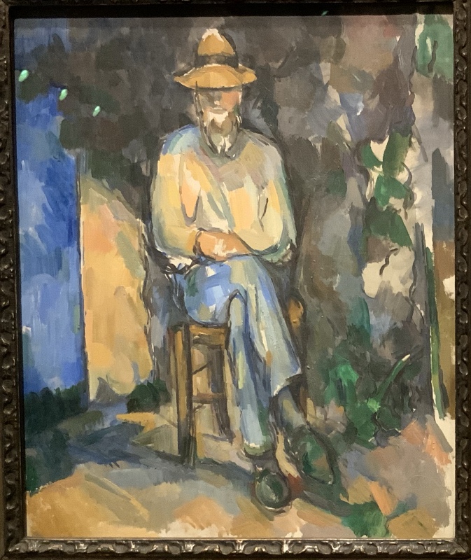
His marks may be perfect for the overall form he is developing - but often they are unconnected to any detail in the subject. Everything feels laborious - because that’s how he was. And he was a loner - passionately devoted to pleasing no one but himself. All of which made so many of his figurative pieces problematic. As Peter Schjeldahl once noted, his portraits are “lurchingly uneven” and may be “clunkers”. To me, most of the Bathers just feel silly. But there are a few remarkable exceptions. The portrait of his wife in a yellow chair is a highlight of the Art Institute’s permanent collection. The portraits of his gardeners display great admiration for their quiet masculinity - and his solitary male bather erupts from the wall, later inspiring the young Pablo Picasso to paint the same figure walking a horse. It was female nudes that gave him the most trouble. He knew that great European artists are supposed to paint them, but out of either shame or lack of desire, he apparently did not know how he really felt about female flesh.

His still lifes reveal a passion for color, pictorial space, and other elements of graphic design. But what he really loved was sunlight on the hills, trees, and mountains of his native southern France. He also loved the villages - though only from an aerial view. Apparently he was not so fond of walking streets where he might have to greet someone.

As research has shown, even the “how to paint” guidebooks of his day “ laid bare the components of color and brushwork” Meanwhile “the conventions of European painting” were continuously being overturned in 19th century Paris - and before that as well. What really set Cezanne apart was a stubborn self possession that made him as marginal to the artworld of his day, as it makes him crucial to so many artists of our time. Contemporary artists need pledge no allegiance to church or state. Cezanne was the great pioneer of a self expression that’s worth looking at. He could be called an “outsider artist”, except that he trained in an academy and haunted the Louvre. Possibly that’s why his eccentricity endures.


***********************************************************************************


I wonder what this landscape would have looked like to us without colonization? Would we care about Cezanne or his work? Better yet, would there even be a "Cezanne" without colonization? Would it matter that he broke up the picture plane? Would the idea of a picture plane even be an issue? How would we register the light between the branches? Could he have surveyed the land, creating a disintegrating picture plane, if he was unaware of the disintegration happening on his and his countrymen's behalf in the likes of Algeria, the Congo, Vietnam, and the rest of France's colonies? I don't know if Cezanne had put two and two together. But how do you just see the formal properties of a painting or the scholarship or the invention his work evokes without foregrounding that history? -ARTIST RODNEY MCMILLIAN


It’s good to challenge the primacy of the "disintegrating picture plane" in contemporary discussions of Cezanne, but the bold privileging of politics over aesthetics suggests that the "we" invoked here is the politicized academic community to which the writer belongs.    But has any other academic ever linked the disintegration of the picture plane to the destructive effects of colonization? Has even Mcmillian himself ever published a paper about it ? 
 
 Was French imperialism somehow less destructive back when it was colonizing North America in the centuries before Cezanne?  Has any civilization, going back to Old Kingdom Egypt not disintegrated the many social systems whose people they eventually incorporated?   This is the problem with foregrounding history over aesthetic:   it impedes the direct experience of an historical object with a discourse that is always debatable and in this case just provocative nonsense.


Cezanne : The Gardener Vallier, c. 1906


Of all my experiences of Cezanne's works, the most haunting have been his portraits of the gardener Vallier. Of course, the Mont Sainte- Victoire paintings and watercolors have occupied my mind for years. But the epiphany came with the gardener's portralts. This is a simple man, maybe the closest to Cezanne. He is sitting on a small wail, or on a chair. He has a thin face, penetrating eyes, sunk in a meditation, probably in a lifetime of meditations. And the nobility it entails. The gardener Vallier's portrait is Cezanne's ultimate "mountain,* his Ecce homo, his real testament. The gardener is sitting cross-legged, looking from his bench at the master's studio, lost in his thoughts, And Cezanne, watching him, is overwhelmed . No philosopher's portrait has ever reached the evocative power of this one…..Etel Adnan (1925-2021)

I’d never heard of this poet-philosopher-painter —- and really enjoyed discovering her abstract paintings. They are so uplifting.  It’s no surprise Cezanne was comfortable with his gardener - he was a servant - he did the master’s bidding - presumably effectively and without complaint.


 Cezanne : Sea at L’Estaque behind trees, 1878-79 (from the Museo Picasso)


  Lessons I find for the future painter No part of your picture is autonomous, or even a solid fact. Every plant and house you paint has a mirrorlike surface, a refracted symmetry, míni-tricornered and ovalish framed paintings hinged together Two trees obstruct, contain, and surround both the water and the sky. X marks imply the start of an open weave, an aborted grid. It is without regularity that the lines carve the sea, but each sideways cat's-eye, triangle, and brushstroke has a twin or cousin of varying size. Mirroring the left and right or top and bottom like an unfolded piece of origami, these flattened shapes remember space......Laura Owens

I really like this painting  - it's unfailingly energetic and  inventive - like some kind of puzzle.


 I also like  Owens as both painter and writer about painting.   Too bad that none of her writings appear on her website.


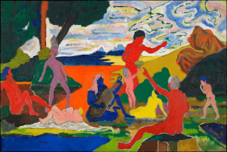
 Cezanne : Bathers , 1899-1904


Cezanne's bathers seem at ease with themselves They look pleased by simply being, enlivened by their surroundings and by each other, enjoying themselves without guilt, aggression, or fear. What I like most about looking at his bathers ... is how they remind me of what it feels like to be renewed. Perhaps this feeling also reflects the notion that water represents a source of life, an instrument of cleansing, and a means of regeneration in virtually all cultures, is this why I so strongly correlate the bathers motif with the notion of renewal?
……Paul Chan

An interesting response - quite different from my own.


Cezanne, Three Skulls, 1902-6


Each absent place an eye should be
drinks-in
the spectrum of its circumstance:
thin'd red with blue
marks one
against a yellow'd pool
the other five make what they will
from annotated variants:
sparks or faded notes of green
gray'd-blues
indigos with cobalt-bits
water'd sepias
blotched-pinks from red
ochre'd mauves and violets.
Each absent nose inhales
an ever-shaded-palette-scent.
Each brush-marked gap
proposes "inside-ness"
invokes a dome we cannot see:
where thought and recollection
once prevailed.-JULIA FISH


Love that first phrase about the empty eye sockets - though neither this piece nor Fish’s paintings especially appeal to me.  Life and death are indeed a cycle.  The one does not exist without the other. But still I am exclusively interested in life. It’s so much more exciting.


Cezanne, Scipio, 1866-68


Cezanne's blacks, applied in thick layers and often with a palette knife, contain vectors that chart a topography both submarine and mineral. When we peer into the black strata of Cezanne's paintings we are aware of the exchange contained within the etch: the blood that still oozes from the wound that is not yet keloidal  and the burial  of the keloid into the mineral ground of Mont Sainte-Victoire. An etched immensity both corporeal and geologic that introduced buried time into Western pointing. This is the pictorial technique Cezanne would further develop as a catalyst for abstract painting of the 20th century the liquid plain of painting hinged to a corporeal past that is not past. -ELLEN GALLAGHER

A dark and sad piece - but appropriate, one presumes, for the subject matter:  a former slave showing  off the whip marks on his back.

"introducing buried time to Western painting" is presumably intended as a provocative overstatement.


Cezanne : Madame Cezanne , 1888-90


This painting does not conform to the brick-by- brick pattem of colored planes generally agreed to reflect Cezanne's method but is rich with many of the formal Idiosyncraties we take for granted as being his today. Sections of the picture alterate between flatness and volume. Edges and contours are established, then disappear. Foreground objects and the background alternately overlap and merge.  Continuous forms are misaligned from one side of a shape to the other. These are among the peculiar, yet deliberate, inconsistencies that give Cezonne's painting its vitality and contribute to an inexhaustible  sense of fascination.
_-KERRY JAMES MARSHALL


Hannah Edgar (linked below) calls this a "geek out about the use of perspective" -- - and it does entirely avoid both subject matter and aesthetic impact in favor of. "peculiar yet deliberate inconsistencies".

Is that what gives his work vitality - or just it’s connection to the personality who made it ?
 
*******
*******
*******


Hannah Edgar of The Chicago Tribune reviewed the show here.

The first thing that struck her was the curator’s  decision to drop the aigu accent from the artist’s name (in deference to his origins in the south of France).  She also tells us that the exhibit is rather disorganized- much like the bramble depicted in "Undergrowth", the painting shown at the top of this post. She’ s a fine writer, but not very sensitive to visual art.  Her real specialty is music.  I’m so glad the Trib finally took got rid of John Kass - but otherwise, after so many corporate takeovers, the paper appears to be on life support. 


Self portrait with pink background, 1875

Dmitry Samarov’s review in the Chicago Reader  is the best local art criticism I can remember ever reading. (but then it my memory is fading - and so little good ever gets written about art )-
 
Ignoring gallery signage and art theory,  his review is just his own, personal confrontation with the artist based on his lifetime of experience with painting.
 
 
 Like me, he’s appalled by Cezanne's female nudes - and that is rather provocative - especially since this exhibition presents the "Bathers" as the pinnacle of Cezanne’s career.  I cannot imagine any major art magazine publishing such a dissenting opinion.

Unlike  me, his favorite portrait/figure is the self portrait with pink background.  He likes that it boldly presents an unlikable character. I dislike that it gives me indigestion.


Cezanne :  Paris Rooftoops, 1882

He’s also partial to this piece because he’s painted similar views himself.   I remember seeing one in a show at Dominican University


Dmitry Samarov


And  Dmitry's piece is just as good.


It’s a vision that centers subjectivity, motion, and change, rather than stability, hierarchy, or order. Probably no coincidence that he worked out his methods at the same time when Nietzsche was killing God. Nobody who believes in a benevolent creator fashioning and guiding the universe could see their surroundings in the slippery and undependable way Cézanne saw his 


Roualt, Head of Christ,1937


Roualt might be a counter example,  though actually, Cezanne himself could be a counter example since he was known as a devout Catholic.

Not all the faithful see "stability, hierarchy, and order" in the divine.

Thursday, June 9, 2022

Robert Colescott : Art and Race Matters


 School Days , 1988

Robert Colescott (1925-2009) is controversial in the artworld of racial identity probably because he doesn’t really belong there. As he states in an online 1982 interview, his work is "largely about myself and my responses". He was not speaking for the black people of America, as Kerry James Marshall does. He was speaking for his own unique self - which is kinda black, and kinda not. His educated, musician parents passed as white, and he did as well up to the age of 45.

The Chicago exhibit omitted his most outrageous and famous, blackface variation on famous paintings. We’re shown a sketch of  “George Washington Carver Crossing the Delaware” - but not the finished painting where Washington’s row boat was filled with demeaning racial stereotypes from the Jim Crow era. Possibly he wanted Americans to be ashamed of their racist legacy.  But just as possibly, this highly educated white-art-world master and university professor was ashamed of the ignorance and clownishness attributed to blacks. He did not offer a positive, Afro-centric identity as  did Lawrence, White, Bearden, Motley, and Marshall. His work is satirical of human antics - like Thomas Rowlandson did in the 18th Century - without the cutting racial bitterness of Kara Walker.

As this career retrospective demonstrates, he was an interesting painter even before he began working with racial and gender stereotypes. He had a way of making an ordinary still life or landscape feel fraught with impermanence. A few of his later pieces seem nothing more than jokes or gags - but the six seven foot figure paintings at the center of the exhibition are as thrilling as a wall in the Scuola di San Rocco. Their monumental turbulence demands attention, though the content might be considered more than a little sexist - even if too goofy to be sexually appealing. He likes big fleshy female nudes. One piece depicts the artist himself being distracted by a woman undressing. 

The masterpiece in this show is “School Days”. It’s a maelstrom of interacting figures with energy erupting from every corner. The corrupted scale of justice is at the center, balancing cash money against the black man being weighed. But we also note that he has depicted white kids studying  hard and graduating while black kids point guns and sell their bodies. So who’s really to blame for the disparity of outcomes? It’s strong colors and boldness reminds me of Jim Dine’s recent work,  where recognizable figuration may just have been an excuse for virtuosic abstract expression.

In Chicago, his contemporaries were the Monster Roster, including Leon Golub and Seymour Rosofsky.   This is the generation that came of age in the Great Depression and then were sent off to war. Personal pain and confusion seemed to underlie the subject matter of these white Chicago artists. Colescott’ s work is no less personal - but rather than share the pain, he preferred  to joke about it.  He laughed at racism just as he laughed at sexism. One wonders whether he took anything, other than the effect of paint on canvas,  all that seriously.


******************************

******************************


“Robert Colescott (1925-2009) has never been more relevant than now……his perspectives on race, life, social mores, historical heritage, and cultural hybridity forthrightly confront the state of global cultural today” Despite its unparalleled pedigree, however, Colescott’s work continues to be mired in controversy because of his blunt and crude gestural painting style and his transgressive examinations of race and gender. Colescott is particularly skillful at shocking us by dealing with the issues that we usually shy away from, or only speak of in secret, and then delivering what has been described as a “one-two punch” that forces us to grapple with the artistic, political, social, and historical meanings of his images.


Additional Gallery signage will modify that assertion by telling us "Colescott's approach to gender, race, and beauty is specific to his generation".  But still - Colescott has been recruited to participate in the politics of today.  Perhaps  that’s the only way he could be could have been considered acceptable for the institutions mounting this exhibit.
 
 
“I had to come to terms with it for myself, ultimately controlling the images by making them say some things for me. First I made these paintings and drawings as messages from myself to myself, getting in touch with my own fears, frustration, anger…I have no doctrine. I want to talk about the foolishness of it all. I want to encourage people to relate [to] rather than to punish one another.” (Text from The First Hundred Years)


"The specter of the figure in a red sweater in the left of the composition who points a gun at the viewer is a powerful evocation of events that have shaken American society too often over the past few years.  Perhaps the alienation that is seen as a cause of school shootings is indicated by the fact that the relationship between the figures is random. Each one of the individual figures seems to be an independent entity absorbed in their individual stories.  Scale and perspective are immaterial as we see the large reclining figure with a gun shot wound in his chest to the right The male student nonchalantly points his gun directly outwards towards the spectator to the right the anomalous bicolored female who dominates the space just off center." 


The above text,  accompanying  "School  Days" on the wall, appears to be a deliberate misreading as it focuses on the current issue of gun violence in schools  while ignoring  the contrasting behavior of the white and the black kids being depicted. 


The above is far more provocative than anything included in this show. If a white artist had made it, it would be outrageous.

By the way - it was included in some of the other iterations of this traveling exhibition.  Possibly those who hung the Chicago show thought that our city was not ready for it.


Instead we’re shown the more gentle humor of this riff on Roy Lichtenstein - the least offensive painting in the "Old Masters in Blackface" series.


Tin Gal, 1976

A cartoonish piece that make me think of Chicago’s Hairy Who? shows  from the previous decade.


White Bowl (Distance Traversed), 1962
A fine, unsettling still life from an earlier decade.


An impressive wall of seven foot paintings from the eighties - all featuring nude, full bodied women.  As with his five wives, not all of the female bodies he paints are white - but most of them are.  As with his younger contemporary, Bob Thompson, inter-racial sexual desire was frequently on display.


From a Fragment  by Sargent, 1962
 
 
Colescott has strange-i-fied Sargent's family portrait.
 

Untitled , 1963


Legend Dimly Told, 1961


View of Columbia Gorge, 1960


Olympia, 1959  (after Manet)


Wreckage of the Medusa, 1978

A tragi-comic world.
 
Who could care whether it's sinking.


Flowers, 1958


1949


Dr. Ehrlich’s  Magic Bullet, 1968
Another one of my favorites - even without knowing that Ehrlich discovered a cure for syphilis. 


We Await Thee, 1964


Knowledge of the past is the key to the Future - Upside down Jesus and the Politics of Survival, 1987 

Makes no sense to me visually or conceptually - and gallery signage says nothing


Alas, Jandava, 1998
This is a smaller piece - is it even four feet long?
It also makes no kind of sense - perhaps it’s too personal.


Arabs, the Emir of Iswid. (How wide the gulf), 1992


Beauty is only Skin Deep, 1991
 
"Virtuosity in figuration and compositional organization"? 
 I really can’t agree with the signage that accompanied this painting. 
 It feels like the dizzy chaos of a  fever dream.


Sleeping Beauty?, 2002

Early 2000’s, when the artist had Parkinson’s


An American rescued in the Desert by the Mahdi.and Emperor Haile Selassi, 1986


Choctaw Nickel, 1994


Friday, May 6, 2022

Melanie Pankau at Thomas McCormick


Melanie Pankau : Two Solitudes, 2022


Geoform painting often emphasizes the elements of graphic design. Cleverness appears to be the issue -- as triggered by a dramatic, or even delicate, balance of color, tone, size, or space. Consider the “Homage to the square” series by Josef Albers (1888-1976). The visual elements are so simple and so few - yet their precise arrangement of tonal values and sizes remains intriguing.

Locally, geoform painting has often been more about the intensity of personal expression - beginning with Rudolph Weisenborn (1881-1974) and continuing today with William Conger , Nicholas Sistler , Stanley Edwards , and Anna Kunz. They can express everything from humor to horror, aggression to passivity.

Recently, an exhibition of the German-British painter, Tomma Abts (b. 1967) , traveled to the Art Institute. It was a kaleidescopic playground of visual effects. The current exhibition of Melanie Pankau (b. 1977) is similar in its cold precision -- but it’s also fundamentally different. It’s the eruption of an inner spirit rather than an acrobatic entertainment for the roving eye.

Melanie Pankau is a meditative seeker and her paintings are what she has discovered: the emerging life energy in herself. There is a constant gentle flow, emanating from the center. Nothing is jarringly off kilter - yet the inner movement still feels unique. They are kind of symmetrical - but not quite. Every line denotes the closest distance between two points. None are broken, blurred, or curved. A mathematical idea, rather than an emotion, is the generative principle behind this pictorial universe.

Many of these pieces are not very exciting - at least from a distance. Only up close can you attach to the subtle perfection. “Two Solitudes” is the exception. The warm colors and jagged rhythms can capture attention across a room. Then the closer you get, the more satisfying it becomes.

Pankau tells us that her intention for last year’s show was “ to provide a space that is calm and contemplative to counter the noise, negativity, and combativeness of our current cultural experience.” Isn’t that what a yoga studio does? And that’s where these pieces really belong - rather than an art gallery. Just as that Zurbaran crucifixion belongs in a church, not the Art Institute.

Note:  A quick Google of "Yoga studio art" pulls up a lot of figurative and geometric drek.  I certainly do not intend to associate Pankau’s fine paintings with any of that.

Thursday, April 28, 2022

Susanne Doremus at Zolla Lieberman


Would I have purchased a painting by Susanne Doremus back when she had her first solo exhibition in 1980? I’m not sure. That’s what Dennis Adrian did when he discovered her work in a back room at Artemisia Gallery.  Chicago’s leading art critic was probably responding to the very same sweeping spaciousness and high voltage marks  that are evident in her work forty years later. The airy space suggests a gentle, light hearted, well ordered life - evident much more in the actual work than in internet images. The circularity of the overall sweep suggests a recurring routine, like the seven days of a week or the twelve months of a year. The marks, however, often evoke persistent attacks of anxiety and even despair. And the artist appears to have been obsessed: working the piece until all possible ways to pull it all together have been exhausted. 

She’s definitely not among the Chicago Imagists whom Adrian was then making synonymous with art in Chicago. There isn’t the slightest hint of irony, adolescent rebellion or popular culture.  But there is the same self-centeredness.   She's not imagining places you'd like to go -- she's showing you where she's been.  When objects are identifiable, they might resemble a model she had seen posing at the art school where she taught or the housecat who slept on her window sill. 


Willem de Kooning, untitled, 1948/49, Art Institute of Chicago


She’s in the tradition of post-war Abstract Expression, as exemplified by the early De Kooning paintings at the Art Institute or Milton Resnick, with whom she had studied at the University of Wisconsin. But there’s nothing especially heroic about her work. Rather than drawing from personal life to make overwhelming expressions of power and despair, she uses the ABX lexicon to share the daily flow of a personal life that feels comfortable and ordinary, even if with persistent anxiety. Rather than human destiny being at stake, it’s more like whether she’ll be late for dinner if she gets stuck in traffic when picking up the kids. The virtue here is less the power of rhetoric - and more the truth of authenticity. These paintings feel like the daily journal of someone you might know. Or as Holland Cotter put it in 1995: her work is "like a tough semester's lecture notes from life".

Looking back to her early work, as found online, the swirly spaciousness has not changed. But the mark making has become so much more calligraphic. She can’t do all the things that can be accomplished by an ink loaded brush in the hands of an Asian master, but she can certainly make her lines dance, from the slow and sensual to the anxious and frenetic. And she takes bigger risks by sometimes introducing large, bold, and very awkward shapes - possibly executed with eyes closed.

In this, her 10th solo or duo exhibition at Zolla Lieberman since 1981, the work seems driven more by aesthetic effect than in work seen online from previous decades. Perhaps she is moving further away from feelings about her life, and closer to how paint feels as it touches the canvas. But we really need a career retrospective to make that kind of determination. Wouldn’t the Chicago Cultural Center be the perfect place for that to happen? With no sense of gender, ethnic , or racial identity other than straight, middle class, white suburban American female, she is further than ever from what’s trending in the art world. So perhaps that retrospective won’t be happening anytime soon.


******


In an adjoining room, the gallery presented a collection of local artists as chosen by Doremus herself. Many have been associated with the School of the Art Institute where she once chaired the Painting Department.  Mostly they make her work feel even more enjoyable by comparison.  Except for Jackie Kazarian ( shown above)

Wow!

Such a small painting to present so much fear and deliverance. 
We need to see more of her.
As Dennis Adrian discovered over forty years ago,
sometimes the real gems can be found in the back room.
 

*****

The paintings of Susanne Doremus are so distant from social/political commentary, I’m surprised that New City reviewed her show.  Over the past three decades, they never have.

But now they have published a review by Hadia Shaikh, an assistant director at the Block Museum.  And not surprisingly, the primary theme is that very distance.

She writes that:

Her work bears significant relation to the works of Julie Mehretru and Cy Twombly: multilayered, gestural, unbalanced and erratic.


Julie Mehretu, Conjured Parts (eye), Ferguson, 2016, 84"x96"

As Slate.com has noted, Mehretu "has created a new language for political art" - so I’m not sure she has that much in common with Doremus - at least regarding intentions.

Cy Twombly, untitled, 1964/1984


But the connection to Twombly is tighter than to the de Kooning piece I posted in my review.
The de Kooning  is about to explode  - the Twombly, like a Doremus painting, already has.


Wednesday, March 16, 2022

Joseph Lindon Smith at the Oriental Institute


Contemporary classical realist painters trace their lineage back to the Boston school of the early twentieth century. They combined the tight formal drawing of the French Academy with the looser brushwork and bolder colors of Impressionism. Leaders included Edmund Tarbell, William Paxton, Joseph Decamp, and Frank Benson. Benson (1862-1951) is the one best known in Chicago. Two of his paintings now hang in the Art Institute; one more is the highlight of the Vanderpoel Museum in Beverly.

Joseph Lindon Smith (1863-1950) was Benson’s friend and classmate both in Boston and Paris. Today he may best be known as the subject for a great portrait by Benson - but back in the day, he dominated his chosen subject matter: the representation of antiquities. And so it was that in 1935, the seventy two year old artist was invited by James Henry Breasted, the founder of the Oriental Institute at the University of Chicago, to accompany an archeological expedition to Persepolis.

Skilled draftsmen are often needed in such projects to document shapes too faint to be identifiable by photograph. But Smith’s large paintings appear to have served a more aesthetic purpose. As gallery signage confirms, “He conformed solely to his own distinctive style”. Excavation may be drudgery, but once uncovered, the monuments of past empires can be appreciated as the glorious foundation of contemporary civilization. Or, at least, that’s how those at the top, like the “Boston Brahmins”, might like to have seen it. Isabella Stewart Gardner, founder of her eponymous art museum in Boston, was one of Smith’s patrons. 


Of Smith’s six Persepolis pieces, three are landscape views of the entire site with whatever architectural elements still remained. Depictions of ancient ruins often appeared in the annual Salons of the French Royal Academy. Populated with tourists or travelers, they invoke a romantic sentiment of transitory glory. But Smith presents the broken walls and surviving columns just as an Impressionist might paint the cliffs and saguaro cactus of the Sonoran desert. He’s mostly concerned with light and space. These are pleasant views, though more like prose than poetry. 
 
Smith’s three depictions of the 4th century BC sculptural reliefs are also pleasant. His contour lines feel as chiseled as limestone. The spaces within them have been rendered with chromatic blended areas of thin paint, much like a watercolor. Missing or damaged details have been repaired. The results would fit the decor of an elegant, modern living space. But that is far from the powerful, almost unnerving effect of the original stone carvings, one of which, happily, has recently arrived in Chicago after an eighty year loan to the Museum of Fine Arts, Boston. 


If you walk around to the other end of the museum, you will find it. One of the most vibrant pieces of ancient sculpture in this or any museum. It is not the same piece that Smith painted, but it is indeed, very, very close. Evidently, this repetitive motif of mortal combat between bull and lion was designed to convince subservient rulers of the majesty, and potential violence, of the Persian king of kings. Probably Smith’s patrons wanted something more genteel. Their old school wealth was threatened by the explosive growth of American capitalism just as their tame academic art was being overwhelmed by brash Modernists like Picasso. Both the refinement of Smith and the ferocity of the ancient sculpture have become anachronisms in the art world a hundred years later. But both still can be appreciated.


Monday, March 7, 2022

Bob Thompson - at the Smart Museum


The Koffler collection of Chicago art introduced me to Bob Thompson (1937-1966) almost ten years ago. It had just been donated to the Depaul Art Museum which immediately put some selected pieces on display. Thompson never lived anywhere nearby , so why was he included among all the distinguished Chicago artists? Perhaps the Kofflers wished he really had worked here - and so do I. He did for Old Master European painting what jazz was doing for American musical theater: transforming a strong narrative tradition into a platform for personal virtuosity and self expression. What a surprise in the context of postwar American art! And what a challenge to carry it off with elegance and style - while still preserving just enough of the narrative to keep it comprehensible and compelling.

The Thompson story is both magic and tragic. His career began at the University of Louisville where Charles Crodel, a German expressionist painter and designer of stained glass windows, was a visiting professor. He was probably responsible for linkingThompson to the European tradition as well as the simplified figurative style he would adopt. Soon after graduation, Thompson was having solo shows in New York City, hanging out with the poet, LeRoi Jones (Amiri Baraka) , and hearing, if not jamming with, some of the most progressive jazz artists of the day. (Thompson played drums). The exhibit includes a portrait of the Jones family, as well as “The Garden of Music”, a wall size landscape with cameo portraits of his musical friends or heroes: John Coltrane, Ornette Coleman, Don Cherry, Sonny Rollins and Charlie Haden among others. His paintings were selling, he was making hundreds of them, and he was moving through Europe, visiting art museums and riffing on what he had seen. Then suddenly it all stopped. He was dead at the age of 28.

The portraits mentioned above are interesting mostly for their subject matter. Thompson’s figure drawing was more about pictorial space than figurative expression. The personal nature of the portraits interrupted his sense of space, so the pieces are left feeling awkward and clumsy. Gallery signage suggests that the portrait of the Jones family is unfinished. Occasionally, that clumsiness is felt elsewhere in the show. Thompson may have thought of his paintings as improvisations. Some are hits - some are misses - it doesn’t matter - just move on to the next song on the playlist.


His figures are silhouettes filled in with solid color, much like Matisse. Their contour lines usually lack that early Modernist’s athletic energy and inner life - but the deep surrounding space is so much more ebullient and disruptive. There’s the joy of astonishing disharmony - much like the music of Thelonious Monk. But is there any narrative content worth noting? Gallery signage tells that ”he distorts those received forms in ways that both compound their ambiguity and reveal their relevance to contemporary concerns in the United States from civil rights to freedom of expression to sexual liberation”. But that sounds way too political for the light hearted playfulness that is so upfront. If you ask “what is going on here?” , you will invoke the thrill of absurdity rather than the recognition of some profound theme. In the paintings that riff on Goya’s “Caprichos”, contempt and scorn is replaced by goofiness. The oversized birds and looming, silly monsters recall the world of children’s puppet theater - though the recurring demarcation of the pubic area, suggest work made by, rather than for, children. There is little especially profound here other than the buoyancy of the artist’s spirit. That’s the most important quality that Thomson’s work shares with the Old masters that he drew from. It might also be seen as an outsider's view of  the Euro-Centric imagination - but it remains Euro-Centric, and patriarchal, none the less.


*****************


Homage to Nina Simone


A magnificent, psychedelic mess, the swirling visual incongruities here keep the viewer continually off balance.

Nina Simone is the naked, pelvic-thrusting  lady standing to the left.  She is colored purple, not black, so  we know that racial politics are not an issue.  This is not Kerry James Marshall.


Black Monster


In an online video about this painting, Nicole Bond, Smart Museum Lead Educator, points out that scholars have expressed "opinions which equate the large pointed toothed beast to one of the most feared yet envied human attributes:  black male sexuality"  And it certainly appears that this amorous monster is hunting white girls, not black ones.


Here's another image of a dark creature hunting a naked white girl - this one  being used to promote one of his exhibitions.

It's not a theme that dominates Thompson's work - but he does occasionally visit  American attitudes towards inter-racial sex.  Like LeRoi Jones, Thompson married a white woman.


************

Dmitry Samarov has also reviewed the show  in the Chicago Reader.

 His piece is more of an ecomium - but as an effective figurative painter himself, everything he says about the figure painting of others is interesting. 

 Diane Thodos has some interesting things to say about the blank faces, paradise, and the expressionist painter, Jan Muller.

Wednesday, December 15, 2021

David Antonio Cruz at Monique Meloche

 Can You Stay With Me Tonight


Something momentous happened to humanity a year after David Antonio Cruz’s first Chicago show in 2019. Back then, as gallery verbiage put it : “Cruz’s deeply empathetic gaze enlightens the viewer to those overlooked but urgently salient experiences” of “his black and brown subjects” who have been the “victims” of “extreme injustice”. It’s a message still trending throughout the art world.

It’s not that we no longer need to be enlightened about injustice, but Covid 19 made personal  isolation a primary issue for just about everyone regardless of race, gender, class, or ethnic identity - and Cruz (b. 1974) confronts that universal loneliness with an edgy anxiety and shimmering beauty as old school as the sixth century mosaics at Ravenna. All of his figures are dressed just as smartly. The jazzy, colorful patterns on their shirts are sharp or blurry just where they need to be. If Cruz owned a boutique, I would shop there. But just like the bejeweled Byzantine royal family, not one of the faces is smiling. All of their somber eyes stare right back at the viewer -- as if they were scrutinizing you, rather than the other way around. None of the men depicted are young or especially attractive, but all of them feel quite real and present. This is not the queer world of awkward arousal and confusion. It’s more like David Hockney’s precise world of loneliness, desire, and self interest. As the title of the exhibition puts it: “I cut from the middle to get a better slice”


The spherical space helmets worn by some of the figures in his last show are now gone. No one feels that alienated any more. Some of the figures do, however, wear a kind of blue-green vinyl glove - as if they were still leery of skin-to-skin contact. More importantly, the backgrounds are now tinted - while the old monochrome backgrounds have migrated over to their own panels. They present a ghostly alternative reality, haunted by spectral faces and writhing limbs. A bright, bold and colorful world for the living - a dark, retreating, colorless world for the dead.


Cruz has developed his own, uplifting style of figure painting. Pictorial space is flat. The figures don’t just sit on the surface, they appear to emanate from the wall. Contours are strongly emphasized with contrasting tones that may defy reality. Between the curvaceous edges, the areas of pattern or solid color glow, as if lit from behind rather than from ambient light. It’s similar to the translucent sheets of glass locked within the sinuous lines of lead in the great cathedral windows of the Middle Ages. In both, the effect is transcendent. Every area of body, clothing, furniture, or background seems to erupt off the surface , demanding attention. The viewer must respond. Spirit has entered the room.


The masterpiece here is “Can you stay with me tonight ?” (the full text reads: “canyoustaywithmetonight_causeyouarehere,youarehere,andweareherewithyou”), It’s a monumental 6X8 diptych showing nine men ensconced on a giant sofa, much like hors d'oeuvres on a serving tray: so fresh,  so yearning, so sincere. None of them interacting or touching - all looking out at the viewer and asking "Will you pick me?". All of them are well dressed and the ambiance is tropically festive with an “aspirational aesthetic of luxury and fashion”, not unlike the 18th Century aristocrats painted by Hyacinthe Rigaud.  You want them all to find the love they need - just as you want the saints in a religious diptych to intercede with the divine. Sustaining a community of faith has not been the intention of mainstream Western painting since the Baroque. David Antonio Cruz has just revived it.

*********************


onedayi’llturnthecornerandi’llbereadyforit, 2019 

(shown in 2019)


Theodora mosaic, San Vitale, Ravenna,  A.D. 547


Hyacinths Rigaud, Gaspard de Gueidan, 1738

 BTW - Gaspard was not born to the high aristocracy, but through marriage, investment, and strategy he almost achieved it.