Three museums seen on a Saturday afternoon in October
**************************
DePaul Museum
A Natural Turn: María Berrío, Joiri Minaya, Rosana Paulino, and Kelly Sinnapah Mary
Within A Natural Turn, Berrío, Minaya, Paulino, and Sinnapah question Western and Eurocentric standards of beauty, femininity, and womanhood by reimagining the surreal—creating imaginary journeys around the metamorphoses of the body and redefining what it means to be human. For these artists, surreal imagery is useful in that it can at once call attention to the conflicted legacies of imperialism and colonialism, challenge the status quo, and subvert one’s experience of reality. Surrealism within this exhibition is a means to interrogate structures of power. (Gallery signage)
The above boilerplate of social justice art theory conveniently ignores the "structure of power" that produced this exhibition itself : a major local university with a 36 acre campus in an upscale Chicago neighborhood and a billion dollar endowment. Whatever status quos may be getting challenged here, the authority of educational institutions and their social political agendas are not among them.
Not that I need artists to express angst, alienation, or despair —- far from it —- but the self righteousness of the educated elite is no more uplifting - primarily because it’s boring. No spiritual struggle is evident here. It relies on the cleverness and political correctness of ideas to establish value. The pieces in this exhibit are pleasant and well made, but they have no more formal power than childrens’ book illustrations. As Kerry Marshall has demonstrated, identity art doesn’t need to be this way.
But still - I do have a favorite; Kelly Sinnapah Mary. As she tells her story in gallery text, she was born on Guadeloupe and did not know, until adulthood, that her ancestors came from India rather than Africa. So now she’s producing delightful small figurines with black skin and three eyes. (In Hindu spirituality, the third eye chakra plays a major role)
Like the other small figures on the table,
these look like pastries but were made with mortar and paper..
They feel crude -- but also quite alive.
(the poor fellow with blue suspenders has been sliced down the middle,
but that's OK, he's only a piece of cake)
The artist seems to be having fun with all this stuff.
Possibly she accepts that the confusion of her ethnic identity
is one of the many jokes that universe plays on all of us.
**************************************
WRIGHTWOOD 659
The First Homosexuals: Global Depictions of a New Identity, 1869-1930
This is an exhibition about the very first artists whose work fell under the contested category of "homosexual." In 1869, the Hungarian writer and activist Karl Maria Kertbeny coined the term homosexual. Before then, same-sex sexuality referred to the act performed rather than to a distinct class of persons--in other words, it was a verb, not a noun. "Homosexual" was widely adopted, first in Europe, then the US, and finally around the world, in part because it reinforced increasing legal and medical attempts to isolate, define, pathologize and police same-sex sexuality. But the attempt to delimit and contain a segment of the population had unintended and deeply paradoxical consequences for the fine arts. As language increasingly compartmentalized sexuality into either heterosexual or homosexual--the first celebrated and acceptable, the second confined to a shadowy realm and unacceptable--art unleashed a torrent of new representations of same-sex desire that could hardly be contained. An unprecedented kaleidoscope of new sexual
identities rejected the homo/hetero binary even as it was being forged. In fact, there is an inverse relationship between the acceptance of this increasingly rigid binary definition of sexuality and the proliferation of new identities and erotic possibilities in art. This exhibition of the earliest works of "homosexual" art is arguably much queerer than some contemporary "gay and lesbian" art because of its refusal of gender norms, as well as a refusal to perceive either homosexuality or heterosexuality as mutually exclusive or as an inherently permanent category. While homosexual has come to be defined as signifying a mostly male world, this exhibition shows how central female same-sex sexuality was at its origins, as was gender queerness and other identity categories we assume to be products of our contemporary world. (Gallery signage)

Donatello, "David", 1435-1440
Regretfully this great statue did not travel to Chicago for this exhibit - but I’m posting it here to remind us all that eroticism in male figures flourished in European art long before 1869. What a fine young dude! - nude except for sandals and a foppish hat.
The lad has a sensuous boyish figure - but as sculpture this piece is far from effete. It thrusts itself into the surrounding spatial envelope - it doesn’t shrink from it.
Robert Tait McKenzie, "The Athlete", 1903
Here is an allegedly homoerotic piece selected for this show. I do read it as effete (as well as wooden and awkward) - but maybe not intentionally so. McKenzie was not trained as a sculptor so he would never have closely studied ancient and Renaissance examples. He was a physician with an enthusiasm for physical fitness - not great sculpture. He is sometimes listed as an LGBTQ artist, but there is zero evidence of any sexuality outside his marriage (to a woman). This is just another example of making a fiction true by repeating it often enough. (a familiar tactic in political agit-prop)
But we’re also shown a few fine examples of late 19th Century Shunga. Japanese artists rule the world of explicit erotic art- and they have done so for centuries.
I’d never seen Lesbian Shunga before - but going online, there’s plenty to be found.
The idea here seems to be that sexual energy - of any kind - is to be enjoyed, not repressed.
And, of course, this attitude in Japan predated 1869.
Charles Demuth, Eight O’Clock (Morning), 1917
Here’s a great watercolor depicting the complications of the artist’s personal life. We can only guess how these three young men spent the previous night together.
Duncan Grant, Bathers by the Pond, 1920-21
And here’s another artist sharing his personal \romantic life.
It’s a subject matter that’s rarely found, especially before the 20 th Century. (Perhaps Goya's Naked Maja would qualify as such)
Caravaggio, Boy with Basket of Fruit, 1593
…. and so might this portrait of the artist’s young protege and companion. It certainly seems to be presenting a boy-toy for delectation (along with other ripe fruit) - but the artist's personal life has barely been documented.
Owe Zerge, Model Act, 1919
This boy’s apparent modesty and vulnerability might arouse a certain kind of lust. And he’s off balance - ready to fall. But would the artist and his patrons agree ? There is zero biographical information about them on the internet. And the boy does appear beneath the legal age of consent - at least in our country. What was the law in Sweden back in those years? Gallery signage does not raise these issues. Should it? This is not the mythological Ganymede.
David Paynter, Afternoon, 1935
Gallery text tells us that one naked boy is presenting the other with a flower with an unusually long stamen. Paynter's father was British, his mother was Sinhalese. He is an important figure in the art history of Sri Lanka.
I'm not feeling any sexual energy here - but it does feel quite Japanese in its flatness and possible subject matter: handsome youth going on a picnic (only its cute boys instead of girls)
Jane Poupelet, 1906
Gallery text refers to this as "holistic eroticism" — i.e. the breasts and pubes cannot be seen - but still we have the sense of a young, vibrant body.
The same could be said, however, for Poupelet’s drawings and sculptures of farm animals.
She was among the early innovators of that Modern-Classical style whose best known exponent is Maillol.
Poupelet is listed here in my catalog of that style. It's sad that her career was cut short by illness.
Maillol, Young Cyclist, 1907-1909
Here's a Maillol male nude from about the same time.
(It’s not in this show)
Is it erotic?
Did the artist feel that way about it ?
It seems no less possible than most of the other pieces in this show.
Magnus Enkell, Man with Swan, 1918
As gallery notes suggest, this is a playful variation on Leda and the Swan. Browsing online, Enkell's erotic.nudes were exclusively male - and these butt cheeks feel hot and ready for action. Though still it's a far cry from Tom of Finland.
Thomas Eakins, Salutat, 1898
Karl Kertbeny may have coined the word "homosexual" in 1869 - as a less judgmental term than "sodomite’ - but that doesn’t mean that all practitioners must identify as such ever after - and since this was nearly a century before Gay Pride, all we can do is guess about the sexual feelings and identity of most of these artists.
It does seem that Eakins is drawing our attention to the boxer’s cute buttocks - and he does not appear to be a fearsome pugilist any more than a lithe folk dancer. What other point could this painting be making other than the contrast between bravado and vulnerability?
It's not very attractive, by the way, in person. The portraits in the background feel crude - the space feels uncomfortable - the color and lighting feel sickly. It's not surprising that it was unsold during the artist;s lifetime. I'm quite grateful, though, that the curators brought it to Chicago -- because I may never get around to visiting the Addison Museum in Andover.

The butt cheeks are cute - but so is the eager lad in this promotional photo for the same fellow.
*****
Overall, this exhibit was disappointing, if not depressing - though, I suppose, that's appropriate for the shame then attached to homosexuality. And Lesbian desire does seem to have been underrepresented. Perhaps the curators tried but failed to get them - but the sculptures of Harriet Frishmuth and the paintings of Tamara de Lempicka are glaring omissions.
A low aesthetic value and marginal connection to homosexuality runs throughout this exhibit. Most of this stuff really does not need to be seen in person for whatever history lesson you can take from it. A website would have been much more convenient.
*************************************
Art Institute of Chicago
Bridget Riley
Blue Landscape, 1959
Bridget Riley’s (b. 1931) Op Art made it big in the swinging London of the 1960’s - but after then… not so much. All four of her pieces in the A.I.C. permanent collection date no later than 1971.
But prior to that - in the decade after art school, her idol was Georges Seurat - and she made landscapes and portraits following his kind of simplification to produce some images with a startling sense of presence.
River at Molcey’s Mill, 1952-55
Man in Garden, 1952-55
Garden with White aloud, 1952
Riley never went back to figurative painting - but probably not for economic reasons. She seems to have been fascinated with the interface of mind and repetitive geo-form patterns. Manual fracture was not crucial for her — she gave that work to others - right from the very beginning. That’s the kind of work that mostly fills this exhibit.
1988
I find such work as bloodless and boring as an electrical circuit board - even if it has some important application of which I am unaware.
***************
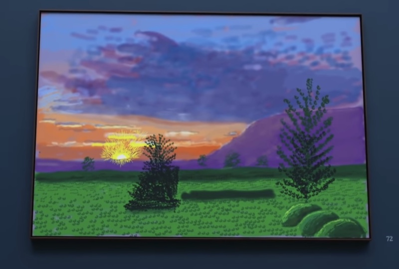
David Hockney
The Arrival of Spring, Normandy, 2020
When was the last time you saw an exhibit of contemporary landscapes at the Art Institute of Chicago?
(for me the answer is never - but then I am less than a hundred years old). This show might be quite thrilling for those who like landscape paintings even if they weren’t done in the 19th Century. But it’s not likely that they will ever see another. This is an exceptional case: a superstar artist is venturing into a new technology: the IPad and its dedicated graphics program, "Procreate’.
With 116 pieces executed over five months, that’s nearly one a day - quite a regimen. The graphic program lets the user cut, paste, and draw within a great number of independent layers. It’s an opportunity for endless experimentation. It also works with pure, direct frequencies of light rather than the surfaces that reflect them. That’s probably why Hockney was so enthusiastic about learning a new medium even at his advanced age: he loves pure color.
Hockney’s IPad designs have been blown up into printouts four to six feet wide and then crammed into two dark, narrow, hundred foot hallways. With all the high chroma color, the effect is a bit overwhelming - like the immersive Monet or Van Gogh projections so popular in Chicago. These pieces are more like posters than paintings - and possibly you remember the difference between Van Gogh's Sunflowers as seen in a museum wall and a large print of same that you may have hung on the wall of your college dormitory.
What we have here is pleasant graphic art on the theme of renewal -- the joy of being alive -- by an octogenarian master. Contemporary art usually considers life a joke or puzzle, if not a painful burden. Hockney is playful and virtuosic. Every tap of his stylus is connected to the lively energy of the pictorial space he is creating.
What we don’t have, however, is a sense of place - other than Hockney’s overheated imagination. Nor do we have that much formal power.


Like a trip to the gelato shop.
The theme as well as spontaneous execution reminds me of some Chinese masters of brush painting
Like this piece, for example.
BTW -it’s a still taken from a popular instructional video.
It’s anonymity and traditional technique is quite a contrast with this show.
Xu Wei (1521-1593)
This example displays the formal intensity that Hockney’s pieces are missing - but hey - he’s a really old, rich, and famous guy who could be basking on an exclusive beach somewhere instead of working so hard to make us all happy. And he has has accomplished what no other living artist has been able to do for a hundred years: put a show of landscapes into the Art Institute of Chicago.


.jpg)