Friday, May 19, 2017

Emily Rapport at Firecat Projects


"Damen Avenue Nocturne"


Not every Chicago neighborhood is wealthy and trendy, but quite a few are well kept and pleasant, even if the modest homes are so close that you can’t see one without seeing its neighbors.   They stay that way because owners care for them.  This show celebrates that older architecture and the middle income people who inhabit and maintain it.  You might call it a rebirth of Regionalism that combines a love of community with a love of paint and European pictorial space.  In equal proportions.


Centered on the exterior– the public side – of a building,  there is an emphasis on things as made not worn. Each scene is an upbeat arrangement of discrete elements:  architectural, arboreal, and painterly.   There are no dings or broken glass in the cars or houses – even if the city has marked an abandoned building with a “Red X” to caution firefighters.  A “Wilson Avenue teardown” has been so cheerfully painted in its funky decrepitude, it’s hard to imagine that a replacement could look any better.  It’s also hard to imagine that this 12-inch square painting could be any more delicious with its flamboyant manipulations of thick paint worked with both ends of the brush.   “Damen Avenue Nocturne” hangs beside it and is twenty times larger.   Surface details are not as tasty, but at a distance, you can appreciate how it’s been cleverly split by a telephone pole in the foreground, effectively creating two distinct,  complementary  views.  There is much to see on both sides as the artist, as always, gives equal focus to foreground, middleground, and background.   The curious eye is led down every passageway and into every nook and cranny. 


In four separate paintings, variations on the same house document its stages of repair.  The differing details in the adjacent buildings and background reveal how much the artist is inventing.  She may begin with reality as it appears, but soon the painting begins to drive itself,  establishing its own mood in response to the season and time of day. Given the basic structure of the buildings – everything else is invented:  the size of the windows, the surrounding foliage,  the color, etc.  Receding perspective lines are bent at will. The final effect is that the energy of each painting is deep inside.   What you see are the ripples left on the surface.


There’s a sense that making art is not far removed from repairing buildings.  Both artists and building trades have inspired her.  In apparent homage to Grant Wood’s “American Gothic”, Rapport offers the glowing white austerity of an “Urban Farmhouse”.  In apparent homage to Charles Burchfield,   the convoluted  branches of surrounding trees give an eccentric personality to a “Cottage House”.  In a salute to city workers,  “Streets and San: Building a New Chicago” shows a work crew digging beneath city streets after sunset.


There is, of course, much more to Chicago than its middle class neighborhoods.  There is a luxury condo building boom near the lake while many other neighborhoods suffer from crime, poverty, and neglect.  The city continues to stratify.  But the future of urban life, as well as the American art that enhances it, lies with the sustainability of its middle class.   Emily Rapport is making a worthy contribution to its psychic health.


*******************

 Cottage House


Summer's  End  .... and ... Ground Work


Urban Farm House


Wilson Avenue Tear  Down


Saturday, March 18, 2017

Classicisms at the Smart Museum


Must a tradition be defined by every adaptation made of it?  Must that definition account for things done in jest or hostility ?  Must it account for incompetent execution or things made only to be sold?  Must it account for things damaged by time or reproduction?   By  querying “the many ways in which classicism and even its opposite ideals come to be represented” , it is hardly surprising that a multiplicity  of “Classicisms” has been found for this exhibition.


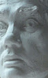
The three sculpture heads at the entrance give some idea of how artworks have been selected and presented. To the left is an undated plaster cast of a Roman portrait bust originally created in the second century.   Signage informs us that such casts were once considered “an idealized model of enduring dignity”.  Whatever quality the original marble may have had, this more recent reproduction has all the enduring dignity of a tombstone – fit to signify, but not exemplify, something of value.   In the center is an original Roman bust from North Africa cut from a limestone relief carved in the fifth Century.  The nose is gone, the lips are chipped and one eye is badly mangled.  Signage tells us that it “would never do” for display in European palaces and academies.  But even in its damaged condition,  it proclaims a  fresh and powerful spiritual idealism that feels early Christian.  To the right is a plaster cast of Rodin’s portrait of Pierre de Wiessant.  It’s been scaled down from his multi-figure “Burghers of Calais”,   cast twenty five years after it was modeled, and the mould seams left uncleaned.  Signage  tells us that Rodin  “adopted the cult of the  fragment”.  But more importantly, this piece demonstrates his amazing ability to control space and express turbulent character with anatomical detail. 


The introductory catalog essay asserts that  “it would be best to consider classicism less as a quality inherent in an artwork than as a tool for understanding it.. a concept pertaining more to the beholder than to the artist”. (1)   Yet within that same catalog,  an 18th Century painter, Antoine Coypel,  is quoted as follows:  “Le dessein elegant de l'antique sculpture, Joint aux effets naifs que fournit la nature". (“L'esthetique du peintre”,1721) .  Though  written nearly a century before the word “Classicism” was first published,  that conflation of historic elegance and fresh observation of nature dates back to the Parthenon. Dramatically reborn eighteen hundred years later,  Classicism has been practiced as a way to enjoy life in the natural world without fear, despair, or attention to a hereafter.  Like concurrent achievements in Athenian democratic institutions and rational inquiry, it has echoed throughout world history,  however often it has been marginalized or adapted for other purposes. 

 Only a few good examples of Classical practice can be found in this exhibit, which does not even include the best pieces in the Smart Museum’s own collection ( for example: its two sculptures by Maillol).   Possibly the scholars involved do not relate to that practice, and evidently they prefer the conceptual to the visual aspects of art. Three of the catalog essays discuss the gender bending concept of Joel Peter Witkin’s photograph, “Canova’s Venus”.  A comparison between Tintoretto’s  “Mercury and  the Graces” and Agostino Carracci’s engraving of same focuses on semiotic details while ignoring overall visual effect. (2)   A discussion of Piranesi’s “Temple of the Sibyl” sees a “heavenly altar” but not the dark, damp,  Gothic mood. (3)


A hundred years ago, modern classicism was championed by the art department of the University of Chicago under the leadership of the sculptor and writer,  Laredo Taft.  Obviously, the university’s cultural mission is now quite different.   But the need for the visual expression of an elegant,  vibrant,  rational life style continues to be felt and addressed.  It may even become academically fashionable again some day. 


(1) Larry F. Norman "Multiple Classicisms"
(2) Frederick A. De Armas "Mercury as a Messenger of the Gods"
(3) James Nemiroff "Piranesi's Imitation of the Classics"

Saturday, December 17, 2016

Norman Lewis at Chicago Cultural Center


March on Washington, 1965

Procession: The Art of Norman Lewis at the Chicago Cultural Center


Like many American artists of his generation, Norman Lewis (1909-1979) began with social realism in the 1930’s and switched to Abstract Expression after the war. As the artist once wrote  “the development of one’s aesthetic  abilities suffers by an emphasis on social conflict – the content of creative painting develops automatically with the choice of forms and colors, for the combination of composition and color is the content.. “ Yet this retrospective serves best as a chronicle of social conflict.   “Police Beating” (1943) is the most compelling image in the show,  and not just because the subject is as relevant as ever.  Taking an aerial view, as he would throughout his career,  Lewis presents a fallen black man beaten bloody by a white cop while another white man grins and a third stops to take a look.  It ironically meshes horrific subject matter with the pleasant color graphics of a Sunday newspaper’s comic strip.


Apparently it was Post-war Jazz that inspired Lewis to work with  Abstract Expression.   Be-Bop was the most dynamic eruption of  spontaneous  improvisation America had ever seen, and it was born in Lewis’s African American community of  New York.  Obviously Lewis identified with the musicians who stood up on stage and blew with all the pent up emotion they could muster. His paintings share the intensity of  great jazz solos,  but his compositions are not especially melodic,  pursuing   diversity of mark making more than unity of design.  They are not appealing, but once you enter them, the possibility for exploration among the details seems endless.


Among other painters of the period, Lewis drew closer to the delicate ambivalence of Wolfgang Paalen than the heroic display of Gorky or DeKooning.  Paalen had introduced a technique of fumage (candle smoke ) to create the kind of blurry,  nebulous form that Lewis would use in contrast to the  sharp edges and calligraphic marks that straddle the threshold of recognizability.   As suggested by the title of one of his pieces from 1948, “Rhododendrons in Winter”, many of his pieces  from that time depict a kind of somber, resilient faith and melancholy defiance.


But his spirit was raised, in both anger and hope, as he entered the 1960’s and the quickening of the Civil Rights Movement.  The strongest piece from this period is “American Totem” of 1960.  It’s title recalls a famous essay by Paalen (“Totem Art”, 1943) while its white on black image resembles the hooded garb of the Klu Klux Klan.  As history progressed, Lewis’s field of expressive marks began to resemble crowds and processions of people on the march. Eventually his gatherings were clearly celebratory, as in “New World Acoming” (1971) and “Aurora Borealis” (1976)


Outside the context of African American history, the paintings of Norman Lewis are well made, but not exceptional.  His talents lay more with calligraphy. As he once wrote: “The whole thing in a sense became calligraphy, which made me pay more attention to Chinese Art--- everybody going someplace and nobody getting anywhere”  That’s a good description of any art practice that focuses on discrete elements of detail.  Lewis’s details are comparable to the Chinese characters of the great 11th Century calligrapher, Su Shi.  And his work is all the more remarkable for having originated from his own life rather than a tradition that was already a thousand years old. 


Police Beating, 1943


Jazz Musicians, 1947


Too Much Aspiration, 1947


Rhododendrons in Winter, 1948


American Totem, 1960


Aurora Borealis, 1976


Aurora Borealis (detail)


Su Shi, "Cold Food Observance" (detail), (1084-1086)


*************************


Regarding other reviews of this show:


Stan Mir reviewed the Norman Lewis exhibit at the Pennsylvania Academy of Fine Arts for Hyperallergic.  He questions why Lewis has never been included in surveys of Abstract  Expressionism, even though he was friends with Ad Reinhardt and was photographed with some of the other players.  Apparently he has not noticed that Lewis' paintings look very different. Not every abstract and expressive painting made in  that time and place belongs to the New York  school.


Stephen F. Eisenman reviewed the Chicago Cultural Center show for New City.   He has picked up the melancholy mood of Lewis' work  from the forties but apparently missed the celebratory works from the 1960's and 1970's.


Thursday, December 8, 2016

Shai Azoulay at Zolla Lieberman


Shai Azoulay, "Rhombus", 2016


Despite the title of this exhibit, “Pupil”, the artist, Shai Azoulay, is already a master of line and color.  At a distance,  you see stick figures;  moving up close, there appears the delicate expression of figurative structure and gesture.  Sometimes his color is so remarkable, it’s difficult to think about anything else.   He arranges clear, strong hues to maximize the effect of each .
 

 The narratives are puzzling in the way that cartoons in the New Yorker can be.  Design makes the ambiance whimsical and sophisticated, while meaning can be elusive.   A few pieces feel like puzzling fables from the Arabian nights. One is set in a Middle Eastern souk. Often he presents a solitary figure in a vast desert.  That sense of isolation and child-like wonder recalls that classic of children’s literature, “The Little Prince” by Saint-ExupĂ©ry. Like its solitary hero, the artist is still exploring  the world beginning with himself.  He often includes what appear to be self portraits with a gentle, bearded face.   That face is the focus of attention in “Bus #69”, where a circle of people, young and old, are interconnected by glowing lines of thick, orange paint.  Are they his parents, friends and family?  In “Mingling”, that same face, now disembodied, is one of many mask-like heads on strings that comprise a Middle Eastern beaded curtain.  They must be the people who live and work in his neighborhood.


No sacred meta-narrative connects the depicted community, as it does on the facades of medieval cathedrals. There is a furtive quality in his painting of precious, small figures set against a thinly brushed void. It suggests that just as everything has quickly come together in a charming way – it may also vanish just as suddenly.  You might call it a nostalgia for the present.   Those who follow current events can guess why an Israeli artist might feel that way. He spells it out in “Study 2016”.  Two men face each other on a tight rope above an abyss.  Each carries a long pole for balance .  Or is it a weapon?  Neither is likely to reach the other side.


David Leggett at Gallery 400


David Leggett, "I Feel Threatened", 2016


Several streams of American visual culture flow together in David Leggett’s recent work. As with abstract painting, careful attention has been given to how color, line, and texture interact on a flat surface. Subtlety, however, takes a back seat to attention grabbing sentiment, just as in mass marketed toys.  The artist’s own collection of Walmart tchotchkes accompanies the exhibit, as does a pointy nosed portrait by Jim Nutt. Leggett has professed admiration for Chicago’s  cartoonish provocateurs from the sixties.  He also admires the hard hitting racial agitprop of Kara Walker. Her nightmarish drawing, “the N Word”, also accompanies his exhibit. 


Mostly, Leggett’s art recalls topical stand-up comedy, like that of Richard Pryor, one of whose album covers is also on display.  Each piece is a joke – not the kind that makes you laugh out loud, but the kind that rattles around in the brain until it draws an inner smile of recognition – or not.   It makes sense to accompany text like “All lives Matter” with the image of a dopey white kid standing beside a smiling purple gum drop.  But why accompany “HELLO HATER” with an image of Elvis Presley?  Who is the hater?   Elvis, or those who need no evidence to accuse a Southern white rock-n-roller of racism? 


Despite the themes of social justice, Leggett is mostly looking inward, showing us how those themes flicker on his screen of self awareness .  A disembodied self-portrait floats throughout the exhibition, from one painting to another.  Sometimes a Polaroid selfie, usually it’s a strongly drawn cartoon of himself as a strong but gentle, wise but innocent, man-child.


Consistent with challenging hierarchies of taste and power, the artist does not appear to have set standards for what he will show.  One piece, “WASH YA ASS”, is more appropriate for a grade school washroom than an art gallery. Other pieces should to be considered for any group show of strong young painters who explore coming of age in America.  Overall, the show is more about the person than his painting. He’s an enjoyable person to meet.

 
............................................................................


Here is a review of his next show at Shane Campbell.  Though the show opened only four months later, it does not include the same pieces.  Perhaps this new work is less self centered and more mature.  Or perhaps the critic just chose to write more of a promotional fluff piece - which is the only kind of art criticism that New City will publish when social justice is the issue. 


Sunday, November 27, 2016

Reality Check at U.I.M.A.


The text  that follows was published here on the New City website . The editor chose to radically contradict it with a headline that read "Artists Hold On to Modernism in a Fractured World". I appreciate his ideological commitments and feisty sense of humor, but for the sake of clarity, would like to replace it with:


Artists Abandon Modernism in a Fractured World


What do Ukrainian artists do when liberated from Soviet oppression and freed to connect to Ukrainian history as well as international contemporary art? Artists associated with the Ukrainian Institute of Modern Art have been addressing this query for more than four decades. Although often referencing ethnic and religious traditions, they have proclaimed the individual freedom and high spirits of a secular new world—they have held fast to Modernism.

The current exhibition, “Reality Check: Directions in Contemporary Art since Ukrainian Independence,” also involves artists who live far from Eastern Europe. But having recently checked “reality,” they decided that a brave new world isn’t so credible any more. Yulia Pinkusevich, a California artist with both Russian and Ukrainian parents, has created a massive image of destruction and conflagration. Its wall-size cinematic fury recalls the twenty-five-feet Kamakura scroll “Night Attack on the Sanjo Palace.” It stands alone as a powerful painting, but to invoke “the aesthetics of protest,” it was stretched directly on the wall and connected by cables to sandbags stacked in the corner. Natalka Husar, an American-born Canadian, has applied a cold, flat style of newspaper photojournalism to illustrate the covers of a proposed series of noir pulp-fiction about those who “behave like Russians. They represent an urban nightmare of gangsters, glaring lights and dead-end lives.” Raymond Chandler would feel right at home in these paintings.


Explanatory signage accompanies both of the above, though it’s not really needed. The work eloquently presents dystopia all by itself. Explanations are, however, required for the rest of the show. Visuality has taken a backseat to concept, even when that concept is to “celebrate the balance and harmony found in nature.” Anna Bogatin’s geo-forms may be repetitive and tedious enough to participate in contemporary abstract discourse, but they lack the formal tension to evoke what she calls “beauty’s ability to evoke happiness.”

Other works may be of interest only to those engaged in contemporary art theory, as formal power is never allowed to distract the viewer from epistemological investigation. Ukrainian-American artists are apparently losing their visual idealism, just as the young Ukrainian state stands at the brink of dismemberment. (Chris Miller)

Saturday, November 5, 2016

Theaster Gates at Richard Gray


A Review of Theaster Gates at Richard Gray


Theaster Gates has cut a path somewhere between the West African traditions that his work resembles and the European Modernists who also drew from that tradition. His sculpture does not offer the ethereal transcendence of African pieces like the Great Bieri at the Met, but it does address the spiritual life of his community. It does not offer the formal power of the early Modern masters, but every piece is strong. He is not ambivalent about space; he seizes and manipulates it. Like European artists of the past two centuries, his work does not serve a social, transformational, or religious function. It has been directed toward sophisticated collectors of contemporary art in a two-year project in collaboration with this upscale gallery. Every piece has been carefully mounted on a well-chosen plinth of wood or stone.

  Despite that beautiful presentation, the show offers a bleak view of contemporary Black America. At its most hopeful, there are youthful, though disembodied, heads. Facial scarification expresses wide-eyed curiosity. At its most discouraging, there are the oppressive qualities of roof tar and chains. One slouching figure, his waist pulled down to his knees, has been wrapped in a dark fabric shroud and buried in mud that still clings to it. It is a sharp portrayal of lost identity similar to that expressed by several Afro-Cuban artists in a current show at the DuSable Museum.


Between those extremes, subtle differences in facial expressions offer a variety of neighborhood folk like the menacing old codger or the many-faced woman. There is also a kind of stiff, androgynous full figure that’s about to awkwardly fall off its 19th-century pedestal, and emerges again, nearby, in cookie-cutter multiples from a thick chunk of clay. What we don’t see are representations of brilliant, joyful, or balanced individuals. Theaster Gates’ figures will never walk the vibrant city streets of Romare Bearden or dance in the nightclubs of Archibald Motley. They cannot rise above their circumstances. Descendant rather than transcendent, the installation sinks beneath the present into the horrible depths of the past. There are no success stories here, other than the project’s highly inventive aestheticization of failure. (Chris Miller)


Through November 20 at Richard Gray Gallery, 875 North Michigan


******************


Though edited and approved, the above was pulled from publication.

No explanation was offered, but one might guess that something like "political correctness" was at play.

The exhibit, as well as my review,  involves the kind of racial politics that are so important in the contentious 2016  U.S. presidential campaign that ends next Tuesday.

The following line may have been judged too problematic:


"the installation sinks beneath the present into the horrible depths of the past."

Below, the editor and I discuss it:


Editor:
Anyone who pays attention to the news would understand that the present is just as rife with objectifying violence against black bodies as there were in the "horrible depths of the past." To deny this is to be complicit in the prevailing racism of our time. 

Chris Miller:
I certainly agree that police need to be better vetted and trained - but I do not agree with an ideology that equates trigger-happy police with the institutionalized Jim Crow, lynching, and constitutionally established slavery of the past.
 

Editor:
I subscribe to the idea that mass black incarceration, racially biased policing, and deeply entrenched social-economic disparity between black and white communities is effectively a new Jim Crow, complete with the legal protections and violence of the old ways.