Saturday, November 17, 2018

The Hairy Who at the Art Institute of Chicago


Why did the Hairy Who shows attract so much attention back in the 1960’s? All six of them have been partially recreated at the Art Institute of Chicago, so now we can see for ourselves. Not only do the large paintings consistently deliver a wallop, but the six participating artists are quite different from each other - beginning with the two painters who hatched the project at the very beginning: Jim Nutt and Art Green.


Jim Nutt paints human figures that are so uncomfortable they seem to be jumping out of their own skins. Brutally distorted, boogers erupt from the nose; elaborate sores blossom from the flesh. As human beings they are horribly and/or humorously afflicted - yet as paintings they are wonderfully crafted with a variety of materials. The colors bold and beautiful, the designs restless and dynamic; the back painted plexiglass illuminating the room with an eerie glow


Art Green paints ideas. If a human body, or anything else, needs representation, it’s notational rather than expressive. The identity of the objects depicted is obvious: a fiery smokestack, a heavy cannon, an ice cream cone, an automobile tire. The juxtapositions, however, are so puzzling, puzzlement itself appears to be the intended meaning. Our manufactured world is a rent with contradictions. The one piece that delivers that message most explicitly is “Consider the Options, Examine the Facts, Apply the Logic” According to the artist, it depicts Secretary of Defense, Robert McNamara, as he “applied his rational mind to an irrational situation” (the war in Vietnam)


Karl Wirsum, added to group by Don Baum, presents the madcap, boundless energy of a hyperactive ten year old rather than any emotional or philosophical angst. Yet there is nothing careless or juvenile about his work. He has compressed all that high voltage into the strong colors and jagged lines of a graphic design. Most of the characters he presents are fun, wacky, and mysterious rather than afflicted or alienated. The outrageous, nubile women of his “Show Girl” series might be threatening -  but only to a pre-adolescent male.


Jim Falconer is closer than any of the others to canonical modern art instead of various kinds of popular, commercial graphics. His impressive “Can in Sky” recalls the dynamic, loosely figurative surrealism of Arshile Gorky. It was not included in any of the Harry Who exhibitions, however, which featured his more cartoonish creations. It’s not surprising that he chose to opt out of the last Hairy Who show at the Hyde Park Art Center, or that his most recent Chicago show was utterly non figurative. Joining the Hairy Who was just something he did in his mid twenties – it did not establish the direction of his career.


All these artists grew up in the 1950’s, a time when gender differences were more sharply drawn in America than they are today. Girls played with things that were soft and cuddly; boys played with things that were threatening or creepy. Boys were expected to grow up to make, fix, or sell stuff - girls would grow up to be consumers.  Boys were exclusively focused on themselves - girls were more sensitive to human interactions. Both the form and content of the work done by the two women in the group differ from their male counterparts in a similar way.


Suellen Rocca is more puzzled than anxious about gender identity. Her contour lines are wavy and comforting rather than tight and threatening. Her graphics relate more to mail order catalogs rather than cartoons or comic books. Her work invites calm, meticulous study rather than forcing an emotional reaction.


Gladys Nilsson is more concerned with social interaction.   Don’t girls develop social skills before boys do? Her watercolors resemble the graphic styles of those children’s books that present a gentle, humorous world that may be strange but is never really threatening. Her silly characters appear to be stoned if not tripping as they float across the page like brightly colored balloons.


Compared with the most renowned exhibition ever organized by American artists, New York City’s 9th Street Art Exhibition of 1951, the Hairy Who shows were rather modest. The number of artists involved was six instead of sixty, and their careers had yet to emerge. They were hardly announcing the arrival of a new avant garde to accompany a new social order, spiritual awakening, or understanding of the human condition. Instead, like the popular music of the time, they announced the arrival, and discontent, of a new generation. They were born in the same years as Bob Dylan (1941), Jerry Garcia (1942), Jim Morrison (1943). Jimi Hendrix (1942) and David Crosby (1941). Propelled by commercialization, this was a generation that would arrive with much greater fanfare than any that had preceded it.


Artworld fashions come and go. The artists and collectors of New York would soon move beyond the the abstract expression that was trending in 1951. But adolescents in the modern world will always rebel against the responsibilities of adult life and the injustice, irrationality and glaring stupidity of convention.  And so, fifty years later, the brash defiance of the Hairy Who continues to resonate. A remarkable variety of Chicago’s most talented artists also respond to the world with youthful dismay and sometimes accompany the display of their work with mass produced paraphernalia - offered not with irony but with sincere admiration. Think of Tony Fitzpatrick and his collection of bird figurines, Marcos Raya with his Mexican plastic skeletons, Phyllis Bramson with her porcelain romantic couples, and David Leggett with a vitrine full of children’s toys relatable to racial identity.

One might note that like the artists listed above, the Hairy Who's art demonstrated many of the traditional skills of making visual art - especially contour line drawing.  But unlike them, the Hairy Who demonstrated little or no concern for social justice.

As Richard Vine noted in his review of “Art in Chicago since 1945”, this work has the “in-your-face quality that once made art in Chicago intellectually mordant-and outrageously fun.” And just like the 1997 show he saw at the MCA, this show at the Art Institute creates a “tension between the often irreverent, high-energy works on display and the institutional sterility of their setting.”


But when will we get a uniquely Chicago kind of art that can seriously exemplify any kind of social or spiritual ideals? Will we always be the smart alecks who sit in the back of the classroom and draw clever/cruel caricatures of the teacher? When will Chicago art ever grow up ?


******************


Suellen Rocca,"Game"


Karl Wirsum


Jim Falconer, "Can in Sky"


Art Green,
 “Consider the Options, Examine the Facts, Apply the Logic”


Phyllis Nilsson, "Physically Outphyted"


Jim Nutt, "Miss E. Knows"


*************


Chris Reeves reviews the show in  New City, and concludes:

 However, the work in this show speaks to a 1960s custom that gets too short a shrift in contemporary art-historical conversation: the notion of riskiness, of attempting something so wild and hairy (excuse the pun) that it almost doesn’t make any sense. That these works in smaller spaces on two floors can be more uncomfortable, hilarious, daring and baffling than the entirety of an international art showcase that takes up the whole of Navy Pier is a testament not only to the spirit of the 1960s, but what’s missing in contemporary art today.


By contrast, I am consistently more baffled by many things at Art Expo. Often I ask: Why are they showing me this? Why should I pay any attention to it?   Most of the pieces in the Hairy Who shows make a lot more sense to me -- but then -- I was also born in the 1940's.

And I would not say that riskiness or wildness are qualities worth pursuing.

Just being fully alive and trying to comprehend and deal with the consequences is wild and risky enough.


Saturday, September 15, 2018

Charles White at the Art Institute of Chicago


"Preacher", 1952


This has been a summer of twentieth century American figurative art at the Art Institute of Chicago. John Singer Sargent presented the glamor of wealth, Ivan Albright shared the terror of mortality; but Charles White addressed something much more momentous: the ongoing struggle of America’s racially identified underclass. It’s the catastrophic national disgrace that’s embedded in our nation’s founding documents. After two hundred and fifty years of armed and political struggle, responses to the African-American experience still drive the campaigns and agendas of each and every national administration – as well as American popular music. White’s work has the prophetic gravitas required– especially his stark black and white linocuts. As pictorial space collapses, all energy is pulled into his figures – especially the powerful heads and hands. They are solid and earthbound like nothing else in American art.

Often, his work reached beyond the world of art collectors. The exhibit includes a study for his 1943 mural, “The contribution of the Negro to American Democracy” at Hampton University. It demands  social recognition and respect, while it's angular, imploding planes have all the jagged intensity of Picasso’s analytical cubism. The exhibit also includes his 1956 drawing “Oh Freedom” that was reproduced for a 1960 NAACP rally in Los Angeles that featured both John F Kennedy and Martin Luther King. It depicts a sturdy young man scattering seeds with an open, confidant gesture. Other than Abraham Lincoln and John Brown, all of the people that White depicts are black -- and all of them are sturdy.

White’s art participated in the consecutive political movements of his lifetime: from Communism to Civil Rights to Black Power. Yet it feels too vulnerable and personal to be just propaganda or political cartoon. As quoted within gallery signage, he once declared “Paint is the only weapon I have to fight what I resent”.

Born just one year after Jacob Lawrence, White is far removed from the ebullient aesthetic of the Harlem renaissance. His work is about struggle, not celebration. Often it is grim and unpleasant to view. When reduced to one shape and one color – like his linocut portraits - the pieces can be quite powerful and enjoyable, with faces honed by suffering.. Otherwise, they often feel confused, distorted, and cluttered. Over the course of his forty year career, however, one might note how his faces become more natural and his designs more lyrical.

It’s quite a journey from “Soldier” (1944) to “Banner for Willy.”(1976). Both work with tragic themes: an African American soldier fighting to preserve an unjust society against an even worse opponent -- followed thirty years later by a eulogy for his murdered uncle. Brutal, angular distortions have been replaced by more natural figuration within an almost beatific design. The artist has moved from black is strong to black is beautiful - especially in the most recent piece in the exhibit, “Sound of Silence” (1978), done one year before his death. A serious, vigorous looking youth seems to be conjuring up his inner spirit that takes the form of a twisting, fulsome conch shell. Nothing is going to stop that young man from leading the kind of life that he wants.

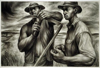
Much of the work in this show might best be called illustration as formal concerns take a back seat to emotional political narrative. One exception would be “Harvest Talk” (1953), the artist’s most explicit homage to the Soviet Social Realist art of that time. Not only do the characters feel as real as a documentary, but they flourish within rather than fight against the pictorial space that envelops them. It seems to sanctify both the men and the work that they are doing. Most postwar American art has been about the self expressive individual - defying social norms with heroic resistance, flagrant irony, or bitter alienation. This piece, however, celebrates humans in community with each other and the planet. It’s such a masterpiece. (though one might note that the Noble Farmer is a trope in Nazi as well as Soviet art)


"Harvest Talk", 1953


*****************


Lee Ann Norman's New City review  also draws attention to "Harvest Talk", and adds some additional biographical information, including the following:


Most (Los Angeles) artists fell into one of two camps: those who valued traditional figuration to convey black pride and those who preferred newer techniques such as performance and abstraction, or assemblage to achieve those means. Eventually, White became influential enough to convince the Los Angeles County Museum of Art (LACMA) to focus on L.A. artists and include contemporary work rather than solely existing to compete with New York’s Metropolitan Museum or Chicago’s Art Institute and their dedication to old European masters. Soon, LACMA became one of the only places black artists living on the West Coast could show their work outside of their own neighborhoods.


This seems to suggest that White convinced someone at LACMA to show "the newer techniques" of African American expression, as well as the kind of "traditional figuration" that he himself practiced.  I wonder where one might find the source of such information.

***********

In the exhibition catalog, Kerry James Marshall also discusses the current retrospective while paying homage to his mentor:

"---- Simply emulating his work wasn’t enough for me; I tried to be Charles White in every way I could."

He singles out "Seed of Love" and "Black Pope (Sandwich Board Man" as " the most poignant creations of Charlie’s oeuvre. Put those alongside Francisco de Zurbarán’s Saint Serapion, and Saint Francis of Assisi according to Pope Nicholas V’s Vision"


He also notes that:


By the time I enrolled at Otis as a full-time student in January 1977, a revolution was under way. A catchall department called Intermedia—where conceptual art, video, performance, installation, and land art were routine—was advancing the newest wave of art theory. Those insurgents had just about completed their dismantling of traditional, humanist craft workers. The final stroke was the takedown of a medieval bronze statue in the campus quad of the she-wolf suckling Romulus and Remus, dragged down by a rope tied to the bumper of a truck driven by the chairman of that department. When the dust settled, everything I was drawn to Otis and Charles White to learn seemed to crumble as well.


This might suggest that, as far as Kerry James Marshall is concerned, the "traditional humanist craft" as practiced by Charles White could not co-exist with the new techniques introduced into art schools in the 1970's. He further noted that of the four black students then studying with White, he, Kerry James Marshall, was the only one who would have an art career "built primarily on figuration"

And then there's this provocative paragraph:


It was always clear with Charlie that to make good work, one had to know a thing or two about more than how to draw or paint. He had a scholar’s interest in history, which informed the work he made. He often said your work should be about things that mattered but reminded us all to concentrate on making the best drawings we could, adding, “the ideas will take care of themselves.” Similarly, the art historian and theorist Rosalind Krauss, writing about the conceptual photographer Cindy Sherman, critiques the tendency of analysts to privilege meaning in an artist’s work over the mechanisms that structure our comprehension of it: “Sherman’s doll photos are a statement of what it means to refuse to an artist the work that he or she has done—which is always work on the signifier—and to rush headlong to the signified … the constructed meaning, which one then proceeds to consume as myth.”


At this point in time, such a statement might seem reactionary, conservative, and backward.

If, or when, the status of "the newer techniques" falls below that of traditional figuration  -- such a statement may appear prophetic.

Among African-American artists who address African-American identity,  the conceptual/installation/perfomance/assemblage types seem to be the majority among those who show in prominent local venues: William Pope L., Rashid Johnson,  Theaster Gates, David Leggett, and Tony Lewis are names that come to mind -- I'm sure I could recall more if such work interested me enough to go see it.

On the figurative side, the sculptor Preston Jackson is the only Chicago artist, other than Marshall, whom I can recall.  Nina  Chanel Abney, Greg Breda,  and Jennifer Packer have all shown recently in our area, but none live nearby.


*************


Deanna Isaacs in the Chicago Reader quotes the show's curator, Sara Kelly Oehler, that the artist:

 was dedicated to correcting the record on the African-American experience.

She goes on to note:


His larger-than-life portrayals of African-Americans (both famous and anonymous) radiate substance, presence, and agency. They were deliberate correctives to the rampant misrepresentation of blacks in white-controlled mainstream history and art.

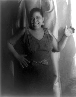
One interesting example might be White's posthumous portraits of Bessie Smith.


Here is a photo - presumably used by the singer and her promoters to promote her career.  She looks sassy and playful -- not  incongruent with a singer best known for "rough", provocative sex songs.


Here is Charles White's linocut portrait of the singer as a soulful, serious, suffering person who, if she sang anything, would be singing prayerful hymns.

Which portrait is an accurate portrayal?  Which is a rampant misrepresentation ?

Like his friend, Harry Belafonte, White would probably have been concerned with the celebration of recreational sex, drugs, and violence promoted by African American performers in the decades after his death.

He might also have been concerned with the aestheticization of failure as embodied by Theaster Gates' sculpture in a  recent show at Richard Gray

In both cases, it might be said that black artists are presenting negative portrayals of  black people for white businessmen to sell.

***

Deanna Isaacs also shares an intriguing theory concerning the conch shell that appears in some of White's last paintings.  According to his son, it's a reference to the Caribbean origins of their family.


Wednesday, August 15, 2018

Arte Diseño Xicágo at the National Mexican Museum of Art


Enrique Alferez,"Eve" (detail)


The legacy of Mexican art and design in Chicago is primarily political. Inspired by the Bolshevik revolution as well as their own, Mexican painters and printmakers in the early decades of the twentieth century addressed that struggle between basic human needs and the accumulation of enormous wealth that continues today. They portrayed the innocence, endurance, and good intentions of working people, often with an emphasis on community, resistance, and iconic heroes. Outstanding among the printmakers was a collective named the Taller de Grafica Popular, established in Mexico City in 1937. Morris and Alex Topchevsky, Eleanor Coen, Max Kahn, Elizabeth Catlett, Margaret Burroughs, Charles White, Mariana Yampolsky, and Misch Kohn were all artists who traveled from Chicago to Mexico to work with the TGP.


Mariana Yampolsky


Especially powerful are the prints of Charles White now on display in a special exhibit at the Art Institute. In this exhibit, it’s the vibrant linocut depictions of ordinary Mexican rural life by Mariana Yampolsky that stand out. Also remarkable is the dream-like depiction of cotton pickers in a linocut by Margaret Burroughs, who is perhaps better known for founding the DuSable Museum of African American History in her own living room. Right next to her oil portrait of Harriet Tubman hangs Elizabeth Catlett’s linocut portrait of the same national hero. That’s just one of many fascinating juxtapositions scattered throughout this exhibit.


Margaret Burroughs, "Cotton Pickers"


Not all of the Chicago area artist-/activists honed their visual skills in Mexico. Inspired by Jose Guadalupe Posada, an earlier political cartoonist, the work of Carlos Cortez delivers its message with simplicity, commitment, and vigor. Maria Varela was a civil rights activist who taught herself photography to promote voter registration in the American South. As it turned out, her feel for visual narrative and design could tell quite a story, even if the subject was only a pair of human hands.

Not all of the art in this show is overtly political, either. There are a few coffee tables and a portrait of the first Mayor Daley executed in mosaic by Genaro Alvarez, a modernist designer based in Mexico City. There are also some very lively small beasts and monsters created by Maria Enriquez. Her youngest son, Mario Castillo, is credited with painting the first of the many Chicano murals that would proliferate throughout Latino neighborhoods across the country. Curiously enough, the theme of that work, ’Metafisica’, as well as his work that followed, is more about self- realization and historic native cosmology than any political movement or discourse.


H.C. Westermann, "Portrait of Luis Ortiz"


And then there’s the Ortiz family, The father, Luis Ortiz, created a bold kind of abstract painting that feels as strange as Surrealism. Apparently his own physical presence also made quite an impression on other artists. The show includes several portraits of him, including one by H.C. Westermann, who shared his background as both acrobat and veteran of World War II. His son, Errol Ortiz, was among the first Chicago Imagists in the 1960’s. His geometric human figures, while not electrically charged like those by Karl Wirsum, feel more ancient and profound.

Many of the artists in this show will be familiar to those who follow our local art scenes. Yet surprisingly enough, the exhibit gives the most floor space to the one artist whom probably nobody has ever heard of: Enrique Alferez (1901 – 1999), a figurative sculptor who spent most of his long career making public sculpture in New Orleans. His life story is as amazing as his work. Born into a traditional sculptor’s family in Zacatecas, he ran away from home at the age of twelve and spent the next ten years in the army of Pancho Villa. Eventually escaping across the border into Texas, his path crossed that of Chicago’s great Beaux Arts sculptor, Lorado Taft, who was lecturing in El Paso. Following Taft back to Chicago, he would attend the Art Institute and live among the apprentices in Taft’s studio.


Enrique Alferez, "Adam" (detail)


Most of the Alferez work in this show comes from the last decades of his life. He was a storyteller like Taft and less interested in formal power than his more celebrated Mexican contemporary, Francisco Zuniga. But his Adam and Eve diptych is still quite an achievement —– and not just because he carved these two multi-figured, eight foot mahogany panels when he was nearly ninety years old. You could not ask for a more thoughtful and skillful handling of the most profound theme in European iconography. Responding to the history of the twentieth century, which almost exactly coincided with his own lifespan, Alferez has shown Woman rising upward while Man, going nowhere, covers his face in shame.

Modern classical figurative sculpture has been so thoroughly banished into the dustbin of history, it’s as if such recent examples could not possibly exist. Sometimes it is worth less than the cost of its materials. But living outside the mainstream of contemporary art, the National Museum of Mexican Art continues to show many kinds of recent art that visitors to other museums will never see. It’s leadership holds firm to those same social ideals that drove the Mexican muralists and printmakers in the early twentieth century. They show art that best addresses the human condition as they see it.. Artworld prestige and auction value are not especially relevant.


Monday, August 13, 2018

Richard Schmid Legacy at the Palette and Chisel Academy


Richard Schmid, "Nancy and  Rose at the Met"


If John Singer Sargent had just painted the popular Spanish dancer, Carmen Dauset, in 2018 it’s not likely it would be shown at the Art Institute of Chicago, as it was in the same year it was painted, 1890. It’s way too outdated. But is it really? Aren’t contemporary viewers still thrilled by this poised young woman with the arched eyebrows, ruby red lips, and ornate, billowing gold and silver skirt? Isn’t that why the Art Institute is showing posters of this painting all over the city to attract visitors to the special Sargent exhibit now on view? Many professional artists continue to produce similarly attractive, upbeat works with more or less success. Why won’t major American museums – even the ones that claim to be encyclopedic-- ever select the very best contemporary examples of this genre for display? Perhaps the dichotomy between avant garde and kitsch has not yet been retired. We can just note that this kind of painting has its own collectors, galleries, and pantheon of celebrated practitioners, including Chicago born artist and teacher, Richard Schmid. (b. 1934). His pieces now sell into the low six figures.

The Schmid paintings in this show are not among his very best – but they do display some of his characteristic qualities. There is a precision in the layered application of brush strokes and a control of pictorial space with edges sharp or soft. There is a calligraphic intensity to the designs, and his brush always seems to have carried just the right amount of paint. His work has breezy lightness and charm rather than the power and glory of earlier masters – but isn’t that more appropriate for our less heroic age? In contrast to the slow, meticulous French atelier approach that has had such a resurgence over the past thirty years, Schmid cultivates spontaneity. As in Chinese brush painting, a rapid, alla prima execution demands a thoroughly developed, methodical process - a process which the artist has presented in over a dozen books and videos published over the past four decades. Wherever he has lived around the country, he has attracted and instructed groups of devoted students.

This exhibit also includes the current work of six of the painters who studied with him in Chicago thirty years ago. All of them have gone in their own, sometimes quite different directions. As once featured in the National Portrait Gallery, Rose Frantzen has specialized in portraits of her neighbors in Maquoketa, Iowa. In this show she offers a wall-sized critique of modern urban life from a rural, yet not conservative, point of view. Why are Christian folks carrying guns in the street and why are black people so often their targets? Scott Burdick and Susan Lyon travel together around the world, giving painting workshops and depicting local color. They both seem to prefer the brash discordance and thick paint of Russian masters like Philip Malyavin.

Romel De La Torre’s tropical sensuality seems to come from an entirely different world of sensibility - yet his portraits follow Schmid’s practice of placing a precisely drawn face against a tempestuous background of expressive brush strokes. Likewise the portraits of Clayton Beck - though the facial expressions that Beck depicts do not flatter the model. He’s more of a realist than any of the other former students. His nudes have have a brute fleshiness much closer to Thomas Eakins than William Bouguereau.

How do these twenty-first century figurative painters compare with Sargent, Zorn, Chase, and the other painters of the Gilded Age now showing at the Art Institute? It does seem that the pieces on display compare better with the magazine illustrators of that earlier era - appealing to a general audience rather than meeting the aesthetic demands of those familiar with great painting. Such a comparison is not really fair, however, since the Art Institute can pick and choose pieces from museums around the country, including its own extensive collection, -- while the small art club that has assembled this show can only exhibit whatever each artist was willing to send. If you look online, for example, you will find several powerful portraits by Nancy Guzik that offer much more than the painfully sentimental depiction of a child that was sent to Chicago.

The exceptional pieces in this show are the small nudes executed by Clayton Beck and Romel De La Torre. They may exemplify the conventional male gaze - but heterosexual male eyes will probably always be fascinated by nubile flesh, and these artists have transformed that desire into fully realized arrangements of line and color.


Saturday, August 11, 2018

Jan Matulka at Thomas McCormick


untitled, 1940's


By the mid-1940s Jan Matulka was no longer considered an important figure in the art world. His work thereafter decreased in quality.” ..Los Angeles County Museum of Art

One cannot argue with that first sentence since Matulka  had no exhibitions of current work after 1943. Moreover, hardly anything he made after 1940 has entered the collections of art museums.

But did his work really decrease in quality ?


Purist Composition, 1923


Only one piece in this exhibit predates 1940, a gouache on paper titled “Purist Composition” (1923). During that period, Jan Matulka (1890-1970) maintained a studio in Paris where he followed the latest trends in Modernism. Purism, as conceived by Ozenfant and Le Corbusier, was an architectonic variant of Cubism— suitable for making an interior space feel open, bright, and cheerful. That wasn’t the only kind of Modernism that Matulka practiced – but it does seem to lead directly into the kind of painting he would do twenty years later -- with some important differences. The shapes in his “Purist Composition” are as tightly held together as the visual features of a building. The edges are as sharp as paper cut by scissors. In the paintings from the 1940’s, however, the edges have grown soft and blurry, while the shapes have begun to wantonly float away, – as if there were no longer the energy or will to bind them together. It’s a kind of disintegration, but neither tragic, unhappy, or chaotic.. The shapes still have the memory of having been together. The composition is not yet lost, – it has just begun to wander. The effect is a delightful release of tension that seems untethered to any time or place. These paintings could just as easily been done yesterday as in New York during the forties. They are markedly different from the artist’s earlier work, as well as from the angst and heroics of the kind of abstract painting that was beginning to conquer the American art world. Acknowledging such anomalies, the McCormick gallery has called this body of work “the Mystery Paintings”.

As Hilton Kramer wrote in 1970, “Mr. Matulka is not the sort of painter who established an original idiom of his own. He looked to his contemporaries and his tradition—the modern tradition— — for his models.” But the Mystery Paintings would seem to contradict that. They may echo the compositions of Cubism and Surrealism from earlier decades, and they strongly .assert that rectangular picture window that characterizes five hundred years of the European tradition. Yet they also appear to be more about the secret life of colors than anything else. These were color field paintings more than ten years before Clement Greenberg used that phrase.

Each painting feels like a separate journey to a destination unknown. Usually they are playful, energetic, and surprising. Some colorful rhapsodies may verge on the psychedelic, though mostly they are as quiet and tasteful as the Upper East Side neighborhood where the artist then lived. Do they belong in the Museum of Modern Art? Probably not. But they certainly can sustain repeated viewing - while a few might even belong in museums that take a less doctrinaire look at the history of twentieth century painting.

Tuesday, July 3, 2018

Ivan Albright at the Art Institute of Chicago


In the history of Euro-American figurative painting in Chicago, Ivan Albright (1897-1983) might be considered one of the game changers. Painters before him depicted people as strong or elegant or noble or charming or gritty. Painters after him depicted people as demented or goofy or bizarre or damaged. There was plenty of sentimentality in the work of those earlier painters, and perhaps the most sentimental of all was his father, Adam Emory Albright (1862-1957). The elder Albright specialized in barefoot boys romping through sunlit fields like erotic nymphs in Arcadia. It’s not difficult to guess why anyone, especially his own son, might wish to go in the opposite direction.

It’s also not difficult to guess why Ivan became attached to morbidity. The exhibition includes some anatomical illustrations that Albright drew while working at a military hospital in France during the First World War. The horrific scope of the casualties must have revealed “Snowden’s Secret” as described in ‘Catch 22’, Joseph Heller’s dark novel of World War Two : “by seeing Snowden's entrails spilling over the plane, he feels that Man was matter.. ..the spirit gone, Man is garbage." While other veterans from that era, like Otto Dix, depicted the aftermath of war with anger or outrage, Albright depicts the human condition as disgusting as a sack of putrefying meat.

If Albright suffered from PTSD, it did not seem to have interfered with his pursuit of a career focused more on fame than money. All but one of the paintings in this exhibit come from the artist’s estate. The single exception is the portrait of Mary Block, the founder of the Woman’s Board of the Art Institute and the wife of a trustee who would eventually become chairman. The artist, who married into a prominent publishing family, had friends in high places. The portrait is hardly flattering. The woman appears to be anxious, suspicious, grasping, and powerful. The artist called it “rather ghastly in a way”. As a dedicated patron and collector, Mrs. Block was probably more concerned with being included in the history of art than with her depiction as an unattractive woman. And perhaps wealthy Americans of the mid twentieth century realized that the upper crust no longer needed to be seen as kind, wise, righteous, devoted, or elegant. Wealth had become its own validation. It still is.

Every decade, or so, the Art Institute hauls out some of its Albright collection and puts it on temporary display. This time the theme is “Flesh”, so the show does not include “The Door” or “The Vision of St. Anthony”. Albright certainly painted a lot of flesh – but only the sagging and decrepit kind. No firm young bodies; no tender, voluptuous skin; nothing that looked healthy and vibrant. Actually, what he depicted does not look like human flesh at all – it’s more like blistering, peeling, artificial leather – unnatural in both texture and color. Like album cover art for death metal bands, it’s on the border of horrible and humorous, with a target viewership that is more about adolescent rebellion than adult responsibility. Two paintings assure us that the work of the hands (“The Lineman”) and the work of the spirit.,( “The Monk”) are without value.

Albright’s fanatic attention to detail and philosophical-sounding titles continue to lead some critics to assert that he was applying old master techniques. Notably, the signage in this exhibit makes no such claim. So much of European painting from the fifteenth to nineteenth century was about making human figures, as well as landscapes and comestibles, appear fresh and alive. The only life that concerned Albright, other than his own, was that of bacteria and fungi.

If he were still alive, he should certainly be commissioned for the official portrait of POTUS #45.  He was a master of moral as well as physical decay. But does Ivan Albright still deserve all this attention? Isn’t the “Picture of Dorian Gray” sufficient to demonstrate his vision and place in the history of Chicago art? Do we really need a well born, well trained, well married, well connected, well respected white man to repeatedly tell us that human life is without meaning or hope ?


*********************


Luke Fidler’s review responds to “Pornography in the Classroom: Another Challenge for the Art Educator” (Blandy/Congdon -1990) – an essay that discusses an Albright painting as follows:


Fidler suggests that Albright treats his subjects, both male and female, with “tragicomic care”, while “it is not he but we who supply the violence”.   With which I’d agree – though I don’t see putrefaction as violent at all – quite the opposite. To quote Andrew Marvell: "The grave's a fine and quiet place"

 I also don’t see why the Blandy/Condon essay should be referenced in art criticism.   As it’s title would suggest (“Pornography in the Classroom”) it was apparently intended to provoke controversy rather than contemplate works of art as such.  Though it does seem that New City  is becoming ever less interested in making such a distinction.

Fidler does highlight, however, the following aesthetic quality:


one of the more intriguing characteristics of his paintings, namely that the teeming rot and discoloration bedeviling his protagonists is rarely matched by frenetic activity on the surface of his canvases. They’re uncannily smooth, amplifying the strange sheen of his palette in which few blacks are true blacks and every tone seems a little jaundiced


I confess that I found the "strange sheen of the palette" so repulsive, I did not notice whether the paint was thick or thin.

 As I had briefly suggested,  Albright's images resemble the rebellious adolescent fantasies of death metal record album covers.  If Fidler would persuade us that they are something more important, perhaps he could relate them to other expressions of what he calls the "tragicomic".  Hans Holbein's "Dance of Death" is one example that comes to mind. By comparison, however, Albright's work is dead in form -- as well as subject matter.

Rachel Niffenegger at Western Exhibitions


Rachel Niffenegger says that her favorite childhood toy was “Dr. Dreadful’s Squeemy Snack Lab” (“Looks gross, Tastes great”) A similar contrast may be found in the current exhibition of her art. The sculptural figures all resemble skeletons wrapped in decaying shrouds. Yet they also suggest acrobats or perhaps even dancers holding acrobatic poses. They are vibrant and elegantly fragile despite their sepulchral associations. Each wire figure rests upon a clear acrylic box half filled with gravel and rubble that must have been swept off a parking lot. It’s possibly the cheapest, dirtiest, and most available material one could find. Yet it’s color and texture is visually the perfect complement to the soaring, twisting figure resting upon it.

Like many other shows at Western Exhibitions, the installation of this show is no less creative than the art on display. The whole is greater than the sum of its parts. A long sheet of translucent white fabric has been stretched within one area of the gallery. Concealing the edges of the conventional white cube, it has been tacked or draped over plinths of various heights. It renders the space more intimate than social. More remarkably, it has also been stretched over a life size department store mannequin of a running woman. Who knew that such an unusual prop even existed? The features of the mannequin are mostly obliterated by the sheet stretched over it – but it still feels lithe and athletic - the same energy that seems to drive all the collages, inkjet prints, and sculptures on display.

Childbirth appears to be the theme that unites everything. As presented by Cosmo Compoli, one of Chicago’s historic Monster Roster, it can be ugly, dangerous, and painful. That’s the message shared by his bronze sculpture, “Birth of Death” (1950). Giving birth, however, might also be considered the most amazing and creative act that humans ever do , even if it’s messy, and chaotic. Wistful faces in muted pink and blue often appear on the thin fabric that has been stretched across some of the wire loops in the sculptures. Though blurry, they still seem to express the sweetness, hope and potential of youth. More youthful faces appear in the inkjet prints where they have been distorted as if reflected by a funhouse mirror. In one such image, an infant is suckled by his naked, smiling mother.

The stated theme of the show, however, is “Psychotic transcendence”. Or, perhaps it’s “Personal Effluvium”. Or perhaps it’s “Mental Hauntings”. The artist offers fifteen possible titles for this show and seventeen possible answers to “what is the work about?”. None of them denote the act of giving birth . She does note, however, that since her last show, “There is more sex and babies”, “I understand beauty” and “Death is now harder” There is nothing cool about becoming a parent – or a “breeder” as some might call it. It’s more about responsibility than freedom. It’s more about creating rules than defying them. It’s more about someone else’s future than your own present. But it does seem to be what has been on the artist’s mind lately - despite her childhood fascination with the macabre.


***************


Luke Fidler's review in New City finds that "No individual piece is quite as compelling as the whole installation" -- as did I.   But he's not sure whether it's anything more than " collecting, re-working, and storing things"  Is it a good collection of such things?  That issue is not addressed - though overall the show is not Recommended

Niffenegger's new found interest in motherhood is too politically oblique right now for an artist to  proclaim or a critic to notice.

By the way, the critic notes that "much of the ambitious work focused on bodies these days attends to vital issues of race, gender, sexuality, or ability, grounding the body’s subjecthood in social procedures of constitution or experience." 


With which I'd agree -- but without the word "ambitious".  Such issues are more like low hanging fruit -- easily reachable and automatically respectable.


Friday, June 22, 2018

Elliott Hundley at Shane Campbell


(detail)


This exhibition of recent work by Los Angeles artist, Elliott Hundley takes its name from “Eighteen Seconds”, an avant-garde screenplay by Antonin Artaud. Written in 1925 for a silent film that was never produced, it presents the last eighteen seconds in an actor’s mind before he shoots himself in the head. He’s on the verge of both a great career and romantic triumph, -- but “he has been stricken with a bizarre malady. He has become incapable of reaching his thought; he has retained all his lucidity, but no matter what thought occurs to him, he can no longer give it external form…. ----- he is reduced to watching a procession of images, an enormous number of contradictory images without very much connection from one to the next”

At first glance, Hundley’s collages might produce the same effect. They’ve been packed with a variety of images that seem to lack much connection. Many come from selfies or photos of other scantily dressed, lithe young men. Others come from advertising, especially fashion, or comic books. There are a few photos of statuary or ceramics, both commercial and classical. A few images are mildly cute and girlish; a few others are mildly creepy and boyish. There’s only one scene of explicit violence – a cartoon superhero walloping some hapless villain. There is zero explicit sexual activity. There’s also zero religious imagery or photojournalism of current or historic events. But there are many, many disembodied human heads –most of which stare directly back at the viewer as if to ask “and who are you?”. It’s a collection that might be found on the bedroom wall of a quiet, sheltered twelve year old boy who is more concerned with his own identity than with anything else out there in the world. Possibly he will eventually identify as gay. Possibly these processions of images make some sense after all.


(detail)


As patches of color and texture, the small images also build up into overall patterns that work quite well as abstract paintings. Several employ a grid of either concentric circles or checkerboard squares or both. The underlying photos easily get lost within the dynamics of the design – especially as the surface is built up with pins, string, and whatnots up to a depth of five inches. In one piece, the panel is penetrated with the kind of black rubber collars that are used to plunge toilets. Combined with multiple images of red gaping mouths with canine fangs, that piece is intensely ominous as well as alluring. Nothing breaks the surface however in the two works on paper, and one piece is not a collage at it all. It’s a monochrome view of a museum of comparative anatomy, overlaid with a layer of long, streaking, colorful lines. It was executed with oil paint on linen, though it feels much more like a screen image manipulated in photoshop. More than anything, these pieces might be experienced as experiments in design and materials.

The chaotic but positive energy of a vibrant city feels like it’s coursing through each work – just as it did in so much work of the New York school from the 1950’s. As an innovative and thrilling designer, the artist is obviously much more skilled, experienced, and accomplished than the fictional mind in which these final eighteen seconds were occurring. But that doesn’t make these pieces feel any less hopeless and self-centered. We are still looking at a modern boy-man who, just like Artaud’s protagonist, is “incapable of participating in the lives of others, or of devoting himself to any activity”. After nearly one hundred years, this fascination with intellectual despair can no longer be considered avant-garde. It has been normal for half a century - at least in the contemporary artworld.


Tuesday, June 19, 2018

Women Painting Men - Riverside Arts Center


Jessica Stanfill, "Gabrielle and the Swan"


Women have been depicting men for a very long time. Recent analysis of hand prints found beside prehistoric cave paintings suggests that the majority of early artists were female. When we visit the art museum today, however, nearly all of the historic paintings on display have been attributed to men. Since the society they addressed was patriarchal, women have often been depicted as they might best serve the needs that gender -- primarily as mothers or sexual partners.

As men continue to need women to fulfill such roles, it’s not likely that these kinds of depictions will ever be abandoned. But sixty percent of art school graduates are now female, and patriarchal priorities have been waning for several generations. What kind of roles do contemporary creative women see men as playing? The demographic of this show is rather limited. All of the artists are early millennials who got MFA’s locally within the last ten years. Not only is each of them white, but so are all the men they depict. There is variety in these depictions, from fear to pity to ridicule, but nothing like admiration and respect. Men have an over inflated view of their own importance: economically, intellectually, and sexually. They need to be taken down a notch or two. It’s payback time.

Jessica Stanfill offers us the naked man as either a drunken, inflatable sex toy or as part of a bland floral arrangement. Mel Cook scrawls the voyeurish details of male frontal nudity on the back of a boy’s prim and tight white briefs. Katie Halton depicts a bunch of beefy bearded guys hanging out at a beer garden to posture their Neanderthal manliness Celeste Rapone imagines a fairy tale villain as a child’s stuffed toy whose fat pink nose and clenched white teeth are interwoven with thin, spindly arms and a blue feather boa. Karen Azarnia depicts a bald, shirtless old man wading through a field of high grass as he desperately tries to escape something that frightens him. Gwendolyn Zabicki depicts a tree trimmer who is certainly more strong, daring, and adept than any of the men shown above, but the result of his work is pathetic. He has cut every branch off the mighty elm and reduced it to an ugly, ludicrous stump.

In all of these paintings, formal quality feels no more than sufficient to deliver the intended narrative. Like viewing a political cartoon, after you get the idea, you might as well move on. That may be the legacy of a certain kind of art education.

What about recognizable portraits? What about serious depictions of men at their best as well as their worst? What about depictions of the opposite sex as actually sexy? What about narratives that are more explicit than puzzling, and more affirming than ironic? What about artists from other ethnic groups as well as outside the conceptual world of contemporary art? It wouldn’t be a bad idea to have “Women Painting Men” become an annual exhibition - but with even more variety next time. It also might not be a bad idea to gather these same skilled and sophisticated artists around a less ideological theme. 

Tuesday, May 29, 2018

Richard Rezac at The Renaissance Society


The sculptures of Richard Rezac can no better share the same room with each other than a bunch of anarchists might. They’re more about breaking rules than following or making them. The resulting space feels like the aftermath of a child’s birthday party. Unusual objects appear to hang from the ceiling, sit on the floor, project from a wall, or wedge into a corner for no good reason. Each has been reduced to the most basic kinds of enclosed shapes, much like a Brancusi bird or fish. But less attention has been given to developing an inner dynamic of form – and more to inviting viewers “to consider the multiple layers and possible readings of each piece”

There might be two cross purposes here. On the one hand every Richard Rezac object looks pleasant and well crafted. Like toys made for toddlers, the shapes are simple, the surfaces smooth, the colors solid. None of the twenty pieces are disruptive, and a few are quite attractive in a modern decorative kind of way. Puzzlement, however,seems to be the top priority. Many appear to be architectural details, yet they serve no conceivable function. It’s as if some organic pattern of interior design had become cancerous and was producing dysfunctional anomalies. A variety of materials are used – glass, wood, metal -- in such a way that the combinations always feel incongruous. One end of a gate might be supported by a painted wooden strut – while the other end is supported by a lump of unpainted cast plaster.

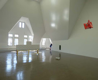
The largest piece, referred to as the “Ren Screen” was apparently designed for a specific place on the floor of the Renaissance Society gallery – which is itself a rather incongruous space. It’s bizarre, trapezoidal walls were the unavoidable consequence of the Gothic Revival façade of Cobb Hall. The upper edge of the screen echoes the pattern of high windows in the wall behind it. It serves to scale down the ungainly space of the enormous room. It also cheers the room up with a quite pleasant red and green floral pattern. Yet, when seen from the rear, the symmetries are broken and the combination of patterns feels arbitrary. It serves to support a small wood sculpture that resembles the waist of a violin. Titled “Cremona”, it makes a droll reference to the history of musical instruments while accenting the center of the screen -- but it doesn’t really save the screen from feeling arbitrarily pieced together..

Who cares about anomalies? Near anomalies can be quite thrilling in paintings as they challenge and stress the composition. If they destroy it, however, scientists and financiers might be even more fascinated. Something that doesn’t make sense often triggers a major new theory, product and investment opportunity. Those modern elites might be the best viewership for this kind of art.  It might well inspire creativity within the immaculate white cells of laboratories or corporate headquarters.. Elsewhere, however, it probably just serves to reaffirm the intellectual superiority of the viewer - without really offering any substantial evidence of it.


************************


The review published in New City concludes that "Above all, this is an anti-monumental show. Nothing big, nothing grandiose, no hyperbolic claims about art’s importance. This is itself refreshing, but the sculptures thus run the risk of not being taken quite seriously enough; and to underestimate them would be a mistake, because there’s something quietly subversive about Rezac’s well-crafted dialectic of difference and repetition."

Presumably, a "dialectic of difference and repetition" is subversive, and being subversive is important. We can only guess why.   The artist is well established and his  "vocabulary of shapes" though incomprehensible,  is hardly provocative in a contemporary artworld that thrives on provocation.

The exhibit, as well as Luke Fidler's review, would seem to reaffirm rather than subvert any social or visual conventions that may apply. 


Saturday, May 26, 2018

Mary Qian and Miguel Malagon at the Vanderpoel Museum


Mary Qian: "Dayton Street"


More images of the show have been posted here


Mary Qian’s “Dayton Street” is the first painting you see when entering this show. It’s also one of the best realist paintings recently made in Chicago. In the background, people are walking, driving, or biking down a busy street. In the foreground, a tall, Latino man with shoulder length hair is staring at a point somewhere above the viewer’s head. With eyes wide open, and expression calm and determined, he is apparently having a vision. The strong triangular composition gives that vision the gravitas of a religious icon. The neighborhood is vibrant, congested, and youthful, while Willis Tower in the hazy distance identifies the city as Chicago. These are not the mean streets that might relate to a discourse on social justice. Nor are they the beautiful streets that might celebrate the pleasures of urban life. The street is orderly in that everyone is following the rules of traffic. Visually, however, it has the chaos of arbitrary placement ,a jittery sense of space and a hint of anxiety. All that makes this view beautiful is the man depicted in front. Not that his face or clothes are especially attractive – but there is a beautiful spirit shining out from his eyes. You might call this a romantic realism that is more sentimental about the future than the past.

Qian’s other portraits, usually just a head and shoulders, also pursue a truth that is earthbound as well as spiritual. Skillful drawing projects the volumes of the skull and the fleshiness of features like the lips and nose. Yet even more, the design projects the spirit of the person depicted. They don’t seem to be extraordinary individuals – but neither do they appear depraved, ridiculous, demented, or banal. Each has a unique character. All other qualities of paint or model are secondary. A more expansive cityscape fills the background of “Above”, and again the person in the foreground is looking upwards in a pensive way. The light breaking through the clouds intensifies the dramatic effect – as if this woman had overcome many obstacles and was courageously pursuing her dream. She’s young and handsome, and appears to be African American – but all that seems incidental to the strength of her spirit. This is Rembrandt's legacy in portraiture: painting the soul while making the body just realistic enough to convince you that such a person actually exists. A double portrait of a mother and child is less successful. This time, the narrative is carried by a caressing hand rather than a staring face so the mood needs to be more about comfort than perseverance. The foreground features a beautifully painted color patterned shirt, but that’s not enough to keep this grayish painting from feeling a bit sad and dreary. It’s a tribute to motherhood that’s more to be admired than enjoyed.


Miguel Malagon: "Downtown Vendor"


The cityscapes of Miguel Malagon are as immersed in the street life of the city as the man depicted in “Dayton Street” for which he was the model. They have the same gritty texture and jittery sense of space. His figures sometimes struggle to emerge from a blizzard of paint strokes and they never relate to each other very well, but isn’t that the reality of an urban street ? People may be physically close, but each is living in a hectic private world. There’s a sense of displacement, as one might expect in a city with so many immigrants – including both of these artists. (Qian was born in Shanghai, China; Malagon in Guanajuato, Mexico) Each painting feels like a collage of on-site sketches or studies from snapshots. They exhibit more concern with what can be seen than with what it might mean. Malagon’s landscapes, however, seem to focus on a kind of nervous and forceful graphic energy. He has relaxed and taken comfort from some rocks along the edge of a pond, but the hills, trees, and clouds appear to reflect back the artist’s own restless, questing spirit.

This exhibit takes place in the Vanderpoel Museum. John Vanderpoel (1857-1911) was a popular instructor at the School of the Art Institute. In his time, figure drawing from life was fundamental to art education, and he was a master. His instructional book, “The Human Figure” is still in print. Soon after his untimely death, former students began to assemble a collection of observational art in his honor. Some of the pieces were done by him or his students; most were not. Some were made by the leading artists of the day; most were not. It’s a fascinating slice of art history and of a tradition that lives on in the work of Qian and Malagon. It’s also a rather somber reminder that most art, no matter how skillful, thoughtful, and emotive, will eventually be pushed beyond the radar of the artworld. Now located in the Ridge Park Field House on the far south side, the Vanderpoel Museum itself is at the brink. It may not survive another generation unless someone steps up to revive it with more shows like this one.


Wednesday, May 23, 2018

Richard Hull at Western Exhibitions


Ridiculous Mirror


It’s always been hard to look at the fantastic imagery of Richard Hull and not think about the Chicago Imagists who preceded him at the School of the Art Institute by about a decade. His work is typically humorous, defiant, precise, and cheerfully wacky. It has the cranky obsessiveness of a self-taught outsider and the aggressive lines and colors of comic books. In most of his forty year career, however, he has not represented the human figure. He has been called an “abstract imagist”

In many ways, the paintings in this exhibition are not much different from previous work. They still have the flattened, bulbous eruptions of linear protoplasm. But nothing is left of the architectural space suggested in early paintings, and by packaging his forms within a basic shape that resembles a head and shoulders, the viewer is now confronted by portraits of human beings. So now we have a moral content that may be queried. What kind of people are these? Are they to be loved, feared, trusted, helped, obeyed, admired ? As with most of the people represented by the Imagists – they do not appear to be responsible adults. They’re all nut cases – unaware of any world outside their own perseverating mind. They’re caught up in some kind of twisted mental process or an alternative reality with a few too many dimensions. Perhaps they are pondering one of the classic mathematical problems that have bedeviled great minds for centuries. The artist tells us that this series was inspired by the Klein bottle – a nineteenth century topographical construction that defies a conventional understanding of three dimensional space.

The main gallery of the exhibition is rather intense. The viewer is confronted by the same wacko psychology on every wall, as well as rising from the floor as freestanding “mirrors”, painted on both sides. Rather than presenting a human image for contemplation – it’s as if the inner workings of a disturbed mind was bubbling out from a gate to another world - like the monsters that pop out from every dark corner of a carnival fun house. The viewer is immersed in the endless loop of the artist’s repetitive cogitation. The work is intense in close-up detail, as well, with painted surfaces that often feel teased, tormented, and reworked many times.

You can feel the careful consideration given to balancing shapes and colors, and there is a variety of emotion from the black/yellow anger of “Joan of Arc” to the green/red contentment of “Arrived”. Even without any sharp angles, it has a strong, assertive appeal. None of these portraits, however, seem to represent anyone who is compassionate or rational. And there is no sense that the space outside each figure has been taken into consideration. It’s just whatever the inner turmoil has left unfilled. As a group of paintings, it’s fun and exciting. But as a group of the people they might represent, it would be a bunch of high energy psychotics – which is how so many other prominent Chicago artists of our time have viewed humanity. Hopefully, someday we’ll see Hull’s portraits hung side-by-side with similar portraits by Nutt, Rossi, Pyle, and Wirsum. Even more hopefully, however, let there come a day when more Chicago artists, like Kerry James Marshall, offer a positive vision of humanity. If we all accept ourselves as crazy monsters, there’s not much incentive to improve behavior.

Martin Hurtig at UIMA


Complexities and  Contradictions (1966)


There are five distinct styles of abstract painting in this retrospective of Martin Hurtig (b. 1929) spanning the last four decades of the twentieth century. The earliest piece, dating to 1963, is so typical of the gestural abstract expression of the previous decade, it might even have been intended to exemplify it. There is struggle, passion, and frustration as a grand, serpentine gesture culminates beneath a thick red X. Whether or not that meant that the artist was finished with making heroic gestures, we certainly don’t see any more in this exhibit. In the next piece, “Complexities and Contradictions” (1966) we see broad calligraphic strokes and squiggles dancing above a pattern of floating rectangles of solid color. It’s decorative and balletic; and it might remind us that the artist was trained at IIT’s Institute of Design in the 1950’s. In all the paintings that follow, painterly self expression will continue to complement, or perhaps compete, with the geo-form design of modern architecture.

In some untitled acrylic paintings from the seventies, a flat rectangle of solid color ( red, green, or white) emerges from one side of the panel and nearly reaches the other. The margins fight back with strong colors and arbitrary edges, but clearly the battle is being lost. Then, the geometric-forms leave the painting altogether and re-emerge as sculpture. The plexiglass constructions that hang from the wall resemble architectural models for office cubicles. The freestanding pieces block out their space on the floor with aggressive, sharp angles. Be careful! If you stumble into one, it could do some damage. Be especially careful of the waist high aluminum trapezoids called “La Famille”. What a combative, dysfunctional family it must refer to. By the 1990’s, the geo-forms have moved back to the walls, this time as aggressive black and white patterns. The smaller ones might serve as pictograms for hazardous material warnings – the larger ones as wall decor for the hi-tech lairs of James Bond villains. But a few years later, in 1999, the artist returned to a more colorful, painterly kind of painting with blurry ,nearly repetitive patterns. They appear bland at first sight, but reward longer study with subtle rhythms and variations. These two pieces are really quite pleasing – the yellows and greens of the one puts you in the middle of a spring garden – the blues and reds of the other feel like a patriotic parade.

Overall, this body of work, like most architecture, is more about the effective use of line, color, and angle than about anything explicitly personal or social. When color is used, it seems to be perfectly tuned for the space that it occupies – except for a large patch of olive green that is truly annoying. The variety of familiar styles might suggest that these are impersonal, academic exercises, appropriate for an artist who was also directing a university department of art and design. Perhaps, however, the changes chart the course of the artist’s life - from the excitement of self discovery to the challenges of career and family to the comfortable golden years of retirement. A successful life in the modern world. My favorite pieces are the two etchings from 1967 that seem to strike the best balance between the artist’s calligraphic and geo-form impulses. They seem to embody the spirit of the improvisational jazz of that era.


Thursday, May 17, 2018

Judy Ledgerwood at Rhona Hoffman


Yoni


It’s impossible not to smile at the mischievous presence in Judy Ledgerwood's eight paintings now showing at Rhona Hoffman Gallery. And not just because, like everything in last summer’s “A Sag, Harbored” show at Western Exhibitions, all of the paintings smile back at you with a drooping sag across the upper edge. They are right at the edge of tedious repetition and wanton self expression— – of banality and obscenity‚ – of sloppiness and precision. They share the casual goofiness of a daycare center, yet also suggest the conceptual rigor that‘s sought in contemporary art. Whenever my eye tries to escape an annoying pattern, there’s always a drip, or a slurp, or an aberrant lump to give it some welcome relief. And then there are the two orifice-centric pieces that are blatantly sexual. Even before reading the title, “Yoni” was relentlessly pulling my consciousness into the bottomless pit of tantric female energy. And then there’s the muscle bound vagina of “Sheela”, - whose title might well refer to Ma Anand Sheela who was convicted of bio-terrorism against the entire population of a small town in Oregon that resisted the residency of her ashram—. (it’s recently been the subject of a Netflix documentary.) Girls will be girls! It’s a wild story of sex, religion, violence, and boundary crossing - all of which is suggested by Ledgerwood’s painting.

Although less naughty, most of the other pieces are just as fun and playful. “Eye Opener” is a woozy arrangement of lines and polkadots. The pattern would feel too tightly ordered except that some elements are beginning to wander off, and uniformity is occasionally broken by variations in thickness of paint. Similarly, the stultifying grid of “Grandma’s Garden” is relieved by discrete variations in size, angle, and luminosity. “Grandma” is obviously a serious abstract painter when she’s not tending garden,and she mounts an even more flamboyant attack on a checkerboard grid in “Tiny Dancer”. Though strictly maintaining certain rules of an overall pattern, every other choice in color, thickness, and placement feels whimsical yet correct. The only clunker, for me, is “Hopscotch Chelsea Rose” where the variations in color and tone fail to relieve the tedium of a strictly orthogonal, evenly spaced grid.

These paintings are far less overwhelming, more intimate, and less casual than Ledgerwood’s room size “Chromatic Patterns for the Art Institute of Chicago” that serves well as a Feminist assault on the hierarchy of art and craft, – especially now as it’s Bacchanalian vines envelop the walls of that patriarchal institution with the neoclassical facade.. Such provocation was a primary agenda of the The Pattern and Decoration Movement founded in the 1970’s. It remains well represented in major Chicago institutions with Ledgerwood at Northwestern and Michelle Grabner at the School of the Art Institute. Each of these paintings, however, appear to be doing what paintings, especially Chicago paintings, have often done in recent decades: amuse, entertain, and thrill with a prankish attitude and skillful execution.

Judy Legerwood’s “Far From The Tree” shows through May 19 at Rhona Hoffman Gallery, 1709 West Chicago.

Friday, April 27, 2018

Teacher and Two Students - at Printworks Gallery


James Valerio


Mark Bowers


Maria Tomasula


From Kerry James Marshall on down, many of the city’s best known artists have been educators, but I can’t remember ever seeing a teacher/student exhibition outside an art school’s own gallery. Only in the strongly traditional arts, like Classical Realism, are lineages still held in high esteem. So this exhibition of James Valerio with two of his former students, Maria Tomasula and Mark Bowers, is an unusual event – but then, James Valerio is quite an unusual artist. Many artists meticulously copy photographs – but Valerio can infuse his interpretation with a formal idealism and tension that reaches as deep into minutiae as the eye can see. And though his subject matter is secular, his work feels Christian as it proclaims the special glory, mystery, and destiny of human life. The two monumental graphite portraits in this show radiate the intensity of a spiritual quest. Their subjects are unknown and may not even be Christian, but “There is no respect of persons with God” (Romans 2:11.) Valerio’s close-up view of refuse, “Mud”, was far less inspiring as shown in the gallery, beneath reflective glass, Online however, I was better able to feel depth in the shallow spaces—and then eventually discover the human face hiding in plain sight. “For dust thou art, and unto dust shalt thou return” (Genesis 3:19)

Both of Valerio’s former students, now with art and teaching careers of their own, also show highly detailed graphite drawings in this exhibit. But that is all they have in common with their teacher. Bowers creates dream-like views of Midwestern landscapes where nothing feels alive or natural. The circular edges confirm them as inner visions rather than windows on the world. The sky is ominous; the atmosphere dark and heavy; the foreground collapses into background. These are anxious nightmares. Tomasula draws still-life where the real subject always seems to be her own body. Because she is an artist, there is often an emphasis on the hands –up to five pair. Because she is a woman in a patriarchal society, her torso is conventionally presented as either a luxuriant flower or a gravid fruit. She feels distant from all of these roles –as if they chose her rather than the other way around. So the self she portrays is more like a dessicated biological specimen than a living human being.

It’s admirable that these students have taken what they wanted from a teacher, and then followed their own path. Their work feels more personal and especially relevant to the anxieties of their generation. But I do find the teacher’s work far more enjoyable, encouraging,and even amazing. I could not believe that the glowing highlights in his portraits were not achieved without a white crayon – but the artist has confirmed that he only used black graphite. The areas of intense brightness are just unmarked white paper And it’s always surprising to find a living figurative artist who presents a spirituality that is not only secular, but also unsentimental and non commercial. Though not as much fun as the leading Imagists, Bowers and Tomasula are firmly within the surrealist mainstream of post-war Chicago art. Valerio is closer to the naturalism, precision, and humanism of the Renaissance - which might even be re-born again someday.


James Valerio