Saturday, March 22, 2025

Torlonia Collection of Roman Sculpture

 A review of “Myth and Marble”, the Torlonia collection of Roman sculpture at the Art Institute of Chicago.


Germanicus, 1st Century , bronze fragments, mostly plaster


Lots to see in this 19th C. collection of heavily restored ancient Roman marbles - and  it’s clear that the collectors, the Torlonia family, shared the ancient Roman desire for decoration, entertainment, status, and politics - even if gods and goddesses were being depicted. Nothing here, however, rises to the level of the Belvedere torso that came to Chicago about forty years ago.

The gesticulating figure shown above reminds us of how the republican ideals of western civilization differ from all the other mega-cultures. We want our leaders to convince us with words —- not clubs, swords, or guns —-even if it has always been “more honoured in the breach than the observance”. Only some parts of torso and leg are original, and like most of the heavily restored pieces in this exhibit, overall mediocrity has been excused by the authenticity of fragments. 


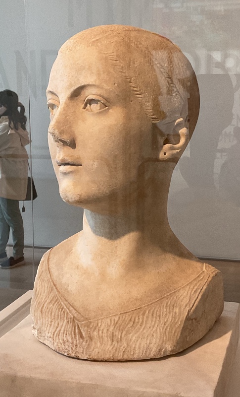
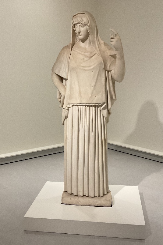
Maiden of the Volci,  mid-first century BCE

A few pieces do stand out, however  - especially the portrait shown above - recalling the austere elegance  of Francesco Laurana or Charles Despiau.  As the Torlonia website declares:  “Its extraordinary stylistic peculiarity makes this female portrait one of the longest-examined and most discussed works in the Collection”


It comes alive and dominates the room - even from behind a heavy glass case.
So many subtle little touches
like the nose turning ever so slightly to the left
and small irregularities in the folds of the tunic and dressing of the hair.


..and rarely, for this show, it's 100% original,
in stark contrast to the following:
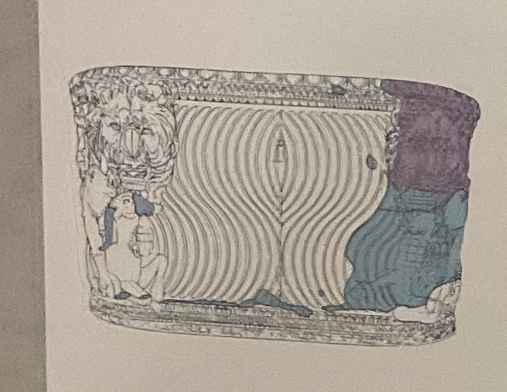
2nd Century


Gallery signage indicates how much of each piece is 
original (white), modern (blue), or ancient but from a different statue (purple).

In this conglomeration, only the head and torso of the child are original.  All three dogs were added more than a millennium later.  It’s charming - but like the work of the highly skilled fabricators who work for Jeff Koons - it’s no more than a joke.


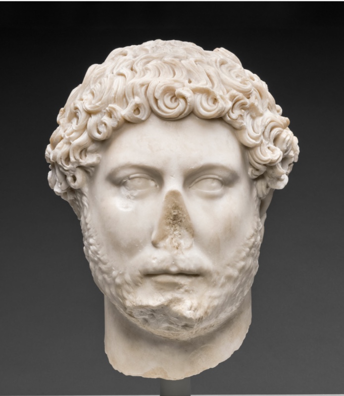
Portrait of Hadrian, c. 130


A majestic imperial portrait that compares well with the example in the Art Institute’s permanent collection:


Hadrian - Art Institute of Chicago
Sensual and crafty


strong, fair, and determined


But the strange and menacing figures on his armor are the best part.


120-130


Several of the female portraits felt as eternally present as the famous encaustics from Fayum, Egypt


150 - 200


The show includes two large sarcophagi - each depicting the labors of Hercules


160-170.   


This is the better of the two,
but I’m doubting any of the 10-20 thousand other Roman sarcophagi
ever rose to the quality of the relief sculpture shown below:


Trajanic freeze on the Arch of Constantine, early 2nd century

The very best work was reserved for emperors.


Here’s what sat on top.

Neither ancient head is original,
but the male is so much a better fit than the female.


260-270

As you can see in the sketch above, this is the conglomeration of two ancient tubs-with-lions. I’d love to have it in my  own backyard.


Early 2nd century, Hestia Giustiniani

Wow!
This feels so much like Art Deco from the 1920’s
I’d expect to find it in the lobby of a movie theatre from that era.


….. and it’s almost entirely original.
Gallery signage tells that this is in a retro archaic Greek style

But as we see below,
it’s quite different:

Peplos Kore, 530 BCE

This piece, staring straight ahead,
was made to interact with a supplicant,
and it’s like a burning torch of energy.
It belongs in a temple,
the Roman variation belongs in a garden.


Mid-first Century BCE

A fine Republican head, not especially enhanced by the later torso


100-300 BCE, Greek or Roman


Karl Malden? Gene Hackman?
The closest this exhibit gets to Hellenistic naturalism.
The restored brim of the hat feels clumsy,
but it’s oh so hard for one sculptor to continue the style of another.


Young Marcus Aurelius, 144-47


Faustina the Younger, 160


Classical props for a  sword-and-sandals B movie


the Torlonia Nile,  late first century


Belongs in an amusement park 

**************


It’s no longer fashionable to augment ancient fragments with so much  modern addition,
 and maybe that’s a good thing.  Often it’s just distracting. But those 17th- 19th century sculptors were often quite skilled and enjoyable in their own right.

This is the museum’s third exhibit of European classical figure sculpture in 18 months - and I certainly am grateful.

**********
**********


Not my favorite sculptures, 
this show has three nearly identical statues of Leda.
As found in my online collection of Leda, the Prado and Getty museums have the same thing and I strongly dislike them all.  


Is the draped arm supposed to hide the shame of an avian lover? Were they customarily used to decorate brothels? I suppose every village had one and aesthetics was never  an issue.


*************************************


“Everything We Ask of Art” ?

Ouch!

Entertainment- propaganda - sentiment ?

Yes 

Power - passion - faith - peace - joy - angst - transcendence - revelation ?

Not so much.

I suppose we should be grateful that the Times prints any art criticism at all,
much less a show of ancient sculpture in Chicago, 


Jason Farago’s review in the New York Times is a puff piece
though he probably had nothing to do with the headline.
It’s the job of an editor to grab attention no matter what.
As with click-bait.


… though it does reveal that the goat head shown above was carved by Gian Lorenzo Bernini


… while the head of Venus was made by his father.

Not hard to see why the son is so much more famous.


Monday, November 4, 2024

Modersohn-Becker and the Horvitz Collection at the Art Institute of Chicago

Paula Modersohn-Becker, (1876 - 1907 )Reclining Mother with Child II, 1906

Death of Demosthenes 1805,  Georges Rouget (1783-1869)

I doubt the Art Institute of Chicago had any intention of mounting  these two shows simultaneously.
but they do complement each other quite nicely:

The world of men — the world of women
Public — private
Aristocrats — commoners
Theater stage — bedroom.       
Three dimensions — two dimensions    
Strong colors —  muted colors
 Dynamic, complex anatomy — blockish, simplified anatomy
Extraordinary—ordinary.      
Violence — nurture
Melodrama — no drama 

Historically, the one might well be understood as a strong reaction to the other,
especially with the examples of  French Neoclassicism as collected by Jeffrey E. Horvitz.
Evidentially, he had no interest in painterly quality except as it delivers overwrought melodrama.


Jacques Louis David, Oath of the Horatii, 1784

We can’t blame Horvitz for collecting Rouget instead of the unavailable work of his master, David.  One  might attempt to characterize how the above differs from "The Death of Demosthenes" - but if you’re reading this blog, you already know. Rouget could render strong figures  but he had no talent for graphic design or narrative staging.  And the same might be said for the entire  Horvitz collection. 

The 2006 Girodet  exhibition at the A,I.C., however, proved, at least to me, that artists trained in French Neo Classicism could make masterpieces despite being  quite unfamiliar to contemporary American eyes.  I’ve posted some examples below:


Regnault, Judgment of Paris, 1820

Here’s Neo-Classical painting at its colorful, saccharine, well-staged best, even though the artist is neither David nor Ingres.

Jean-Germain Drouais (1763-1788). Marius at Miturnae, 1786

and here’s a much better variation by another pupil of David

Regretfully, Horvitz did not find work at this level - so no more attention need be given to his collection.

( Norman Bryson's chapter on French Neo-Classicism is discussed here )

Hilaire LeDru, Indigence and Honor, 1804

One more large piece from the Horvitz collection - if only to show that he did not limit himself to collecting Neoclassic subject matter or academy trained artists.


 **********


The Paula Modersohn-Becker exhibit, however, is fascinating.  Traditionally ( and  probably universally) motherhood  is the crowning achievement of a woman’s life. So it was no surprise that Mary Cassatt, one of the few pre-modern women to have a career in art, painted women with children. But what other names come to your mind? It seems that motherhood and a career in art have long been conflicting interests for women in the modern, and post modern world.


Elizabeth Catlett, 1956

There are, course, exceptions.
Here’s a small terracotta from the fifties


Rose Frantzen

Here’s a contemporary oil painting by the queen of Maquoketa, Iowa.

With the millions of  talented contemporary women around the world, there are bound to be many more good examples - but you will be challenged to find them in galleries or museums - and indeed, Paula Modersohn-Becker was probably an unfamiliar name to almost everyone who visited this exhibit. 

She did not make paintings about painting (Cubism) or about the challenged  psyche (Surrealism) or social justice (social realism).  She just depicted a healthy,  ordinary woman’s life, including her own She was a total outlier.


Kathe Kollwitz (1867-1945)


Modersohn-Becker

Here’s how compares with a much better know woman of her era.


Self portrait with Two Flowers, 1907

Mummy portrait, Egypt, 120-140 CE
Here’s how she compares with a piece referenced by gallery signage. 

There’s less gravitas than Kollwitz and less eternity than the ancient  Fayum portrait. Taken from one of her letters, "I am me" is the title given to this show - and maybe we’d like to see her striving for something a little more.

But still …. there a competent and engaging presentation of her life spirit - something which is rarely found among contemporary artists unless it is non-objective.  It’s like what Van Gogh did - though not as powerful or delicious as that great visionary. 


Here are some of my other favorite pieces from the show, all of it pleasant and engaging as a unique point of view — but not quite as timeless and stirring as this sculptural monument by a friend commemorating her untimely death:


Bernard Hoetger (1874-1949 ) Mother and Child , 1907


Hoetger was one of the great sculptors of that period,  yet sadly he remains even more obscure than his subject.


Wednesday, October 30, 2024

Scott Wolniak at O’Connor Gallery


Spiral, 74 x 74, acrylic, graphite, pumice medium on canvas


\

Detail

Even when Chicago artists aren’t delineating figures,  they’re still looking outward, not inward - and they offer as much tension and noticeable craftsmanship as the Imagists.     Miyoko Ito (1918-1983) , Barbara Rossi (1940-2023), Candida Alvarez (b.1955), and Magalie Guerin (b. 1973)  might serve as examples. They depict objects in the world - even if unrecognizable. And those objects are accompanied by attitudes of satire or puzzlement or humor or wonder or whatever.  Always intense - always personal.  Deeply so. That’s the Chicago way.

In this show, however, Scott Wolniak  (b. 1971) goes in nearly the  opposite direction.

Pieces are indeed well made - but they feel more casual,- even passive.    Shapes float rather than assert - and  they seem to be appearing on their own - like moisture stains or cracks in a wall. There is no provocative personality here - just acceptance.  Like George Harrison’s "Life flows on within you and without you". 

The title of the exhibit, "Aggregations", refers to how the paintings were made in layers. First, a flat pattern of hollow tubing was sketched in - usually as a spiral. Then, like sausage casings, they were filled in with a variety of stuff:  splotches, marks, lines, whatever. The piece as a whole may feel tired and boring.  In a museum or gallery with hundreds or thousands of works to see, I would walk right past them. But often there is a quirky beauty in areas of detail.  It’s not a beauty that slaps you in the face.  It’s just that whenever you look for it - there’s a surprising variety of textures, surfaces, and marks that feel unpredictable and is echoed, in some way, across the canvas. It’s just what is needed for pieces one sees every day - in home or office.

The results are the same calm you might feel from Persian carpets - and they likewise share an inexorable pull from the edges towards the center.  Chicago art is notably high spirited.  These  paintings are more like meditational/spiritual.  

Some of them might serve well as mandalas at a yoga retreat - but they aren’t really targeted at any one specific spiritual practice.  Wolniak teaches in the visual art department at the University of Chicago  so he makes conceptual installations as well. ( 2009 :  "Ungray: Color, Light, and Other Balms" at the Cultural Center).  We might then think of his work as being about spirituality - in an intellectual way - rather than actually being part of a spiritual practice.  Experimentation is more important than rectitude or enlightenment.  Which does not mean that they necessarily look better or worse than what might be found in a Tibetan monastery.  Though they do feel less serious.  Unity with the spirit of the cosmos is not at stake.  

In the history of American Art, this is the Hieroglyphic tradition of New York in the 1940’s - except that there seems no suggestion that the marks relate to ancient or esoteric symbols.  The art theory has changed more than the painting.

Adolph Gottlieb, Masquerade, 1945

This piece comes the closest.


Allium, 36 x 30,  acrylic, oil, pumice medium, fiber paste on canvas


Detail

What a wonderfully watery piece
even if muddy/murky in some areas.
It’s pulled every which way - and loose.
There seems to be a driving principle behind it’s organization-
but I know I will never find it.

Walk in the Park, 21 x 17, acrylic, oil, pumice medium, fiber paste on canvas
The least spiritual, and most enjoyable piece in the show
Might serve as the cover for a Brian Eno album.
I’ m guessing that the title is an afterthought.


Detail


Maurice Prendergast, Franklin Park, Boston, 1895

Here’s another stroll through a park.

On the other hand, the pieces in Wozniak’s 2023 show. "Cross currents", at Goldfinch Gallery were quite different:


Radish, Et Al,” 2022, acrylic, graphite, paper pulp and pumice medium on canvas, 72″ x 60″ 


It also resembles a Tibetan thangka, but it’s more like a figurative one - even if it has no recognizable figures. 

I

The Resplendent One, 14th Century


Going back to his 2014 show at Valerie Carberry,
we find the wild, chaotic intensity of an early modernist like Pavel Filonov:


Current, 2014, Acrylic, ink, and watercolor on carved plaster, burlap , and plywood., 24 x 21

Now this is more like Chicago art.
It’s something Bruce Thorn might do.


Clearly Scott Wolniak is moving in an ever more spiritual/meditational direction and I look forward to seeing a retrospective someday.  He might even end up with the emptiness of Malevich or Rothko - but his response to nothingness would probably be to start  automatically filling it up with something, anything. It’s called horror vacui.

*****
 .


This show also includes these small sculptures:


Wolniak has taken his lumpy shapes off the wall and made them sculptural objects.  Now their value is entirely conceptual. These painted plaster casts are so realistic that indeed wild birds might peck at them ( remember Zeuxis of Heraclea? ) They are indeed humorous.- but their forms are as disposable as the overripe fruit they represent.  I’m sure the janitorial staff had to be cautioned not to pitch them in the garbage.


Wednesday, July 17, 2024

John Himmelfarb at Koehnline Museum

 A review of John Himmelfarb "How things Stack up" at the Koehnline Museum


KB3 - 2014


Girls like dolls. Boys like toy trucks: they carry stuff - they have wheels - they race downhill - dad may  own the real thing.  And John Himmelfarb (b. 1946) still can’t get enough of them.  As the gallery sitter informed me, every single piece in this career spanning exhibition has a truck (though you may have to look very very hard to find it)

Above is a vintage real truck that he’s stuffed with junk - not unlike the metal salvagers who patrol the alleys of Chicago.  I’ve always loved  rusting farm machinery whenever found,  but even better, this pile of junk has  been as tastefully arranged as a bouquet of flowers.


The Ink Truck is Here, 2015

While here is a really dynamic, and scary,  wood block print. Himmelfarb may be locked onto a single subject matter - but can use a variety of materials and techniques to great advantage. Reminds me of the 4x8 plywood sheet prints of fellow Midwesterner, Tom Huck.


This bronze "Ur Truck" (2019) seems to have driven in from another dimension.
Playful and mysterious, it has the blue-green patina of an ancient relic. Not surprising that the artist once worked in the studio of Ruth Duckworth.


Drama, 2020


Himmelfarb plays with styles as well as materials.
This piece could have hung in a Hairy Who?  exhibit of the sixties. 
High-chroma silliness done really well.


Girder, 2012

And he makes plywood constructions that suggest buildings or factory machinery.


All of the above is a boy’s  delight in building and beholding the great and incomprehensible world of men. Like the Chicago Imagists, he doesn’t want to grow up.  And why should he ?  Everything he touches becomes delightful - at least for a moment.

PV84, 2015

Could be trucks, could be wine bottles, 
could be text written in a lost alphabet.

Or could just be an expressive abstract painting.
It’s not the only such piece in this show.
There’s a feeling of passionate emergence here,
a thought trying to clarify itself. A brain at work.
Or maybe just the corroding undercarriage of a a semi ?
 
This is the one piece in the show that feels like it's seeking rather than entertaining.
I’m glad he does both- but also wish he made things that  transcend the busy, mundane  life of the street or nursery.
Himmelfarb's art has a warm, cheerful, positive glow.  The workmanship broadcasts good will. 
Yet it also echoes the great suburban sprawl of our civilization as it smothers the planet with highways, strip malls, industrial parks, and housing developments.  Everything solidly built, nothing beautiful.  No refuge here for contemplation.  No ideal beyond the accumulation of more stuff - stacked high in the bed of a cute old pick-up.


Saturday, June 22, 2024

Sol Kordich at Mariane Ibrahim


So much thought and skill has gone into these  ambitious pieces.


Coming Back to the One, 2024,  75 x 77


A cosmic theme presented by swirling, virtuosic brush work.


It’s just that it makes me feel nothing.


Sensual - but not compelling 
Serious but not profound
Energetic but not powerful
Appealing but not beautiful 

This is an aesthetic perhaps better realized with died fabric rather than paint.
The images don’t really seem appropriate for flat, rectangular surfaces,
and the artist seems to be pulling yarn rather that attaching herself to a canvas through the tip of a paint laden brush.

Sol Kordich (b.  Buenos Aires, 1995) was trained as an architect, and the impersonality here would fit better in the lobby of a glistening new hi-rise than in the more personal space of an apartment.


Wednesday, June 19, 2024

Bill Conger at 65 Grand


Any diversion from popular cartoon-like art is much to be welcomed into the Chicago artworld.  No garish colors and aggressive figuration here.  These pieces resemble  circular Petri dishes that have been marked up by bacteria on a thin film of agar. So what we feel here is a force of nature, not the hand of man.  There was some gestural painting done at the beginning of the process, but it was transferred and layered onto another support.

From a distance, these meditative circles might suggest classical Chinese landscape painting - but there is nothing monumental or sentimental about them.  It takes so much effort to feel how they pull together as a design, you might as well be  looking at something that happened rather than something that was shaped.  The swirling  lines shown above might be the strands of hair pulled into the drain of a bathtub.  Perhaps photography  is the best way to create such effects - it's certainly less labor intensive.

Though not readily connectable to Chicago (as are the paintings of the other William Conger), this cool, earth-tone nature art is widely made in the Mid-west.  (and the artist lives downstate).  Before it’s closing, Perimeter Gallery was a good place to find it.


detail


Can you feel any kind of human striving, play, or emotion in here ?  It might require a dedication, formal sensitivity, and patience greater than my own.  Yet still -  when so many other kinds of painting swiftly transport me to ecstasy - why would I want to do so much work?


These pieces feel less like a celebration than a penance.