Wednesday, October 30, 2024

Scott Wolniak at O’Connor Gallery


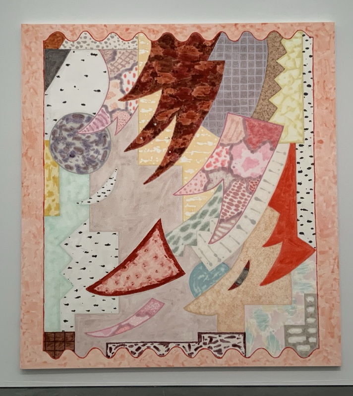
Spiral, 74 x 74, acrylic, graphite, pumice medium on canvas


\

Detail

Even when Chicago artists aren’t delineating figures,  they’re still looking outward, not inward - and they offer as much tension and noticeable craftsmanship as the Imagists.     Miyoko Ito (1918-1983) , Barbara Rossi (1940-2023), Candida Alvarez (b.1955), and Magalie Guerin (b. 1973)  might serve as examples. They depict objects in the world - even if unrecognizable. And those objects are accompanied by attitudes of satire or puzzlement or humor or wonder or whatever.  Always intense - always personal.  Deeply so. That’s the Chicago way.

In this show, however, Scott Wolniak  (b. 1971) goes in nearly the  opposite direction.

Pieces are indeed well made - but they feel more casual,- even passive.    Shapes float rather than assert - and  they seem to be appearing on their own - like moisture stains or cracks in a wall. There is no provocative personality here - just acceptance.  Like George Harrison’s "Life flows on within you and without you". 

The title of the exhibit, "Aggregations", refers to how the paintings were made in layers. First, a flat pattern of hollow tubing was sketched in - usually as a spiral. Then, like sausage casings, they were filled in with a variety of stuff:  splotches, marks, lines, whatever. The piece as a whole may feel tired and boring.  In a museum or gallery with hundreds or thousands of works to see, I would walk right past them. But often there is a quirky beauty in areas of detail.  It’s not a beauty that slaps you in the face.  It’s just that whenever you look for it - there’s a surprising variety of textures, surfaces, and marks that feel unpredictable and is echoed, in some way, across the canvas. It’s just what is needed for pieces one sees every day - in home or office.

The results are the same calm you might feel from Persian carpets - and they likewise share an inexorable pull from the edges towards the center.  Chicago art is notably high spirited.  These  paintings are more like meditational/spiritual.  

Some of them might serve well as mandalas at a yoga retreat - but they aren’t really targeted at any one specific spiritual practice.  Wolniak teaches in the visual art department at the University of Chicago  so he makes conceptual installations as well. ( 2009 :  "Ungray: Color, Light, and Other Balms" at the Cultural Center).  We might then think of his work as being about spirituality - in an intellectual way - rather than actually being part of a spiritual practice.  Experimentation is more important than rectitude or enlightenment.  Which does not mean that they necessarily look better or worse than what might be found in a Tibetan monastery.  Though they do feel less serious.  Unity with the spirit of the cosmos is not at stake.  

In the history of American Art, this is the Hieroglyphic tradition of New York in the 1940’s - except that there seems no suggestion that the marks relate to ancient or esoteric symbols.  The art theory has changed more than the painting.

Adolph Gottlieb, Masquerade, 1945

This piece comes the closest.


Allium, 36 x 30,  acrylic, oil, pumice medium, fiber paste on canvas


Detail

What a wonderfully watery piece
even if muddy/murky in some areas.
It’s pulled every which way - and loose.
There seems to be a driving principle behind it’s organization-
but I know I will never find it.

Walk in the Park, 21 x 17, acrylic, oil, pumice medium, fiber paste on canvas
The least spiritual, and most enjoyable piece in the show
Might serve as the cover for a Brian Eno album.
I’ m guessing that the title is an afterthought.


Detail


Maurice Prendergast, Franklin Park, Boston, 1895

Here’s another stroll through a park.

On the other hand, the pieces in Wozniak’s 2023 show. "Cross currents", at Goldfinch Gallery were quite different:


Radish, Et Al,” 2022, acrylic, graphite, paper pulp and pumice medium on canvas, 72″ x 60″ 


It also resembles a Tibetan thangka, but it’s more like a figurative one - even if it has no recognizable figures. 

I

The Resplendent One, 14th Century


Going back to his 2014 show at Valerie Carberry,
we find the wild, chaotic intensity of an early modernist like Pavel Filonov:


Current, 2014, Acrylic, ink, and watercolor on carved plaster, burlap , and plywood., 24 x 21

Now this is more like Chicago art.
It’s something Bruce Thorn might do.


Clearly Scott Wolniak is moving in an ever more spiritual/meditational direction and I look forward to seeing a retrospective someday.  He might even end up with the emptiness of Malevich or Rothko - but his response to nothingness would probably be to start  automatically filling it up with something, anything. It’s called horror vacui.

*****
 .


This show also includes these small sculptures:
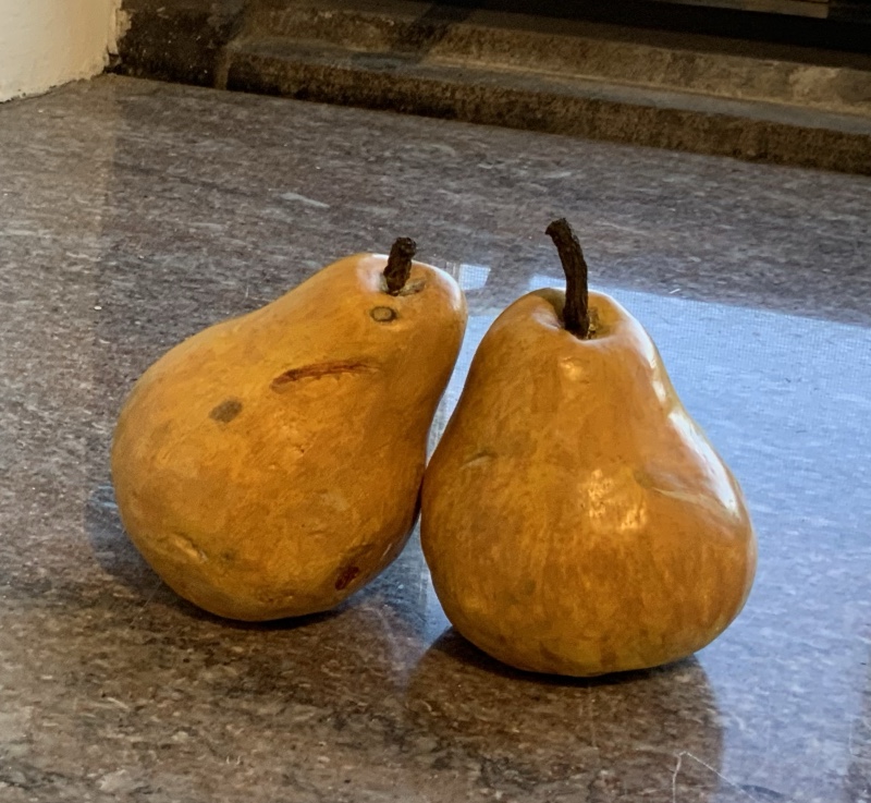


Wolniak has taken his lumpy shapes off the wall and made them sculptural objects.  Now their value is entirely conceptual. These painted plaster casts are so realistic that indeed wild birds might peck at them ( remember Zeuxis of Heraclea? ) They are indeed humorous.- but their forms are as disposable as the overripe fruit they represent.  I’m sure the janitorial staff had to be cautioned not to pitch them in the garbage.


Wednesday, July 17, 2024

John Himmelfarb at Koehnline Museum

 A review of John Himmelfarb "How things Stack up" at the Koehnline Museum


KB3 - 2014


Girls like dolls. Boys like toy trucks: they carry stuff - they have wheels - they race downhill - dad may  own the real thing.  And John Himmelfarb (b. 1946) still can’t get enough of them.  As the gallery sitter informed me, every single piece in this career spanning exhibition has a truck (though you may have to look very very hard to find it)

Above is a vintage real truck that he’s stuffed with junk - not unlike the metal salvagers who patrol the alleys of Chicago.  I’ve always loved  rusting farm machinery whenever found,  but even better, this pile of junk has  been as tastefully arranged as a bouquet of flowers.


The Ink Truck is Here, 2015

While here is a really dynamic, and scary,  wood block print. Himmelfarb may be locked onto a single subject matter - but can use a variety of materials and techniques to great advantage. Reminds me of the 4x8 plywood sheet prints of fellow Midwesterner, Tom Huck.


This bronze "Ur Truck" (2019) seems to have driven in from another dimension.
Playful and mysterious, it has the blue-green patina of an ancient relic. Not surprising that the artist once worked in the studio of Ruth Duckworth.


Drama, 2020


Himmelfarb plays with styles as well as materials.
This piece could have hung in a Hairy Who?  exhibit of the sixties. 
High-chroma silliness done really well.


Girder, 2012

And he makes plywood constructions that suggest buildings or factory machinery.


All of the above is a boy’s  delight in building and beholding the great and incomprehensible world of men. Like the Chicago Imagists, he doesn’t want to grow up.  And why should he ?  Everything he touches becomes delightful - at least for a moment.

PV84, 2015

Could be trucks, could be wine bottles, 
could be text written in a lost alphabet.

Or could just be an expressive abstract painting.
It’s not the only such piece in this show.
There’s a feeling of passionate emergence here,
a thought trying to clarify itself. A brain at work.
Or maybe just the corroding undercarriage of a a semi ?
 
This is the one piece in the show that feels like it's seeking rather than entertaining.
I’m glad he does both- but also wish he made things that  transcend the busy, mundane  life of the street or nursery.
Himmelfarb's art has a warm, cheerful, positive glow.  The workmanship broadcasts good will. 
Yet it also echoes the great suburban sprawl of our civilization as it smothers the planet with highways, strip malls, industrial parks, and housing developments.  Everything solidly built, nothing beautiful.  No refuge here for contemplation.  No ideal beyond the accumulation of more stuff - stacked high in the bed of a cute old pick-up.


Saturday, June 22, 2024

Sol Kordich at Mariane Ibrahim


So much thought and skill has gone into these  ambitious pieces.


Coming Back to the One, 2024,  75 x 77


A cosmic theme presented by swirling, virtuosic brush work.


It’s just that it makes me feel nothing.


Sensual - but not compelling 
Serious but not profound
Energetic but not powerful
Appealing but not beautiful 

This is an aesthetic perhaps better realized with died fabric rather than paint.
The images don’t really seem appropriate for flat, rectangular surfaces,
and the artist seems to be pulling yarn rather that attaching herself to a canvas through the tip of a paint laden brush.

Sol Kordich (b.  Buenos Aires, 1995) was trained as an architect, and the impersonality here would fit better in the lobby of a glistening new hi-rise than in the more personal space of an apartment.


Wednesday, June 19, 2024

Bill Conger at 65 Grand


Any diversion from popular cartoon-like art is much to be welcomed into the Chicago artworld.  No garish colors and aggressive figuration here.  These pieces resemble  circular Petri dishes that have been marked up by bacteria on a thin film of agar. So what we feel here is a force of nature, not the hand of man.  There was some gestural painting done at the beginning of the process, but it was transferred and layered onto another support.

From a distance, these meditative circles might suggest classical Chinese landscape painting - but there is nothing monumental or sentimental about them.  It takes so much effort to feel how they pull together as a design, you might as well be  looking at something that happened rather than something that was shaped.  The swirling  lines shown above might be the strands of hair pulled into the drain of a bathtub.  Perhaps photography  is the best way to create such effects - it's certainly less labor intensive.

Though not readily connectable to Chicago (as are the paintings of the other William Conger), this cool, earth-tone nature art is widely made in the Mid-west.  (and the artist lives downstate).  Before it’s closing, Perimeter Gallery was a good place to find it.


detail


Can you feel any kind of human striving, play, or emotion in here ?  It might require a dedication, formal sensitivity, and patience greater than my own.  Yet still -  when so many other kinds of painting swiftly transport me to ecstasy - why would I want to do so much work?


These pieces feel less like a celebration than a penance.

Wednesday, May 8, 2024

Entre Horizontes : Art and Activism between Puerto Rico and Chicago

A review of  Entre Horizontes: Art and Activism Between Chicago and Puerto Rico 

at The Museum of Contemporary Art Chicago

**************


 Arnaldo Roche Rabell (1955-2018) Aqui y alla  (Here and There),1989 

There is no indication online that Rabell identified as gay - but four beefy guys cavorting on a boat at night off the coast of Chicago’s north side seems like that kind of theme.  They’re naked and certainly burning with something - probably desire. Rabell’s technique is incomprehensible to me.  He somehow wrapped a paint loaded canvas around  unclothed models. Nevertheless,  the results are quite powerful.  Obviously he made just the right alterations. And probably he was some kind of magician.


Armaldo Roche Rabell ,  Isla Vacia, (vacant island), 1987

More magic from Rabell - a memento mori still-life combined with an aerial cityscape of what must be San Juan -  and the all-too empty chairs.  He's quite passionate about the loss.


Angel Otero (b. 1981), Exquisito, 2009 

This is the kind of work Otero was doing right after he got his MFA at SAIC and was shown at the Chicago Cultural Center.  It recalls the home of his grandmother.  Like Rabell, it drips with sensuality, and it’s a kind of collage.  Otero uses scraped off paint skins.  A cool, distant, objective view of these things (all things?) is not possible. It’s all about emotion.
Candida Alvarez (b. 1955), Licking  a Red Rose, 2020

This piece is from the MCA’s own collection - and I can see why they acquired it.  It’s gorgeous. Signage tells us that it refers to the 2020 election as well as a friend licking a rose. But I think it’s just about Candida's joy of being alive.

Jose Lerma (b. 1971). Dorothy, 2023


As this photo shows, this is quite a large piece.
The artist used a special broom to brush thick acrylic paint across burlap.

It depicts Dorothy Dene, purportedly a model for Luis A. Ferre’s great gift to the museum in Ponce, Puerto Rico, ‘Flaming June’


Lord Leighton, Flaming June, 1895

Lerma has hinted at some ideological content behind his current work - as there was in his spoof of international banking in his show at Kavi Gupta ten years ago (Here is my review)
But gallery signage doesn’t mention it  - so I take it as just an update on the theme of stately young women - suitable now for a corporate headquarters instead of a mogul’s mansion.
It has the pleasant aesthetic of a quilt or soft sculpture.

Sebastian Vallejo ( b. 1982) Esperando La Tormenta, 2017


Signage tells us that the artist painted this in NewYork while Hurricane Maria was devastating Puerto Rico.  For me, it has the excitement of Van Gogh - so I’m not sure that his reaction was one of despair or anxiety.


…and apparently the MCA thought it was decorative enough for a pillow

Vallejo appeared in a show of young artists at the Puerto Rican Community Center in 2016

Sebastian Vallejo, Paseo por la Costa (walk along the coast), 2020

Vallejo would be an ABX painter- except that his subject is his beloved homeland - not his own troubled mind.
I wish he had a gallery in Chicago.

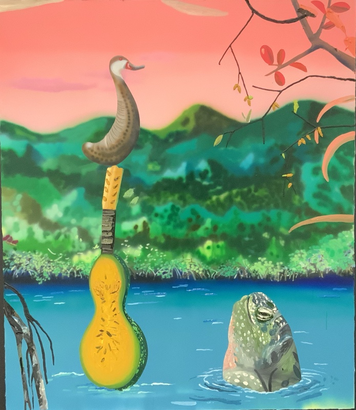
Omar Velazquez (b. 1984) Caguama, 2020

Signage tells us that this depicts the artist’s encounter with a sea turtle while canoeing in the mangroves near Salinas, Puerto Rico. Possibly he encountered a duck as well, and had fruit and musical instruments on board.
 
It's pleasant and lighthearted, but I'm sure I don't enjoy it as much as the artist did remembering his experience.  I have no interest in seeing it again.

******************

Allegedly, this exhibit "examines the artistic genealogies and social justice movements that connect Puerto Rico with Chicago" 

 But what's really interesting were the above paintings on display.  They demonstrate a quite fruitful connection between Puerto Rico and the  School of the Art Institute of Chicago. Two of the above artists are currently faculty members ( Alvarez and Lerma), while the rest all studied there.  They have brought so much beauty and joy to a regional art scene that has mostly been interested in other things.


And though it’s anathema to a Modernist sensitivity, most of their work is saturated with nostalgia. If squeezed, the tears could fill buckets.  That’s probably why the curator chose to emphasize something more fashionable like "Activism".


************

As Lori Waxman wrote for Hyperallergic:


The real stars of entre horizontes are big, lush paintings invoking no particular politics but using a variety of techniques borrowed from printmaking: Ángel Otero’s and Arnaldo Roche Rabell’s messy kitchen tables, with collaged fabrics and impressed textures; José Lerma’s breathtakingly confident profile of a woman, brushed in inch-thick acrylics with a commercial broom; Nora Maité Nieves’s “Magnetic Field” — two pairs of iridescent geometric patterned canvases.

So she mostly agrees with me — except that I found Nieves’  grid-obsessed  "Magnetic Field" too boring to mention.  She must have studied with a conceptualist like Michelle Grabner while at SAIC.  By the way, some of the other work she shows online is quite different.

Sunday, May 5, 2024

Rebecca Morris at Museum of Contemporary Art

A review of  Rebecca Morris 2001 - 2022 , Museum of Contemporary Art, Chicago


*******************************************


I’ve never been able to connect to the Rebecca Morris paintings periodically shown at her local gallery, Corbett Vs. Dempsey.  They felt like cold,  impersonal  experiments in pattern.  A scientist in the laboratory - not an artist in the studio.

But this twenty year retrospective has pulled in pieces that feel different.


Jam packed with tension and excitement. Feels like it started in the center and then struggled to puzzle out the corners.  Morris calls those curved knife-like shapes "lobster claws" - and they do feel formidable.


This speckled piece is more  lighthearted - but it still feels like a person trying to share what is essential and important about their life:  a carefree kind of beauty.


This one does feel experimental - the challenge being to arrange splotches whose soft-edge patterns are always unexpected.  So much anarchy- so much goofiness — highlighted by the shiny gold foil background.  Possibly inspired by the fantasies in Persian miniature painting - or maybe her mother’s clothes closet.


A similar project set against silver foil.


Reminds of the very best quilts - where ordinary fabric is transformed into something too wacky to be from planet earth.  Some women like to over-dress this way -  with deep red nail polish and turquoise cat-eye sunglasses from the 1950’s.  Masculine anarchy tends towards violence - but the feminine moves towards whimsey - and that’s the only kind we need.

***************

Alan Pocaro wrote a fine review of this show for New City - one of the best I’ve ever read there. He concluded that:

At first “the shock of the new” will hold our attention rapt, convincing us that there is something significant at hand, because visually there is. But late abstraction’s lifeblood is also its fatal flaw. The new colors, shapes, configurations and techniques upon which it depends inevitably become old, tired and predictable. Eventually we come face to face with peculiar-looking paintings that are about an artist making paintings that look peculiar. We can still enjoy them, but eventually we will have to admit: there’s not much to it.


 ...and, thankfully he provided celebrated examples of the opposite: "Point of Tranquility" by Morris Lewis (1959-60) "is bold and beautiful and reaches toward the sublime even as it fails to grasp it"
and "Excavation" by Willem de Kooning (1950).  "one of the greatest paintings in the history of the Western canon"

Absent any recognizable subject matter, abstract painting has always struggled to prove any value other than decorative.   Kandinsky, one of it’s earliest practitioners and promoters, introduced the notion of spirituality.  So a painting could be spiritual even if it was not representing something or someone holy.  Kant’s  notion of the sublime was later added to accommodate those more secular.  And  I suppose we should accept that ‘Excavation" is great just because it has been widely proclaimed as such. (It’s never done much for me)

What I want from an abstract painting is certainly decorative.  I want it to appeal to my eye again and again and again.  But that appeal is something apart from what might be provided by a fresh bouquet of flowers.  It’s the life loving spirit of the artist I want to see - fully realized as a singular form that I can experience.  Admittedly that may be far less than the spirits of saints or divinities that were presented by artists of the past.  And it may be less than some important innovation in concept or technique. But heretic that I am ——- I doubt it.

When Rebecca Morris painted pieces that felt clinical, I had no use for her work.   But when I feel her yearning, living spirit - I am thrilled by her company.

************


This seems like a good place to park this quote from Kandinsky about non-objective painting:

A terrifying abyss of all kinds of questions, a wealth of responsibilities stretched before me. And most important of all: what is to replace the missing object? The danger of ornament revealed itself clearly to me; the dead semblance of stylized forms I found merely repugnant. . . . It took a very long time before I arrived at the correct answer to the question: What is to replace the object? I sometimes look back at the past and despair at how long this solution took me. ... Kandinsky, Reminisences, 1915

Saturday, May 4, 2024

Nicole Eisenman at MCA Chicago

 A review of Nicole Eisenman : What Happened at the Museum of Contemporary Art Chicago—————————————————————————————————————


Another Green World,  128 x 106, 2015


I don’t enjoy looking at these paintings.  In the tradition of social realist murals,  their message  is delivered at the expense of aesthetics.  Figures often suffer monstrous distortion,  pictorial space is collapsed onto the surface, and color is crudely chopped up as if to make it printable.  You can sense a vigor of  design in the small scale of the jpeg shown above.  It reminds me of the tumultuous battle scenes in Mughal miniatures.   And the celebration of affection and community is truly endearing.  But at room size it’s oppressive.   I’d probably feel the same way about "The Rake’s Progress" by William Hogarth if it were ten feet long instead of two.  

Triumph of Poverty, 2009,   67 x 83"

Eisenman makes clever, gently satirical cartoons.  Gladys Nilsson works a similar territory for us Midwesterners. It’s just that cash value is proportional to size in the contemporary artworld - so she makes them way too big.  Viewers of contemporary art are used to work that makes them feel disoriented and uncomfortable.  I try to avoid it.


Coping, 2008, 65 x 82

This nightmarish scene is somewhat intriguing on my iPad, but oppressive at seven feet across.


Seder,  39 x 48, 2009

This piece is just about the right size - so I can imagine myself reading the Haggadah to an assembled family of gentle folk and misfits, expressively portrayed by the artist.  It makes a fine contrast with Norman Rockwell’s Thanksgiving dinner as attended by idealized stock characters.  But still — a great painting?  No. There is nothing visual here to savor.  It’s all about rambunctious disruption. Everyone feels out of place.  With each viewing it becomes more stale and tiresome. Like the Sunday comics, it’s disposable.

And that’s what separates Eisenman from Brueghel (whom she quoted in "The Triumph of Poverty".).  Pieter  Brueghel the Elder’s paintings were great as both cartoon and painting  - and that hardly ever happens in blue-chip contemporary art.  (Kerry Marshall being a notable exception)


*************************************************

So I’m not going to assert, as Sebastian Smee recently did in the Washington Post, that  "Nicole Eisenman is one of the best American painters working right now."  Aesthetics still matter - at least to me. Everything else is just subject matter- maybe you identify with it - maybe you don’t.

Smee does, however, make some sharp observations about how Eisenman’s painting has changed over the decades shown in this retrospective. 

And we may note some ambivalence in his concluding paragraphs:

Art, at its best, starts from a premise of aliveness. Aliveness (in the forms of humor, sensuality, richness of response) is attached at the hip to awareness. Awareness (the human brain and body liberated from sentimentality, propaganda and all other forms of denial) involves registering the full extent of the debacle. But acknowledging the debacle, in turn, plunges us into depression — the very opposite of aliveness.
 

Awareness also involves registering the full extent of the miracle - before which we must believe the debacle is just a bump on the road. For those who love the awareness of miracle in form -  Eisenman’s paintings are indeed depressing —- the larger they are, the more so. 

Something like this dynamic inheres in Eisenman’s work. Her paintings and brilliant sculptural ensembles are atotally alive — sometimes almost maniacally so. But they’re also continually collapsing into a stunned stasis. When they emerge again, it’s into states of bafflement as the artist tentatively gropes after community, which she tenderly, gratefully celebrates.

Yes - stunned stasis is what I’m feeling here - and it’s repulsive - however tenderly community has been embraced.  A serious adult public space - like an art museum - should not have the aesthetics of a feel-good daycare center.

BTW - Smee’s essay was quite impressive. If he didn’t pay proper respect to the judgment of the marketplace, he wouldn’t get published.  But if he didn’t subtly undercut it, he wouldn’t be an art critic.


******************************************

Nor am I as comforted by these paintings as Annettte Lepique was in New City when she concluded 


Abolitionists in the Park, 2020-2022, 10’8" x 8’9"


There’s something moving about this moment.("Abolitionists in the Park") There’s recognition of not just one of those now-ubiquitous blue masks, but also the quiet trust that the sleeper gives to the people around her. There’s the knowledge that the exhaustion you may have felt and feel in the face of the world’s chaos is shared. There’s reassurance that you too are part of this world, that isolation is not the norm; that someone, somewhere shares language in common with your heart.

Unlike those "abolitionists  in the park", I had no interest in defunding a police department in the aftermath of the George Floyd homicide.  Nor would I conflate them with the indispensable anti-slavery abolitionists of the early 19th century.

So I am not reassured that "someone, somewhere shares language in common with my heart". This is actually a rather small, if vocal, minority of Americans.  This, like so much social justice art, is preaching to the choir.

 When you ask yourself what did you see, what did you do, what all happened? Know this: everything. Everything happened. You just have to look to truly see it all.

These are fit words to end an essay about a show called "What happened?" -  but it’s also a bit of nonsense.  Many things did indeed happen — but none of us can ever truly see it all.  This painting presents only one point of view.