Saturday, August 11, 2018

Jan Matulka at Thomas McCormick


untitled, 1940's


By the mid-1940s Jan Matulka was no longer considered an important figure in the art world. His work thereafter decreased in quality.” ..Los Angeles County Museum of Art

One cannot argue with that first sentence since Matulka  had no exhibitions of current work after 1943. Moreover, hardly anything he made after 1940 has entered the collections of art museums.

But did his work really decrease in quality ?


Purist Composition, 1923


Only one piece in this exhibit predates 1940, a gouache on paper titled “Purist Composition” (1923). During that period, Jan Matulka (1890-1970) maintained a studio in Paris where he followed the latest trends in Modernism. Purism, as conceived by Ozenfant and Le Corbusier, was an architectonic variant of Cubism— suitable for making an interior space feel open, bright, and cheerful. That wasn’t the only kind of Modernism that Matulka practiced – but it does seem to lead directly into the kind of painting he would do twenty years later -- with some important differences. The shapes in his “Purist Composition” are as tightly held together as the visual features of a building. The edges are as sharp as paper cut by scissors. In the paintings from the 1940’s, however, the edges have grown soft and blurry, while the shapes have begun to wantonly float away, – as if there were no longer the energy or will to bind them together. It’s a kind of disintegration, but neither tragic, unhappy, or chaotic.. The shapes still have the memory of having been together. The composition is not yet lost, – it has just begun to wander. The effect is a delightful release of tension that seems untethered to any time or place. These paintings could just as easily been done yesterday as in New York during the forties. They are markedly different from the artist’s earlier work, as well as from the angst and heroics of the kind of abstract painting that was beginning to conquer the American art world. Acknowledging such anomalies, the McCormick gallery has called this body of work “the Mystery Paintings”.

As Hilton Kramer wrote in 1970, “Mr. Matulka is not the sort of painter who established an original idiom of his own. He looked to his contemporaries and his tradition—the modern tradition— — for his models.” But the Mystery Paintings would seem to contradict that. They may echo the compositions of Cubism and Surrealism from earlier decades, and they strongly .assert that rectangular picture window that characterizes five hundred years of the European tradition. Yet they also appear to be more about the secret life of colors than anything else. These were color field paintings more than ten years before Clement Greenberg used that phrase.

Each painting feels like a separate journey to a destination unknown. Usually they are playful, energetic, and surprising. Some colorful rhapsodies may verge on the psychedelic, though mostly they are as quiet and tasteful as the Upper East Side neighborhood where the artist then lived. Do they belong in the Museum of Modern Art? Probably not. But they certainly can sustain repeated viewing - while a few might even belong in museums that take a less doctrinaire look at the history of twentieth century painting.

Tuesday, July 3, 2018

Ivan Albright at the Art Institute of Chicago


In the history of Euro-American figurative painting in Chicago, Ivan Albright (1897-1983) might be considered one of the game changers. Painters before him depicted people as strong or elegant or noble or charming or gritty. Painters after him depicted people as demented or goofy or bizarre or damaged. There was plenty of sentimentality in the work of those earlier painters, and perhaps the most sentimental of all was his father, Adam Emory Albright (1862-1957). The elder Albright specialized in barefoot boys romping through sunlit fields like erotic nymphs in Arcadia. It’s not difficult to guess why anyone, especially his own son, might wish to go in the opposite direction.

It’s also not difficult to guess why Ivan became attached to morbidity. The exhibition includes some anatomical illustrations that Albright drew while working at a military hospital in France during the First World War. The horrific scope of the casualties must have revealed “Snowden’s Secret” as described in ‘Catch 22’, Joseph Heller’s dark novel of World War Two : “by seeing Snowden's entrails spilling over the plane, he feels that Man was matter.. ..the spirit gone, Man is garbage." While other veterans from that era, like Otto Dix, depicted the aftermath of war with anger or outrage, Albright depicts the human condition as disgusting as a sack of putrefying meat.

If Albright suffered from PTSD, it did not seem to have interfered with his pursuit of a career focused more on fame than money. All but one of the paintings in this exhibit come from the artist’s estate. The single exception is the portrait of Mary Block, the founder of the Woman’s Board of the Art Institute and the wife of a trustee who would eventually become chairman. The artist, who married into a prominent publishing family, had friends in high places. The portrait is hardly flattering. The woman appears to be anxious, suspicious, grasping, and powerful. The artist called it “rather ghastly in a way”. As a dedicated patron and collector, Mrs. Block was probably more concerned with being included in the history of art than with her depiction as an unattractive woman. And perhaps wealthy Americans of the mid twentieth century realized that the upper crust no longer needed to be seen as kind, wise, righteous, devoted, or elegant. Wealth had become its own validation. It still is.

Every decade, or so, the Art Institute hauls out some of its Albright collection and puts it on temporary display. This time the theme is “Flesh”, so the show does not include “The Door” or “The Vision of St. Anthony”. Albright certainly painted a lot of flesh – but only the sagging and decrepit kind. No firm young bodies; no tender, voluptuous skin; nothing that looked healthy and vibrant. Actually, what he depicted does not look like human flesh at all – it’s more like blistering, peeling, artificial leather – unnatural in both texture and color. Like album cover art for death metal bands, it’s on the border of horrible and humorous, with a target viewership that is more about adolescent rebellion than adult responsibility. Two paintings assure us that the work of the hands (“The Lineman”) and the work of the spirit.,( “The Monk”) are without value.

Albright’s fanatic attention to detail and philosophical-sounding titles continue to lead some critics to assert that he was applying old master techniques. Notably, the signage in this exhibit makes no such claim. So much of European painting from the fifteenth to nineteenth century was about making human figures, as well as landscapes and comestibles, appear fresh and alive. The only life that concerned Albright, other than his own, was that of bacteria and fungi.

If he were still alive, he should certainly be commissioned for the official portrait of POTUS #45.  He was a master of moral as well as physical decay. But does Ivan Albright still deserve all this attention? Isn’t the “Picture of Dorian Gray” sufficient to demonstrate his vision and place in the history of Chicago art? Do we really need a well born, well trained, well married, well connected, well respected white man to repeatedly tell us that human life is without meaning or hope ?


*********************


Luke Fidler’s review responds to “Pornography in the Classroom: Another Challenge for the Art Educator” (Blandy/Congdon -1990) – an essay that discusses an Albright painting as follows:


Fidler suggests that Albright treats his subjects, both male and female, with “tragicomic care”, while “it is not he but we who supply the violence”.   With which I’d agree – though I don’t see putrefaction as violent at all – quite the opposite. To quote Andrew Marvell: "The grave's a fine and quiet place"

 I also don’t see why the Blandy/Condon essay should be referenced in art criticism.   As it’s title would suggest (“Pornography in the Classroom”) it was apparently intended to provoke controversy rather than contemplate works of art as such.  Though it does seem that New City  is becoming ever less interested in making such a distinction.

Fidler does highlight, however, the following aesthetic quality:


one of the more intriguing characteristics of his paintings, namely that the teeming rot and discoloration bedeviling his protagonists is rarely matched by frenetic activity on the surface of his canvases. They’re uncannily smooth, amplifying the strange sheen of his palette in which few blacks are true blacks and every tone seems a little jaundiced


I confess that I found the "strange sheen of the palette" so repulsive, I did not notice whether the paint was thick or thin.

 As I had briefly suggested,  Albright's images resemble the rebellious adolescent fantasies of death metal record album covers.  If Fidler would persuade us that they are something more important, perhaps he could relate them to other expressions of what he calls the "tragicomic".  Hans Holbein's "Dance of Death" is one example that comes to mind. By comparison, however, Albright's work is dead in form -- as well as subject matter.

Rachel Niffenegger at Western Exhibitions


Rachel Niffenegger says that her favorite childhood toy was “Dr. Dreadful’s Squeemy Snack Lab” (“Looks gross, Tastes great”) A similar contrast may be found in the current exhibition of her art. The sculptural figures all resemble skeletons wrapped in decaying shrouds. Yet they also suggest acrobats or perhaps even dancers holding acrobatic poses. They are vibrant and elegantly fragile despite their sepulchral associations. Each wire figure rests upon a clear acrylic box half filled with gravel and rubble that must have been swept off a parking lot. It’s possibly the cheapest, dirtiest, and most available material one could find. Yet it’s color and texture is visually the perfect complement to the soaring, twisting figure resting upon it.

Like many other shows at Western Exhibitions, the installation of this show is no less creative than the art on display. The whole is greater than the sum of its parts. A long sheet of translucent white fabric has been stretched within one area of the gallery. Concealing the edges of the conventional white cube, it has been tacked or draped over plinths of various heights. It renders the space more intimate than social. More remarkably, it has also been stretched over a life size department store mannequin of a running woman. Who knew that such an unusual prop even existed? The features of the mannequin are mostly obliterated by the sheet stretched over it – but it still feels lithe and athletic - the same energy that seems to drive all the collages, inkjet prints, and sculptures on display.

Childbirth appears to be the theme that unites everything. As presented by Cosmo Compoli, one of Chicago’s historic Monster Roster, it can be ugly, dangerous, and painful. That’s the message shared by his bronze sculpture, “Birth of Death” (1950). Giving birth, however, might also be considered the most amazing and creative act that humans ever do , even if it’s messy, and chaotic. Wistful faces in muted pink and blue often appear on the thin fabric that has been stretched across some of the wire loops in the sculptures. Though blurry, they still seem to express the sweetness, hope and potential of youth. More youthful faces appear in the inkjet prints where they have been distorted as if reflected by a funhouse mirror. In one such image, an infant is suckled by his naked, smiling mother.

The stated theme of the show, however, is “Psychotic transcendence”. Or, perhaps it’s “Personal Effluvium”. Or perhaps it’s “Mental Hauntings”. The artist offers fifteen possible titles for this show and seventeen possible answers to “what is the work about?”. None of them denote the act of giving birth . She does note, however, that since her last show, “There is more sex and babies”, “I understand beauty” and “Death is now harder” There is nothing cool about becoming a parent – or a “breeder” as some might call it. It’s more about responsibility than freedom. It’s more about creating rules than defying them. It’s more about someone else’s future than your own present. But it does seem to be what has been on the artist’s mind lately - despite her childhood fascination with the macabre.


***************


Luke Fidler's review in New City finds that "No individual piece is quite as compelling as the whole installation" -- as did I.   But he's not sure whether it's anything more than " collecting, re-working, and storing things"  Is it a good collection of such things?  That issue is not addressed - though overall the show is not Recommended

Niffenegger's new found interest in motherhood is too politically oblique right now for an artist to  proclaim or a critic to notice.

By the way, the critic notes that "much of the ambitious work focused on bodies these days attends to vital issues of race, gender, sexuality, or ability, grounding the body’s subjecthood in social procedures of constitution or experience." 


With which I'd agree -- but without the word "ambitious".  Such issues are more like low hanging fruit -- easily reachable and automatically respectable.


Friday, June 22, 2018

Elliott Hundley at Shane Campbell


(detail)


This exhibition of recent work by Los Angeles artist, Elliott Hundley takes its name from “Eighteen Seconds”, an avant-garde screenplay by Antonin Artaud. Written in 1925 for a silent film that was never produced, it presents the last eighteen seconds in an actor’s mind before he shoots himself in the head. He’s on the verge of both a great career and romantic triumph, -- but “he has been stricken with a bizarre malady. He has become incapable of reaching his thought; he has retained all his lucidity, but no matter what thought occurs to him, he can no longer give it external form…. ----- he is reduced to watching a procession of images, an enormous number of contradictory images without very much connection from one to the next”

At first glance, Hundley’s collages might produce the same effect. They’ve been packed with a variety of images that seem to lack much connection. Many come from selfies or photos of other scantily dressed, lithe young men. Others come from advertising, especially fashion, or comic books. There are a few photos of statuary or ceramics, both commercial and classical. A few images are mildly cute and girlish; a few others are mildly creepy and boyish. There’s only one scene of explicit violence – a cartoon superhero walloping some hapless villain. There is zero explicit sexual activity. There’s also zero religious imagery or photojournalism of current or historic events. But there are many, many disembodied human heads –most of which stare directly back at the viewer as if to ask “and who are you?”. It’s a collection that might be found on the bedroom wall of a quiet, sheltered twelve year old boy who is more concerned with his own identity than with anything else out there in the world. Possibly he will eventually identify as gay. Possibly these processions of images make some sense after all.


(detail)


As patches of color and texture, the small images also build up into overall patterns that work quite well as abstract paintings. Several employ a grid of either concentric circles or checkerboard squares or both. The underlying photos easily get lost within the dynamics of the design – especially as the surface is built up with pins, string, and whatnots up to a depth of five inches. In one piece, the panel is penetrated with the kind of black rubber collars that are used to plunge toilets. Combined with multiple images of red gaping mouths with canine fangs, that piece is intensely ominous as well as alluring. Nothing breaks the surface however in the two works on paper, and one piece is not a collage at it all. It’s a monochrome view of a museum of comparative anatomy, overlaid with a layer of long, streaking, colorful lines. It was executed with oil paint on linen, though it feels much more like a screen image manipulated in photoshop. More than anything, these pieces might be experienced as experiments in design and materials.

The chaotic but positive energy of a vibrant city feels like it’s coursing through each work – just as it did in so much work of the New York school from the 1950’s. As an innovative and thrilling designer, the artist is obviously much more skilled, experienced, and accomplished than the fictional mind in which these final eighteen seconds were occurring. But that doesn’t make these pieces feel any less hopeless and self-centered. We are still looking at a modern boy-man who, just like Artaud’s protagonist, is “incapable of participating in the lives of others, or of devoting himself to any activity”. After nearly one hundred years, this fascination with intellectual despair can no longer be considered avant-garde. It has been normal for half a century - at least in the contemporary artworld.


Tuesday, June 19, 2018

Women Painting Men - Riverside Arts Center


Jessica Stanfill, "Gabrielle and the Swan"


Women have been depicting men for a very long time. Recent analysis of hand prints found beside prehistoric cave paintings suggests that the majority of early artists were female. When we visit the art museum today, however, nearly all of the historic paintings on display have been attributed to men. Since the society they addressed was patriarchal, women have often been depicted as they might best serve the needs that gender -- primarily as mothers or sexual partners.

As men continue to need women to fulfill such roles, it’s not likely that these kinds of depictions will ever be abandoned. But sixty percent of art school graduates are now female, and patriarchal priorities have been waning for several generations. What kind of roles do contemporary creative women see men as playing? The demographic of this show is rather limited. All of the artists are early millennials who got MFA’s locally within the last ten years. Not only is each of them white, but so are all the men they depict. There is variety in these depictions, from fear to pity to ridicule, but nothing like admiration and respect. Men have an over inflated view of their own importance: economically, intellectually, and sexually. They need to be taken down a notch or two. It’s payback time.

Jessica Stanfill offers us the naked man as either a drunken, inflatable sex toy or as part of a bland floral arrangement. Mel Cook scrawls the voyeurish details of male frontal nudity on the back of a boy’s prim and tight white briefs. Katie Halton depicts a bunch of beefy bearded guys hanging out at a beer garden to posture their Neanderthal manliness Celeste Rapone imagines a fairy tale villain as a child’s stuffed toy whose fat pink nose and clenched white teeth are interwoven with thin, spindly arms and a blue feather boa. Karen Azarnia depicts a bald, shirtless old man wading through a field of high grass as he desperately tries to escape something that frightens him. Gwendolyn Zabicki depicts a tree trimmer who is certainly more strong, daring, and adept than any of the men shown above, but the result of his work is pathetic. He has cut every branch off the mighty elm and reduced it to an ugly, ludicrous stump.

In all of these paintings, formal quality feels no more than sufficient to deliver the intended narrative. Like viewing a political cartoon, after you get the idea, you might as well move on. That may be the legacy of a certain kind of art education.

What about recognizable portraits? What about serious depictions of men at their best as well as their worst? What about depictions of the opposite sex as actually sexy? What about narratives that are more explicit than puzzling, and more affirming than ironic? What about artists from other ethnic groups as well as outside the conceptual world of contemporary art? It wouldn’t be a bad idea to have “Women Painting Men” become an annual exhibition - but with even more variety next time. It also might not be a bad idea to gather these same skilled and sophisticated artists around a less ideological theme. 

Tuesday, May 29, 2018

Richard Rezac at The Renaissance Society


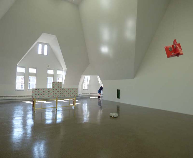
The sculptures of Richard Rezac can no better share the same room with each other than a bunch of anarchists might. They’re more about breaking rules than following or making them. The resulting space feels like the aftermath of a child’s birthday party. Unusual objects appear to hang from the ceiling, sit on the floor, project from a wall, or wedge into a corner for no good reason. Each has been reduced to the most basic kinds of enclosed shapes, much like a Brancusi bird or fish. But less attention has been given to developing an inner dynamic of form – and more to inviting viewers “to consider the multiple layers and possible readings of each piece”

There might be two cross purposes here. On the one hand every Richard Rezac object looks pleasant and well crafted. Like toys made for toddlers, the shapes are simple, the surfaces smooth, the colors solid. None of the twenty pieces are disruptive, and a few are quite attractive in a modern decorative kind of way. Puzzlement, however,seems to be the top priority. Many appear to be architectural details, yet they serve no conceivable function. It’s as if some organic pattern of interior design had become cancerous and was producing dysfunctional anomalies. A variety of materials are used – glass, wood, metal -- in such a way that the combinations always feel incongruous. One end of a gate might be supported by a painted wooden strut – while the other end is supported by a lump of unpainted cast plaster.

The largest piece, referred to as the “Ren Screen” was apparently designed for a specific place on the floor of the Renaissance Society gallery – which is itself a rather incongruous space. It’s bizarre, trapezoidal walls were the unavoidable consequence of the Gothic Revival façade of Cobb Hall. The upper edge of the screen echoes the pattern of high windows in the wall behind it. It serves to scale down the ungainly space of the enormous room. It also cheers the room up with a quite pleasant red and green floral pattern. Yet, when seen from the rear, the symmetries are broken and the combination of patterns feels arbitrary. It serves to support a small wood sculpture that resembles the waist of a violin. Titled “Cremona”, it makes a droll reference to the history of musical instruments while accenting the center of the screen -- but it doesn’t really save the screen from feeling arbitrarily pieced together..

Who cares about anomalies? Near anomalies can be quite thrilling in paintings as they challenge and stress the composition. If they destroy it, however, scientists and financiers might be even more fascinated. Something that doesn’t make sense often triggers a major new theory, product and investment opportunity. Those modern elites might be the best viewership for this kind of art.  It might well inspire creativity within the immaculate white cells of laboratories or corporate headquarters.. Elsewhere, however, it probably just serves to reaffirm the intellectual superiority of the viewer - without really offering any substantial evidence of it.


************************


The review published in New City concludes that "Above all, this is an anti-monumental show. Nothing big, nothing grandiose, no hyperbolic claims about art’s importance. This is itself refreshing, but the sculptures thus run the risk of not being taken quite seriously enough; and to underestimate them would be a mistake, because there’s something quietly subversive about Rezac’s well-crafted dialectic of difference and repetition."

Presumably, a "dialectic of difference and repetition" is subversive, and being subversive is important. We can only guess why.   The artist is well established and his  "vocabulary of shapes" though incomprehensible,  is hardly provocative in a contemporary artworld that thrives on provocation.

The exhibit, as well as Luke Fidler's review, would seem to reaffirm rather than subvert any social or visual conventions that may apply. 


Saturday, May 26, 2018

Mary Qian and Miguel Malagon at the Vanderpoel Museum


Mary Qian: "Dayton Street"


More images of the show have been posted here


Mary Qian’s “Dayton Street” is the first painting you see when entering this show. It’s also one of the best realist paintings recently made in Chicago. In the background, people are walking, driving, or biking down a busy street. In the foreground, a tall, Latino man with shoulder length hair is staring at a point somewhere above the viewer’s head. With eyes wide open, and expression calm and determined, he is apparently having a vision. The strong triangular composition gives that vision the gravitas of a religious icon. The neighborhood is vibrant, congested, and youthful, while Willis Tower in the hazy distance identifies the city as Chicago. These are not the mean streets that might relate to a discourse on social justice. Nor are they the beautiful streets that might celebrate the pleasures of urban life. The street is orderly in that everyone is following the rules of traffic. Visually, however, it has the chaos of arbitrary placement ,a jittery sense of space and a hint of anxiety. All that makes this view beautiful is the man depicted in front. Not that his face or clothes are especially attractive – but there is a beautiful spirit shining out from his eyes. You might call this a romantic realism that is more sentimental about the future than the past.

Qian’s other portraits, usually just a head and shoulders, also pursue a truth that is earthbound as well as spiritual. Skillful drawing projects the volumes of the skull and the fleshiness of features like the lips and nose. Yet even more, the design projects the spirit of the person depicted. They don’t seem to be extraordinary individuals – but neither do they appear depraved, ridiculous, demented, or banal. Each has a unique character. All other qualities of paint or model are secondary. A more expansive cityscape fills the background of “Above”, and again the person in the foreground is looking upwards in a pensive way. The light breaking through the clouds intensifies the dramatic effect – as if this woman had overcome many obstacles and was courageously pursuing her dream. She’s young and handsome, and appears to be African American – but all that seems incidental to the strength of her spirit. This is Rembrandt's legacy in portraiture: painting the soul while making the body just realistic enough to convince you that such a person actually exists. A double portrait of a mother and child is less successful. This time, the narrative is carried by a caressing hand rather than a staring face so the mood needs to be more about comfort than perseverance. The foreground features a beautifully painted color patterned shirt, but that’s not enough to keep this grayish painting from feeling a bit sad and dreary. It’s a tribute to motherhood that’s more to be admired than enjoyed.


Miguel Malagon: "Downtown Vendor"


The cityscapes of Miguel Malagon are as immersed in the street life of the city as the man depicted in “Dayton Street” for which he was the model. They have the same gritty texture and jittery sense of space. His figures sometimes struggle to emerge from a blizzard of paint strokes and they never relate to each other very well, but isn’t that the reality of an urban street ? People may be physically close, but each is living in a hectic private world. There’s a sense of displacement, as one might expect in a city with so many immigrants – including both of these artists. (Qian was born in Shanghai, China; Malagon in Guanajuato, Mexico) Each painting feels like a collage of on-site sketches or studies from snapshots. They exhibit more concern with what can be seen than with what it might mean. Malagon’s landscapes, however, seem to focus on a kind of nervous and forceful graphic energy. He has relaxed and taken comfort from some rocks along the edge of a pond, but the hills, trees, and clouds appear to reflect back the artist’s own restless, questing spirit.

This exhibit takes place in the Vanderpoel Museum. John Vanderpoel (1857-1911) was a popular instructor at the School of the Art Institute. In his time, figure drawing from life was fundamental to art education, and he was a master. His instructional book, “The Human Figure” is still in print. Soon after his untimely death, former students began to assemble a collection of observational art in his honor. Some of the pieces were done by him or his students; most were not. Some were made by the leading artists of the day; most were not. It’s a fascinating slice of art history and of a tradition that lives on in the work of Qian and Malagon. It’s also a rather somber reminder that most art, no matter how skillful, thoughtful, and emotive, will eventually be pushed beyond the radar of the artworld. Now located in the Ridge Park Field House on the far south side, the Vanderpoel Museum itself is at the brink. It may not survive another generation unless someone steps up to revive it with more shows like this one.