Monday, July 4, 2011

Go Figure - at the Smart Museum

Go Figure - through September 4, 2011
Smart Museum, University of Chicago


Representational art may have lost status in the postwar artworld, but it never disappeared, and now Smart Museum curator Jessica Moss has selected nine artists “to illustrate pivotal moments in figurative art of the last 60 years”.

Confining herself to pieces from the Smart and other Chicago collections, chronologically her story begins with Leon Golub (1922 – 2004) .


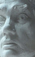
His “Colossal Heads” from 1958 look more like the rough, corrupted surfaces of two colossal Shigaraki clay pots, but there’s just enough facial detail to identify them as ugly monsters and thus express the moral despair of the ‘monster roster’ Chicago painters of the 1950’s.


A decade later, both the morality and the despair is gone, and we have the personalized , defiant fetishism of the Chicago Imagists, represented here by a dozen pieces by Christina Ramberg (1946-1995).


In New York, the figure re-emerged in Pop-Art, but recognizing that the artworld has become more global than ever, Ms. Moss brought in a giant folk-pop head by Ravinder Reddy (b. 1956) who is represented by Walsh Gallery here in Chicago, but works at Andhra University, Visakhapatnam. Though reflecting a tradition that is measured in centuries rather than decades, he still manages to convey the vapid banality of Jeff Koons.


Another world-wide phenomenon, especially important in the Midwest, has been the celebration of art brut. The outsider artist shown in this show is Martín Ramírez (1895–1963), whose obsessive drawings were first collected by doctors at the California mental facility where he was confined and posthumously validated and collected by Chicago artists, Jim Nutt and Gladys Nilsson.


For the figure in conceptual art, a wall-sized installation by S.A.I.C. M.F.A. Clare Rojas (b. 1976) was commissioned. To get the full effect, it needs to be accompanied by her performance as alter-ego “Peggy Honeywell” the folk singer. But even on its own, it would still make for a sharp, decorative mural in a corporate cafeteria.


The five above genres are rather obvious choices for a Chicago based exhibit of figurative art in the contemporary artworld. It’s the other four that are more remarkable, beginning with a few sound suits by S.A.I.C. professor, Nick Cave (b. 1959), who has created a genre all his own. The accompanying theory of concealing racial identity is a bit depressing, but the beautiful costumes are as wild and wacky as anything worn by the Sun Ra Arkestra.


Another local artist whose work echoes African American music is James Kerry Marshall (b.1955) whose narratives of ghetto life are as poignant, topical, structured, and rhythmic as a song by Muddy Waters. American scene painting was banished from high-art by 1950, but, happily, the Chicago artworld encourages it as long as that scene is African American. (another distinguished local practitioner is the sculptor, Preston Jackson)

Neither of the other two artists are from Chicago, but they do represent two of the greatest figurative traditions in the world, a world that now includes its largest civilization, China.

Most artists from the Middle Kingdom gain attention in the West by entering the discourses of contemporary art theory, which makes this show’s selection of a traditional brush painter like Yun-Fei Ji (b. 1963) so remarkable.


Yun-Fei made his Chicago debut at the Smart Museum’s 2008 exhibition of Chinese artists responding to the displacement caused by the Three Gorges Dam. His current scroll continues to work that theme, though he has added two of the most powerful members of every Chinese community, the uniformed officials and the ghosts.


More topical than classic, Yun-Fei may lack the gorgeous power of the great masters, but the gentle humor of his work is as timely as an editorial cartoon.

The other great figurative tradition is post-Renaissance European - in this case, that variety of post-Impressionism that keeps attention on observed detail, but abandons that careful sense of volume that was cultivated from Giotto to Picasso. In middle-brow art, this is the world of art fair photo-realism, in high-brow art it’s Lucien Freud or David Hockney, and it’s fellow Brit, Sylvia Sleigh (1926-2010) who was chosen for this exhibit.


Sleigh was a brave choice because there’s not an ounce of irony, angst, or social criticism in her work. Her “Turkish Bath” gets points for political correctness by replacing appetizing young babes with handsome young dudes. (I think the old dude in front is her husband). But no major museum has collected her painting, and her primary credential for the world of high-art remains her huband, the critic and Guggenheim curator, Lawrence Alloway. Also, her large paintings look quite amateurish as 10 inch reproductions. She has no sense of volume, and since she clearly is trying to make people look sweet, real, and beautiful instead of depressing, sick, or ugly, she appears to be a failure.


But in person, her life size paintings are delicious and far, far removed from amateur naivete. Most remarkable of all is her portrait of Leon Golub, his wife Nancy Spero, and their three sons, with paintings by Mom and Dad on the wall behind them. (including, happily enough, Golub’s “Colossal Heads” which is also in this exhibit) This is the depiction of a happy, healthy, successful middle-class family, so different from the world of monsters that haunt the parents’ imaginations.

Despite 60 years of disparagement, there’s still an enormous artworld out there that is devoted to depicting a happy, healthy life within a beautiful world. Even if some of it’s most prominent practitioners are notorious kitch-meisters, many of them are good artists, and it’s about time that major art institutions, like the Smart Museum, has taken notice of them.

What's still missing are examples of non-cartoonish figure sculpture and volume sensitive painting in the Baroque or Impressionist traditions.

And wouldn't it be shocking if the museum did a show called something like "Go Landscape", with the best contemporary landscapes from Chicago and elsewhere?

************

This turns out to have been one of the most reviewed exhibits of the year:

*Lori Waxman at Chicago Tribune

*Jason Foumberg at New City

*Paul Klein in his Art Letter

Tuesday, June 14, 2011

AIC : New Galleries of African and Indian Art of Americas

The most exciting features of the new galleries of African and American Indian art are the videos intermittently projected high up on the wall. Made by the filmmaker/anthropologist Susan Vogel (who also founded the Museum of African Art in NYC) they don’t tell a story so much as create an ambiance for distant peoples and places that’s ignored by the same generic system of display cases used in the new Japanese galleries. But still these displays of ethnic artifacts are far less ambient and educational than those recently created for the Field Museum of Natural History. And even though these new galleries are more than twice the size of the previous spaces, there isn’t that much more new material that really belongs in an art museum. Though, happily, there are a few exceptions, including some pieces that were first seen in the 2006 special exhibit of “ Casas Grandes & the Ceramic Art of the American Southwest”.


The bowl depicting a Mogollon hunter (950-1150 Ad) is one of the most exciting pieces in the entire museum.


While over on the African side, there’s a highly animated carved wooden headdress for the Yoruba Gelede ceremony in Nigeria. It’s a remarkable figure sculpture that came to the AIC in 2008. It’s also remarkable that this time the artist has actually been identified (as either Fagbite Asamu or his son, Falola Edun). So much of the African art that we see in museums was made within the last hundred years, but the artists are hardly ever identified, probably because once an artist establishes a name in our artworld, his work no longer qualifies as an authentic tribal artifact. Hopefully, this restriction is being lifted, and museum galleries of traditional Indian and African art will eventually accept the work of living masters of their traditions, even if that work was made for art collectors instead of native rituals. So, in some ways these new galleries represent an important step forward (especially for the African section which was recently just a short, narrow hallway) The AIC’s collections in these genres are still nowhere near as substantial as the Chinese and Japanese material. But they’re growing.

Monday, May 23, 2011

Rosofsky and Burge at the Elmhurst Art Museum


The Unsentimental Journey of Seymour Rosofsky,
Denise Burge: Original Dirt through September 4,
Elmhurst Art Museum
(pieces shown: Rosofsky “Lady of the House – Venus” (below,
Denise Burge “Machination” (above))


Though presented as separate exhibits, the oil paintings of Seymour Rosofsky (1924-1981) and the quilts of Denise Burge (MFA, 1991) both overpower their walls with dynamic, centrifugal energies, while offering a fascinating contrast across generation, ethnicity, locality, gender, and media.

A second generation, blue-collar Jewish kid from Chicago, Seymour’s talent was recognized early and he ended up studying oil painting with Boris Anisfeld at the Art Institute. He picked up that Russian’s dreamy, decorative, modern classical style, and also became an art museum junkie, both in Chicago and Paris, drawing from a variety of primitive, post-impressionist, surrealist, and expressionist art. But when he put it all together, it was all about him. There’s a musty, cluttered, claustrophobic feeling about his work, with the viewer often placed in the role of the therapist puzzled by the highly emotional, confused world of a patient who feels trapped in a female dominated, family centered life.

Roughly 40 years younger, Denise Burge comes from the hills of North Carolina. Quilting is a traditional medium and her crude, overstated imagery and improvisational use of materials resembles the outlandish art of Howard Finster. But it would be a mistake to call her a folk artist. For the past 20 years, she’s been an art academic, and folk-themed quilting on environmental themes was just the strategy she employed 10 years ago. (more recently, she’s moved on to installations and then video). Unlike Rosofsky’s work, hers is extroverted and the narrative, rather than being ambiguous, is spelled out in text across the surface. The bold patterns and strong, clear fragments of color in the fabric are much more attractive than the blurry fog of Seymour’s rather pasty oil paints, and mark her as a very sharp designer. If the quilts don’t disintegrate (and some areas do appear fragile) they may well be recognized as exemplary in that medium.

In the catalog to Rosofsky’s 1985 posthumous retrospective, his friend, Chicago artist//historian/critic Franz Schulze defended his “rich color, carefully interwoven tonalities and assured drawing” against the 1972 attack by New York critic, Robert Hughes, in Time Magazine who railed against “Rosofsky’s clumsy paintings” and “wretched thesaurus of clichés.” . But Seymour’s special strength is honesty. His paintings are stocked with clichés from Giacometti, Bacon, Chagall, etc because he loved art history, and they are no more clumsy, cluttered and confused than his own happy/sad domestic life. He exemplifies the passion, resilience, and time honored futility of his favorite team, the Chicago Cubs, while Denise Burge might be considered just one more smart and talented academic working the politically correct mindscape.

Tuesday, April 26, 2011

Marion Kryczka at the Chicago Cultural Center


Marion Kryczka: Recent Paintings – Chicago Cultural Center, through July 3

(text in color was edited out of Newcity version)


Marion Kryczka’s well made, highly ordered, masculine vision of reality may fit the blue collar streets of Chicago, but he’s been peripheral to the contemporary artworld, unrepresented by galleries and remaining an adjunct associate professor at the School of the Art Institute for 30 years. Kryczka’s work also 1acks either the photo finish and sentimentality, or the anger and ugly distortions that other corners of the artworld might appreciate, and he’s not even goofy, damaged, or unsophisticated enough to qualify as an outsider.

As critic, G. Jurek Polanski, wrote about the 1999 exhibit in the Fine Arts Building, “The variety of pieces tell a story, one in which each work, while complete in itself, is placed to build a context with its companions and comprehensively reveal the artist's personality.” And the same is true today, although the story is changing, as the artist mellows into his sixties. The still-lifes include the same dead fish, sharp knives, and bottles of alcohol on low-rent kitchen counters that he’s been painting for decades. But the light feels less harsh, the whiskey has been replaced by wine, and fish seem almost happy to be offering their tender, pink, slaughtered flesh. The vanitas theme is still explored with various kinds of skull, but now the shelves are cluttered with more of the stuff that he’s been accumulating in his life.


There are also some genres that weren’t there 12 years ago. Two magnificent winter cityscapes of his north side neighborhood tout Chicago as an energetic, seasoned, comfortable metropolis. Most remarkable are three views of the Donald Judd sculpture park in rural Texas. Judd’s minimalist stainless steel cubes are the cold, hard face of the industrial world. But set into a bright, sunlit gallery, Kryczka has co-opted the reflective surfaces of sculpture to meditate on beautiful impermanence, just as Monet did with Rouen Cathedral.. As with every painting in this exhibit, every brush stroke and patch of color not only defines a recognizable piece of reality, it also participates in the dynamics of a very tight design. And there are no people. It’s just the man behind the paintbrush and the quiet world in which he lives.

Art theory has not respected regionalism for more than 60 years. But if our local encyclopedic museum ever devotes a gallery to Chicago, it’s my guess that Marion Krycyza’s work will be there. Not because it reflects the trends of Chicago art (it doesn’t), but because it reflects so many lives that have been built here..

East-West at Murphy-Hill


Yan Shi Zhong


East Meets West, Murphy Hill Gallery, through May 20


(text in color was edited out of the Newcity version)


In 1955, the Soviet Union sent Konstantin Maksimov (1913-1993) to Beijing to train a select group of Chinese students how to make social-realist art.


Konstantin Maksimov


And thus began another east-west cultural exchange, one that is still practiced by Chinese artists around the world. Like their commercial counterparts in capitalist countries, their message was restricted to what they were selling. But with Maksimov, as well as many others, the work often seems to have been made to impress other artists, not just the unwashed masses, and at its best can be enjoyed as subtle, expressive, post-Impressionist painting just as much as works by Cezanne or Van Gogh. And so, over 50 years later, we now have the 15 members of the “Oil Painting Society of Chinese American”, most of them art professors in Midwestern universities, and now free to express whatever they wish. All but one were sent to peasant villages during the Cultural revolution, triumphed against the odds to win the post-Mao national competition to get into college, studied art with the generation trained by the Russians, learned English, and finally realized the dream of coming to America.


Victor Wang


Zhi Wei Tu


Each one of them would be a success story even if they never lifted a brush again, but indeed these 15 are still painting, some of them quite well, and a few of them, like Zhi Wei Tu and Victor Wang gaining national reputations despite an art education that was incompatible with either the minimalism or conceptualism of contemporary art. They have much more in common with what is here disparaged as middle-brow, even if American portraits, landscapes, and still-lifes done in traditional European styles continue to have many talented practitioners. Several of these American born artists have also been included in this exhibit.,
David Leffel


including David Leffel, who channels Rembrandt,


Clayton Beck III


Clayton Beck III who reincarnates Nicolai Fechin,


Matthew Almy


and Matthew and Magdalena Almy whose Ravenswood Academy, here in Chicago, harkens back to the ateliers of Bouguereau and Gerome. Notable about the pieces chosen, is that so many of them are still-lifes of Asian sculpture or ceramics, reminding us that cultural exchange continues to go in both directions. Joining these two groups, is a selection of more traditional water media painters from the Chinese Artists’ Association of North America, founded by a legend of Chicago’s Chinatown, Andy Chan.


Andy Chan


Their techniques, materials, and subject matter may be ancient, but the brash effect of their work is as modern as an interstate billboard.
All of this, plus more, takes place in 40,000 square feet on the third floor of the old Sears Roebuck corporate headquarters near Homan and the Eisenhower, in the last show this space will have before it is converted into commercial development. Special credit goes to Chinese born artist Mary Qian who dreamed up this enormous display as a kind of homage to the generations of Chinese artists who came to America before her,

Mary Qian


and to African-American Ralph Murphy, the entrepreneur who always finds a way to make interesting things happen.


Li Hu


Sherrie Mcgraw


Ruby Wang


Richard Lee


Li Lin Lee


Feng Xie

Tuesday, February 22, 2011

Charles White at N'Namdi Gallery


Charles White, Shaping of Black America
N’Namdi Gallery - March 5th


The first thing you notice about these iconic images of American black people is that none of them are angry. Contemplative, intelligent, determined: yes all of those qualities are magnificently expressed, but none of these characters, whether ordinary workers or famous liberators, seem angry about the world of injustice and humiliation into which they were born.

The next thing you notice is that the only thing about them that is African are the features of their faces. They could just as well be Mexican, or Chinese, or Turkish, rendered as they were in the international style of social realism, that leans so heavily on European painting from Giotto to Michelangelo.

Which is especially surprising since this work was done in 1974, at the height of the Black Power movement that inspired so many young African American artists of that era, especially the Africobra artists here in Chicago, to explore African themes, colors, and designs.

But the painter of these images was Charles Wilbert White (1918-1979) and they were done for the publisher of Ebony Magazine, John H. Johnson (1918-2005) who, like White, also grew up in poverty on Chicago’s south side and rose to prominence by virtue of hard work, imagination, and dedication to the destiny of his people.

Originally, this series of 12 paintings was intended to illustrate each chapter of “The Shaping of Black America” , written by Lerone Bennett, the long-time editor of Ebony Magazine. But the small images that appear in the book give no idea of the painstaking craftsmanship that is apparent in the 31”x 39” originals.

Done in monochrome oil on board, they have the feeling of watercolor on paper, with a carefulness that expresses the tenacity, dignity, self-reliance, and sensitivity of the cultural ideals being represented, as well as the mature character of the artist himself at the age of 56.


The social idealism found in his earlier work at the Art Institute (like “Harvest Talk”, 1953) has turned inward to become more personal.


There’s not a lot of joy in these severe monochrome images that seem to painfully emerge from discarded, crumpled brown wrapping paper. But this was intended to be a history lesson, not an aesthetic banquet, and aren’t most of the lessons from history grim ones?

Friday, February 4, 2011

John Marin at the Art Institute of Chicago


John Marin's Watercolors: A Medium for Modernism
Art Institute of Chicago
thru April 17


Sometime in the last century, the shameless huckster became the marketing professional, and the skills of building brand and market share were applied to fine arts as well as chewing gum. What’s so fascinating about Arthur Stieglitz is that he remains so admirable as an aesthete, as well as an artist and successful promoter. The permanent installation in Gallery 265 is the tribute that the Art Institute pays to his uncanny ability to help turn exceptional but obscure young artists into national icons: Georgia O’Keefe, Arthur Dove, Marsden Hartley, Edward Steichen, and John Marin.

Stieglitz began his career promoting photography, but what ultimately captured his enthusiasm was Modernism, the kind that was strong, bold, personal, and just as spontaneous as a shutter click. It was distinguished by its form rather than its perceived content, and none of the work he sold exemplified that any more than the watercolors of John Marin which he continued to collect and sell throughout his life. Happily, in 1949, Georgia O’Keeffe donated 40 of those pieces to the Art Institute, and they are now on display with 16 other paintings (plus some etchings) from the museum’s collection. All 56 are were made by Marin, but the ones that Stieglitz himself collected are the most exciting, as Marin acrobatically triumphed over the daring risks he took with his unforgiving medium.

And what a wonderful variety there are, from the slow and massive to the quick and crackling; from a room full of vibrant New York cityscapes to the rooms of ships, seacoasts, landscapes, and even nude bathers (whose puffy pink shapes are such a contrast with his usual angularities). But is all this expression specific to the Modernism that Stieglitz promoted and the Art Institute enshrines ? Are John Marin’s watercolors a medium for Modernism – or are they a medium for the kind of aesthetic enjoyment of the world that European landscapes have been expressing for centuries, and Asian brush paintings for a millennium? Gallery signage quotes Marin’s nonchalance about subject matter (any boat will do), though elsewhere he pronounced its importance and distanced himself from inner self expression. If Marin was a pioneer in abstract art, so was Rembrandt when he made his landscape drawings.

This exhibit is a triumph of aesthetic practice – in both the painting, the collecting, the curation (Martha Tedeschi), and even the framing, which uses either original gallery frames or ones made to their specifications. Under its current director, several shows have been mounted, using only objects from the museum’s own off-view collection. And this show is no less spectacular than the exhibits of the museum's own European tapestries and Japanese screens that preceeded it.

But it’s also a tragedy. Because when this show comes down, all these paintings may well spend another 60 years in storage, accessible only to those who make appointments with the Goldman Study Center (now open 8 hours/week). Why can’t they be rotated through a gallery of 20th C. works on paper, the way that Ukiyo-e prints have been in the Buckingham Gallery? Why can’t high resolution images of them be posted on the Internet? Why are visitors not allowed to take pictures of these items which are from the museum’s own collection?


Perhaps because the musem is far more committed to the ideologies rather than the aesthetics of modern art, and supporting evidence for an ideology only needs to be comprehended once. It’s only an aesthetic achievement, like a recording of Uchida playing Mozart, that needs to be experienced again and again and again.


Note: the above images,
taken from the AIC website,
are so small
I'm almost too embarassed
to show them.


Cape Split, 1935

But here's how his paintings look
in nice, big images
(thanks to Colby College, Maine)


Brooklyn Bridge, 1912